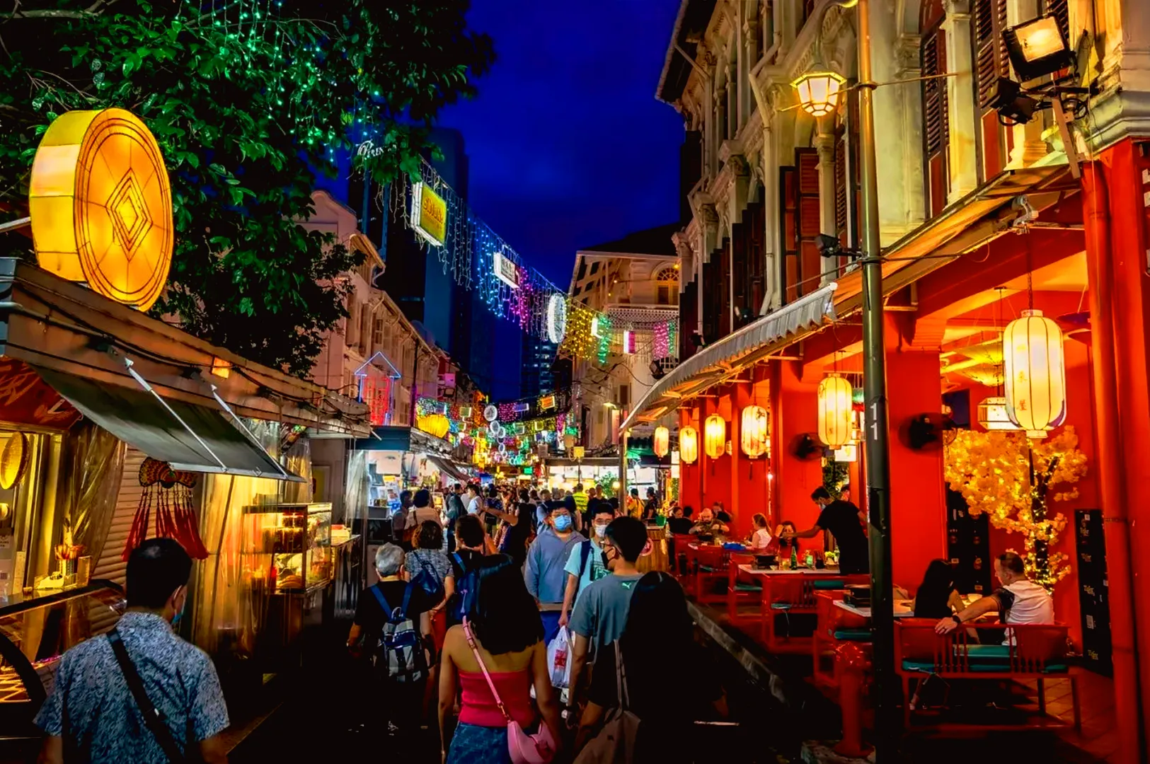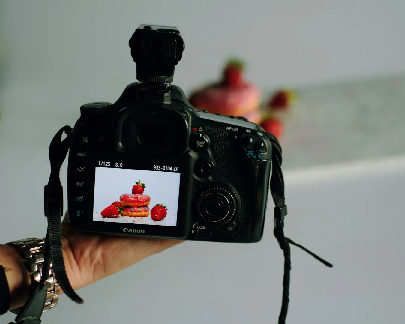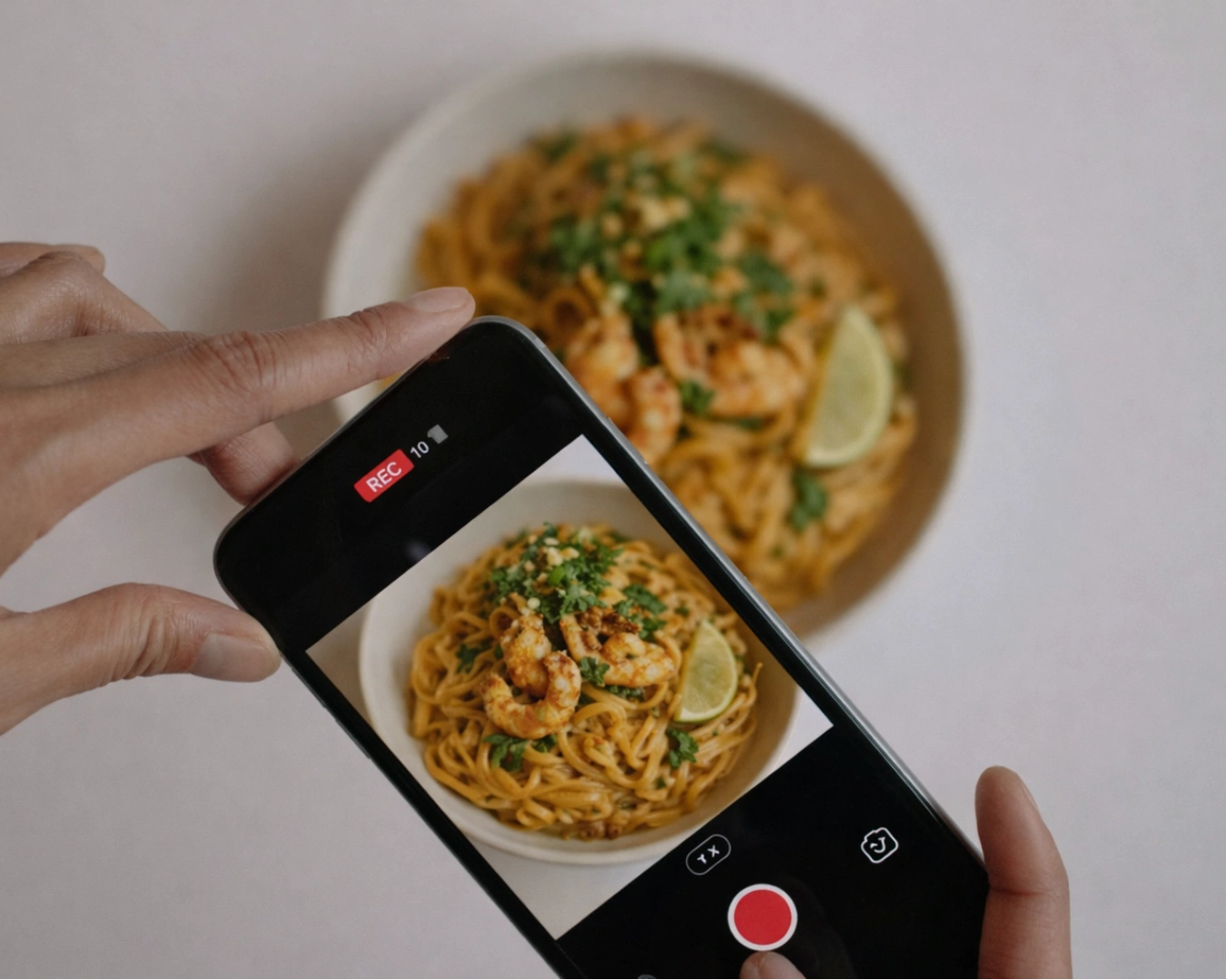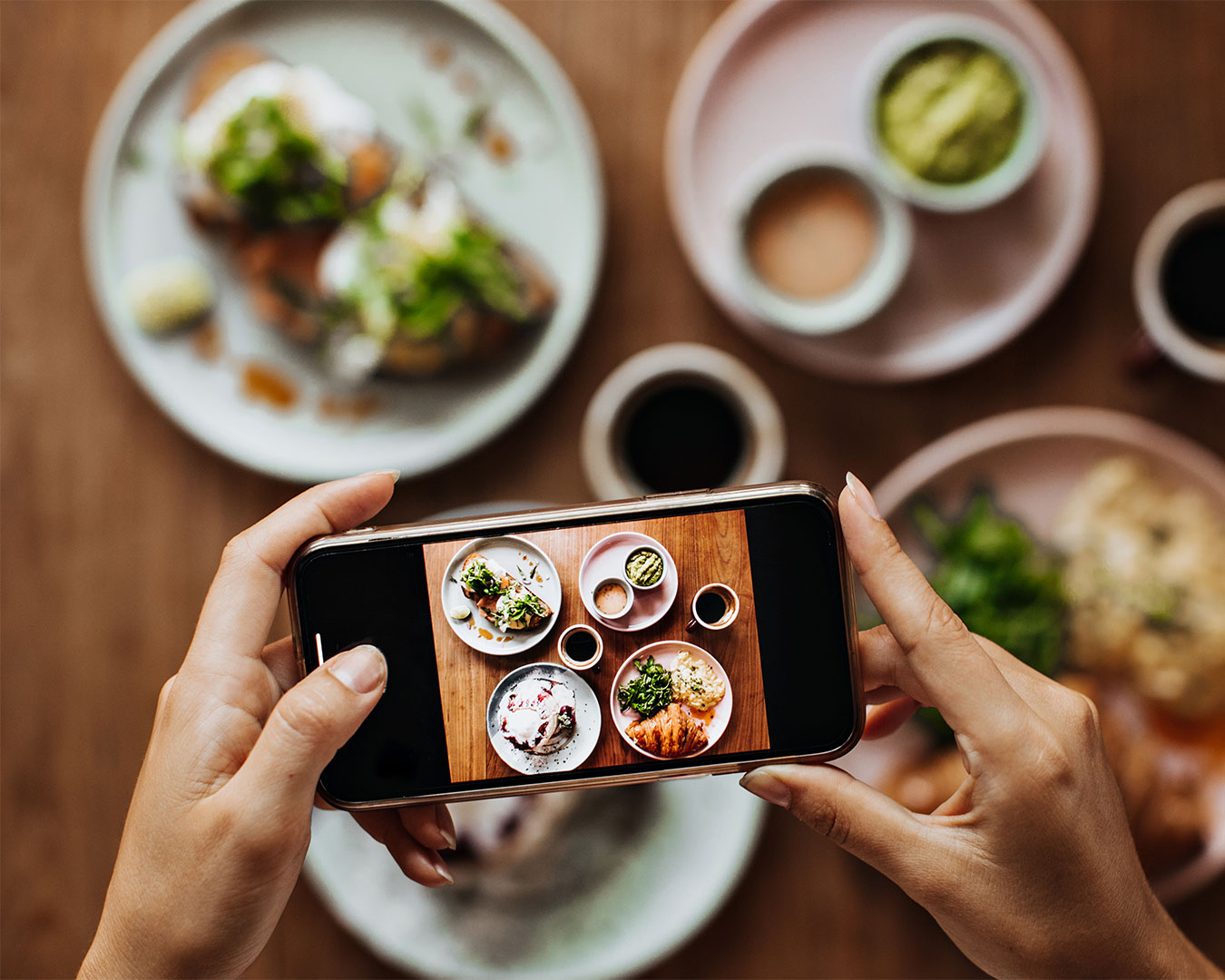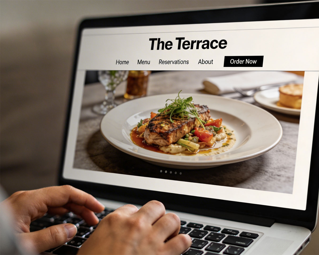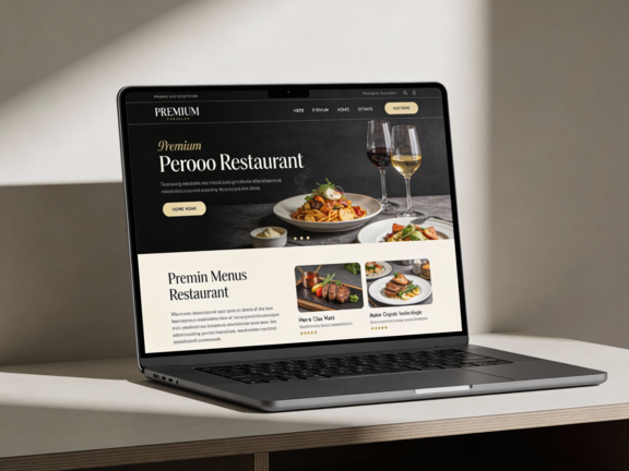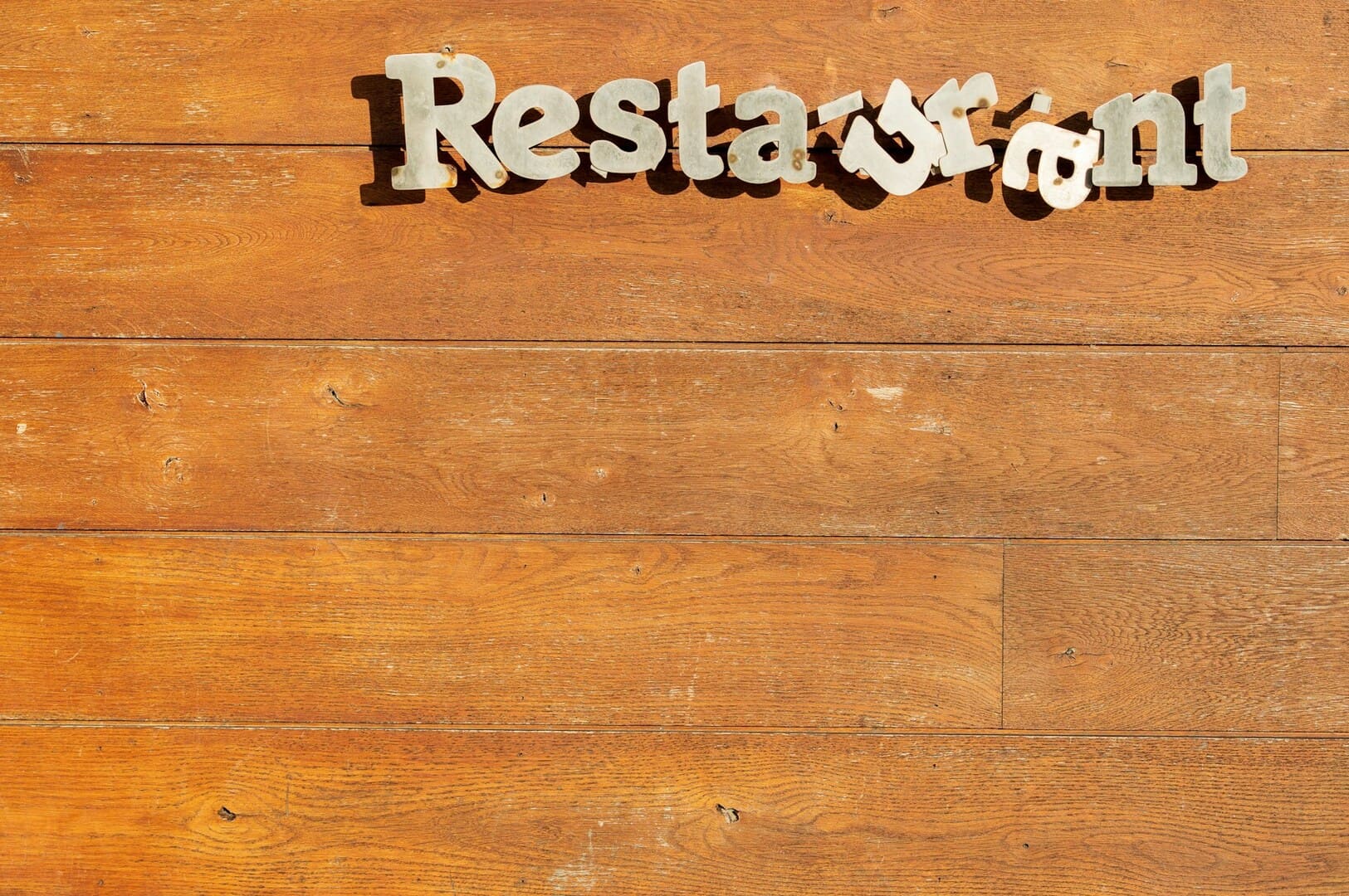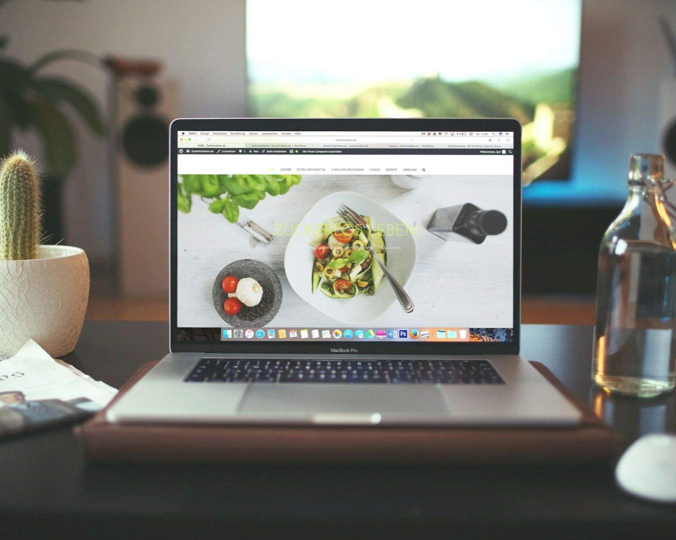
How many potential guests did you lose today because your website took four seconds to load a high-resolution photo of a steak? In the reality of Singaporean F&B, your website is not an art gallery. It is a utility.
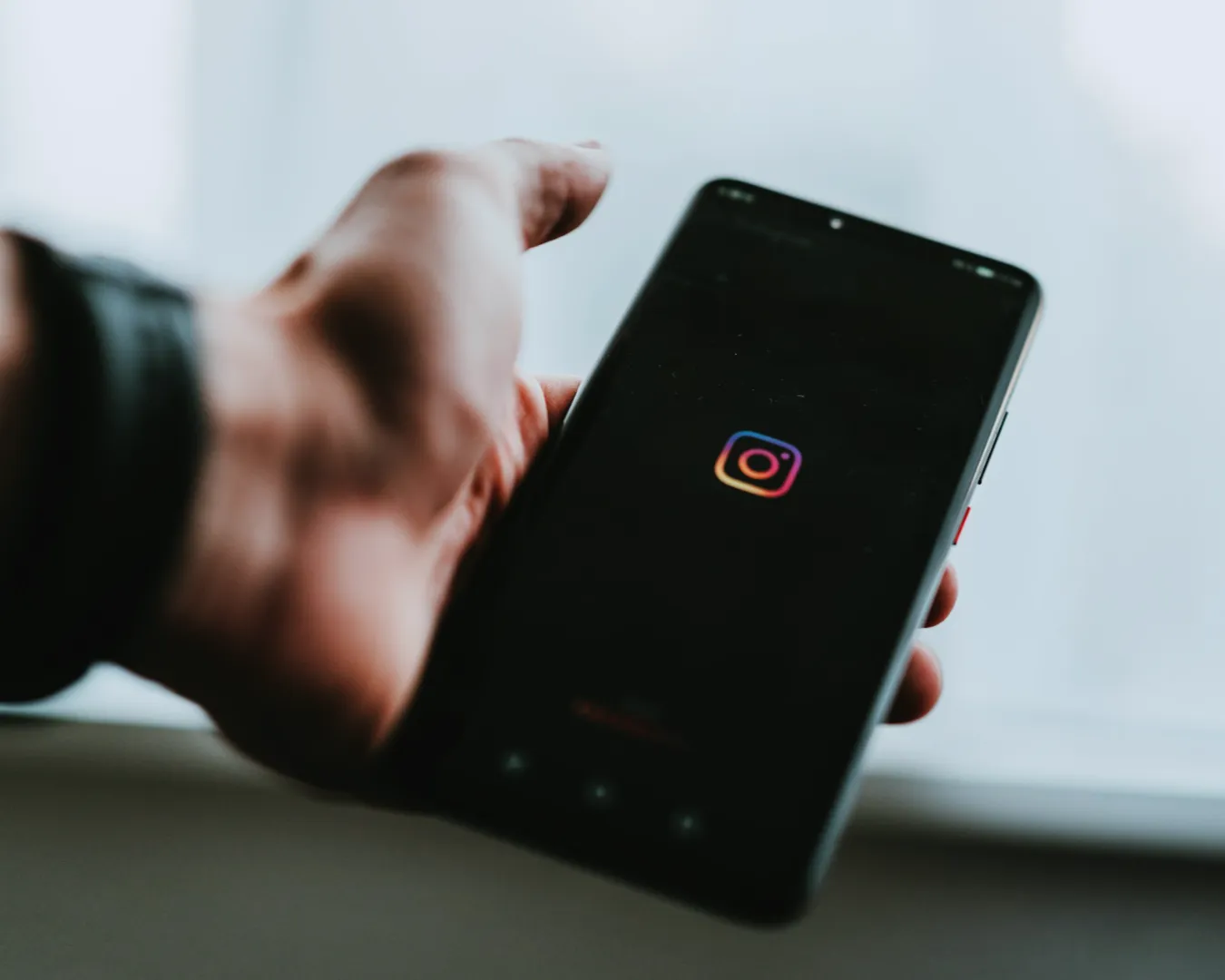
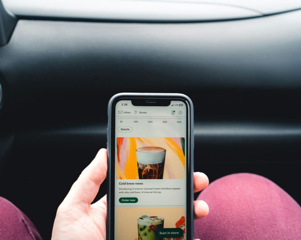
Most of your customers are looking at your site on a mobile device while walking to a train or sitting in a taxi. They have exactly sixty seconds to decide if they trust you enough to book a table. If your digital “front door” is heavy, cluttered, or confusing, they will simply close the tab and move to the next Google search result. These restaurant website design tips focus on converting hunger into reservations before that minute is up.
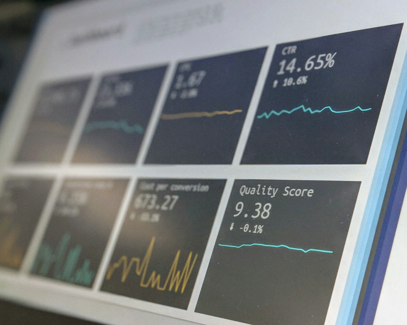
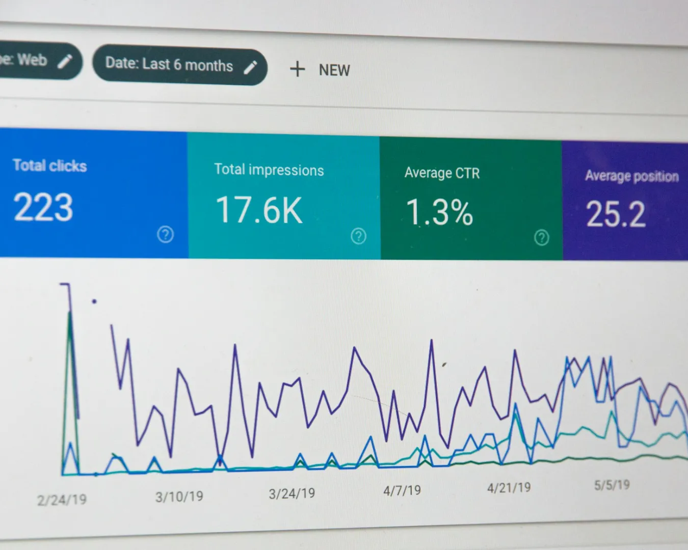
Prioritize Speed Over Vanity
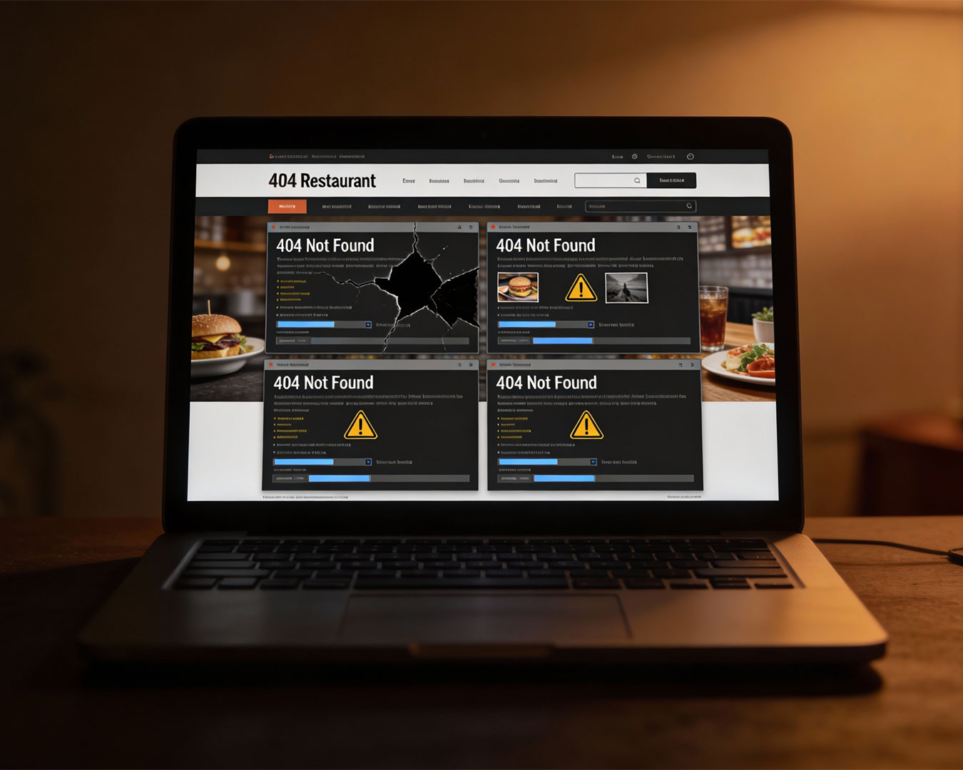
Many owners make the mistake of prioritizing aesthetic flourishes that cripple performance. A beautiful video background might look impressive on a desktop in your office, but it is a liability on a mobile data connection in a crowded mall. Speed is the most important feature of your website.
The first of our restaurant website design tips is to audit your load times. If a guest cannot see your hours, location, and “Book Now” button within three seconds, you are bleeding covers. Your website must be lean. This does not mean it should be ugly. It means the design must be disciplined. Every element on the page must serve a purpose. If an image or a design element does not help a guest make a decision, it is noise. Remove it.
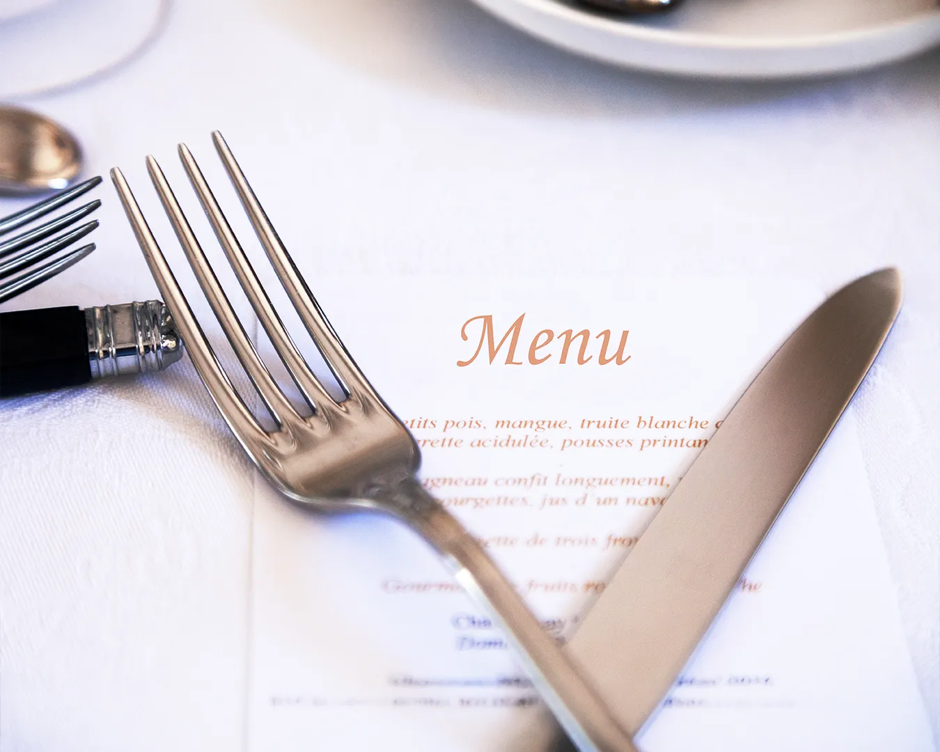
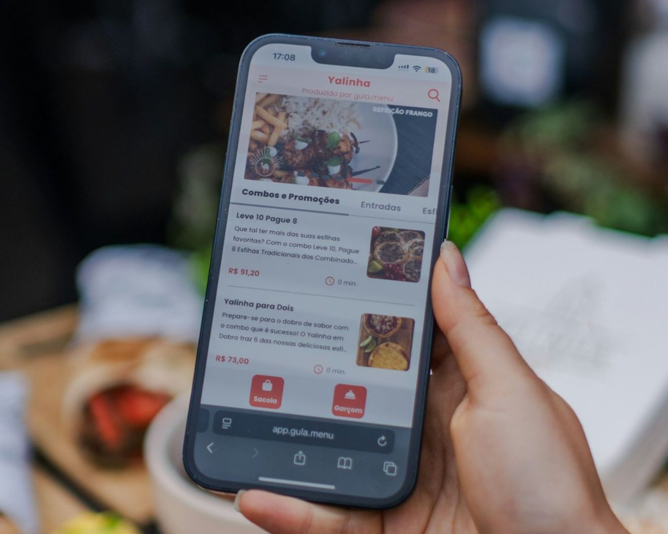
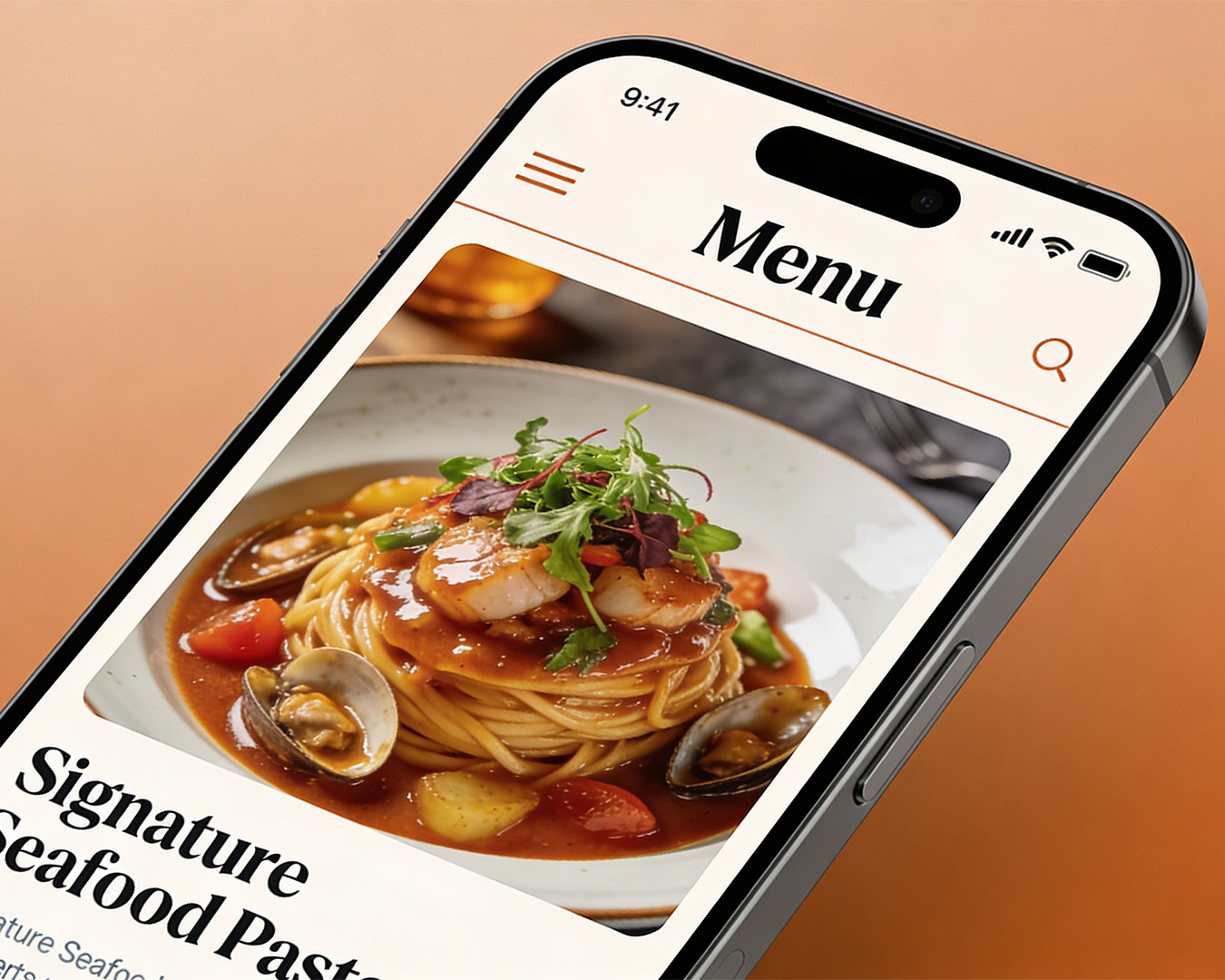
Kill the PDF Menu Once and For All
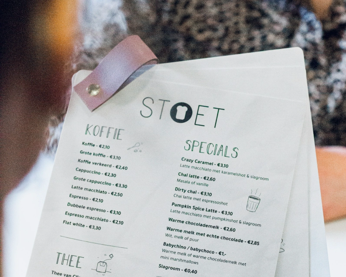
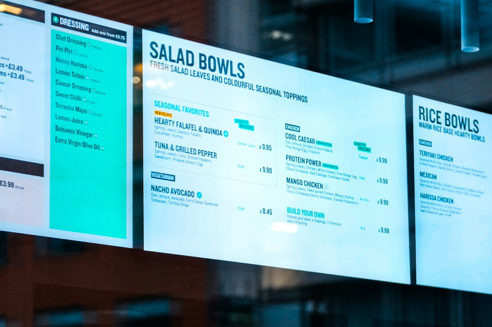
One of the most persistent operational failures in the industry is the reliance on PDF menus. From a guest perspective, a PDF is a nightmare. It requires pinching, zooming, and downloading a file to a personal device just to see the price of a starter.
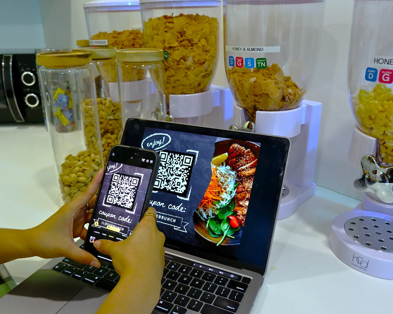
Your menu should be live, responsive text. This allows guests to browse your offerings effortlessly on any screen size. More importantly, it allows search engines to read your content. When a guest searches for a specific dish in your neighborhood, a text-based menu ensures your restaurant appears in the results. A PDF is a closed book. A responsive menu is an open invitation. If you want to improve your digital guest journey, start by making your menu readable.
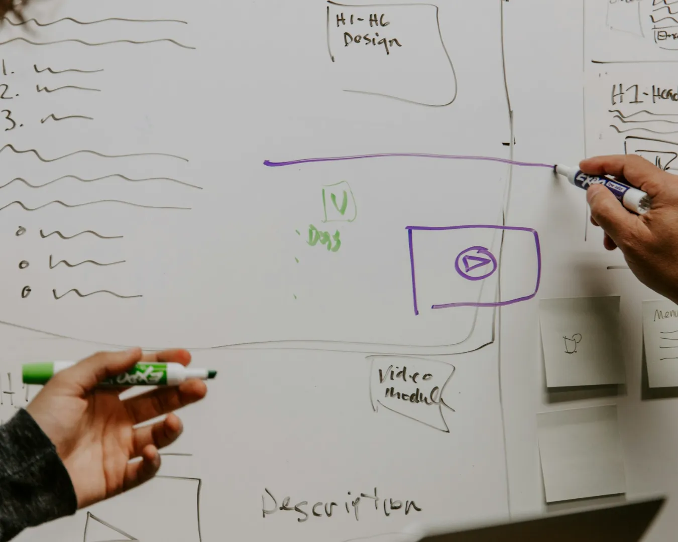
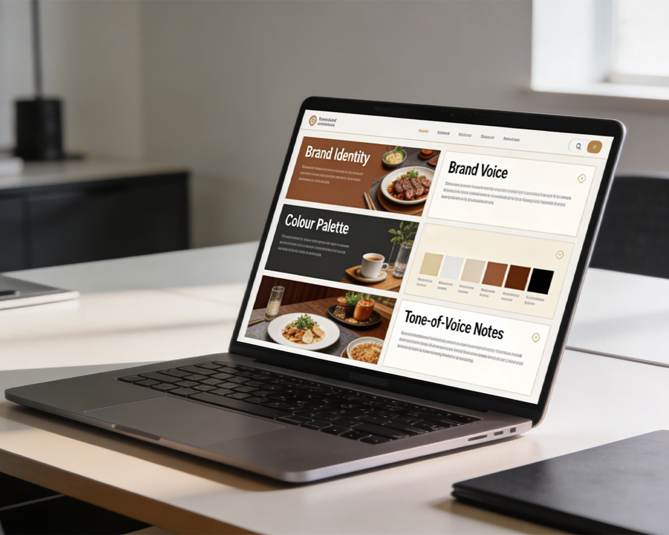
Strategy Before the First Line of Code

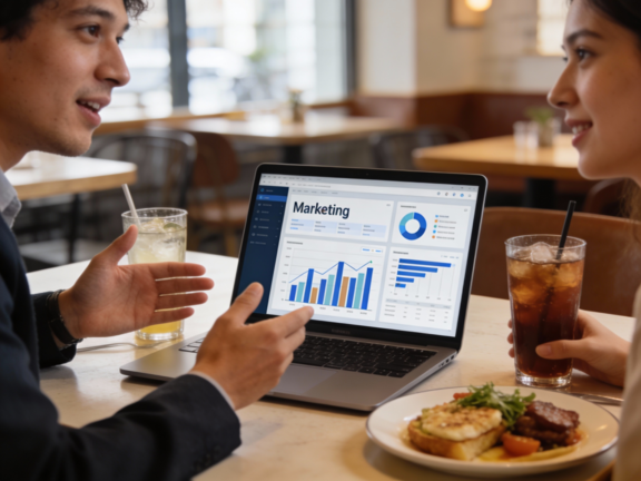
At Atelier Creations, we often see restaurants spend significant capital on “pretty” websites that do nothing for their bottom line. This happens because the design was not built on a foundation of brand strategy. A website built without strategy is just a collection of pixels.
We prioritize brand strategy and long-term consistency before we begin any technical execution. We look at your operational goals first. Are you trying to drive more weekday lunch traffic, or are you positioning yourself for high-end corporate events? Your website design must reflect these goals. We help you build a digital presence where every button and every line of copy is an extension of your brand identity. When your strategy is clear, the design becomes a powerful tool for conversion rather than a decorative expense.
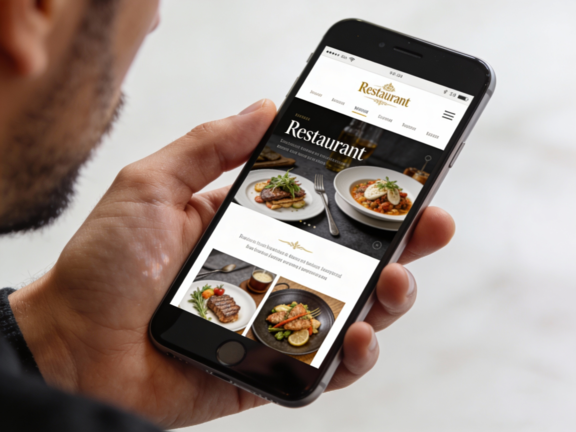
Design for the Thumb, Not the Mouse
Your guests are not using a cursor; they are using their thumbs. This requires a specific approach to layout. Your most important buttons, such as Reservation, Menu, and Call, should be within easy reach of a thumb at the bottom of the screen.
The digital guest experience should feel as smooth as the service in your dining room. This means clear fonts, high-contrast buttons, and a checkout or booking flow that requires as few steps as possible. If your booking widget takes more than three steps to complete, you are asking too much of a busy person. Simplify the path. The easier it is to book, the more bookings you will receive.
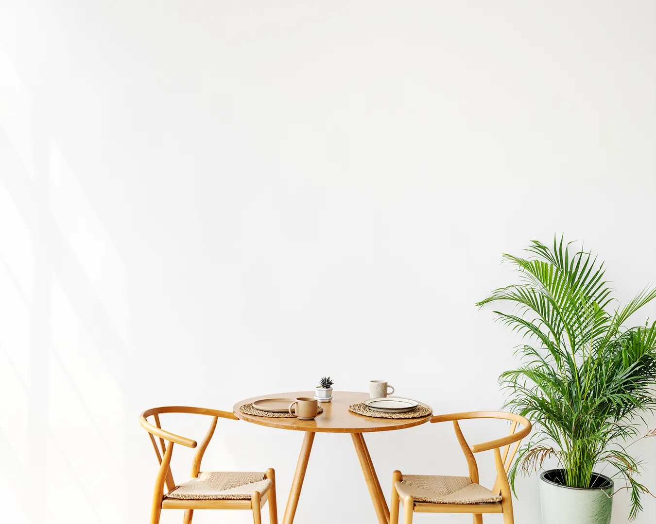
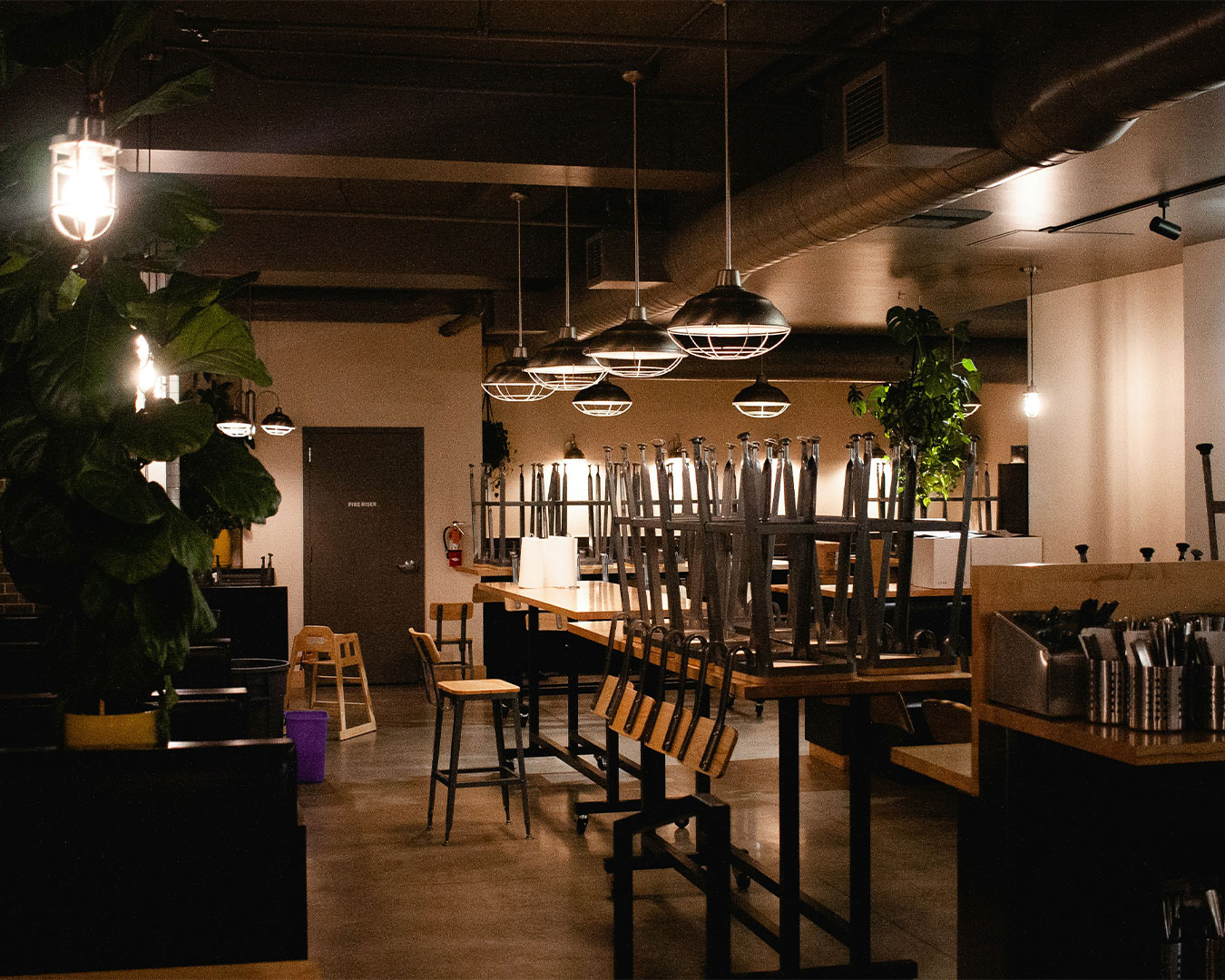
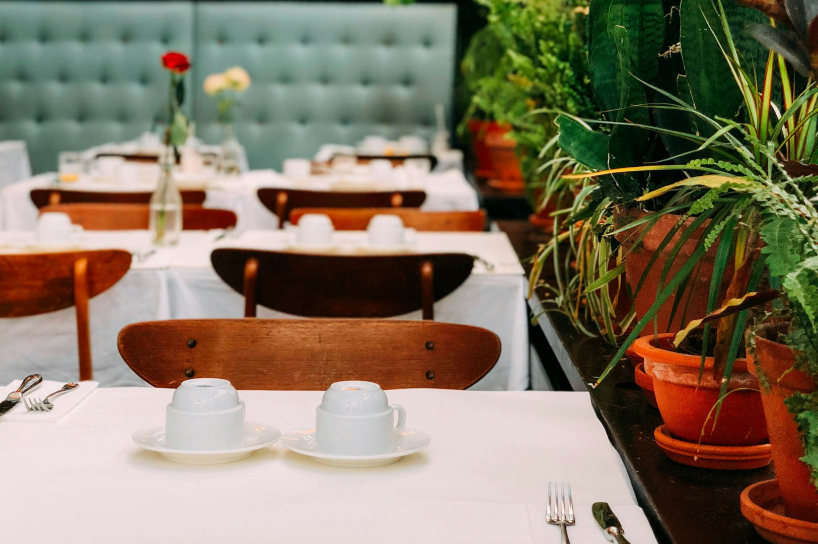
Ensure Your Digital and Physical Reality Match
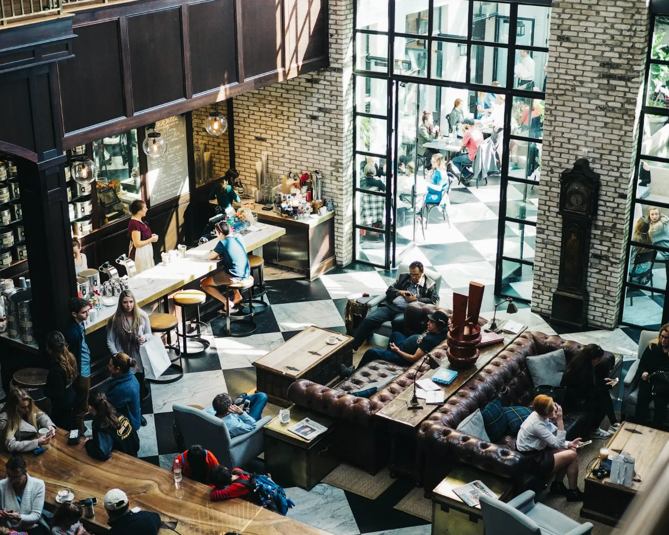
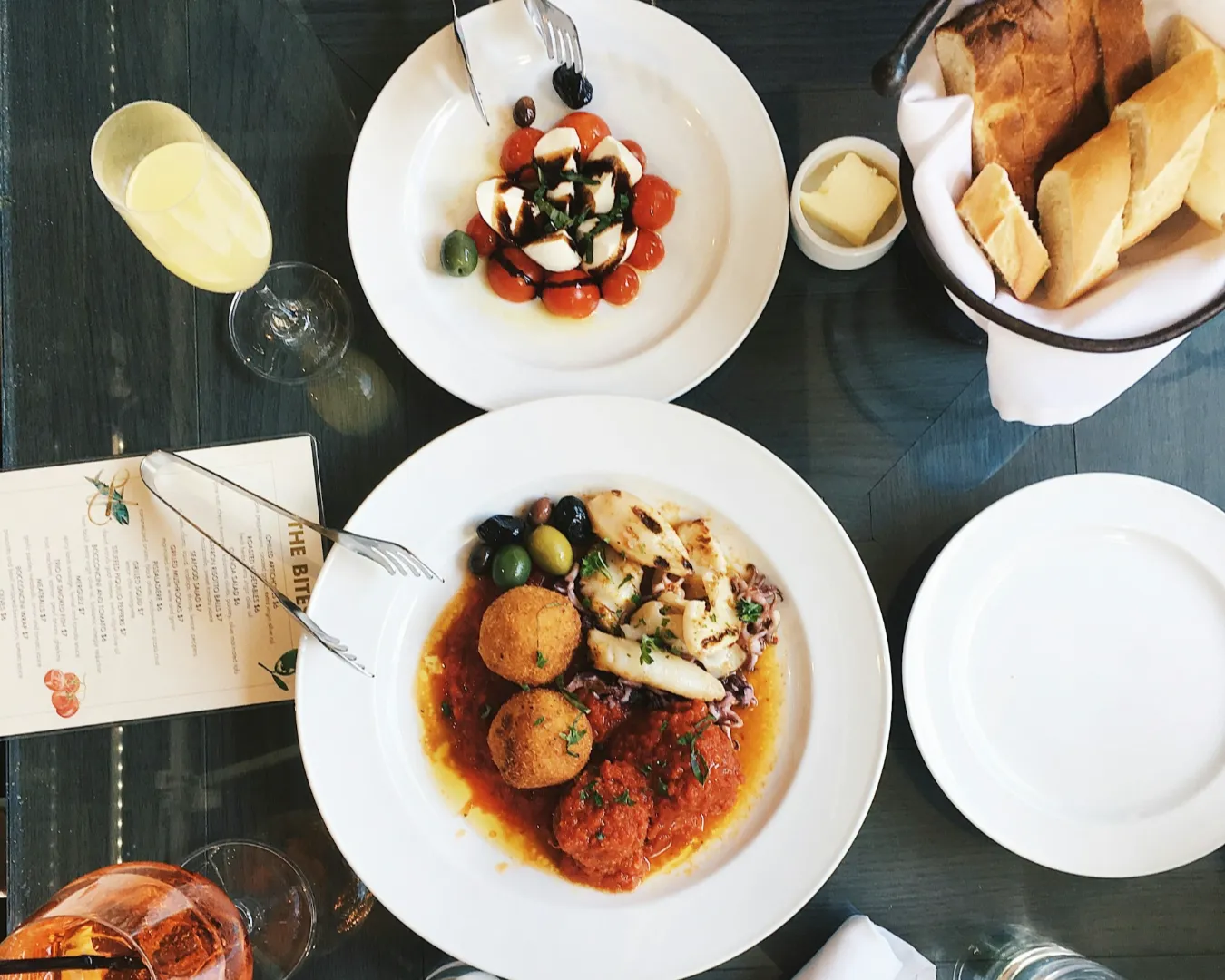
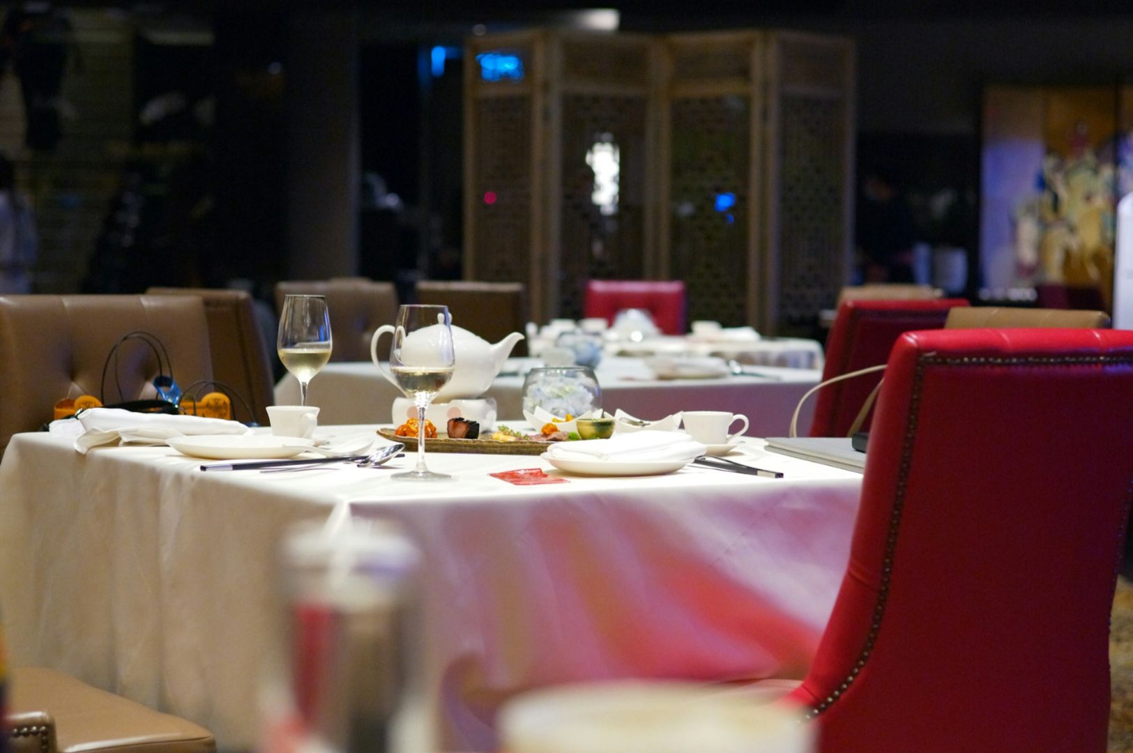
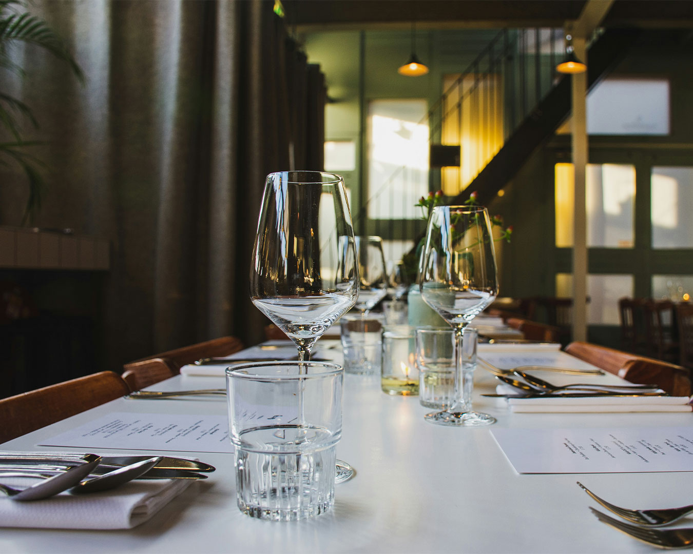
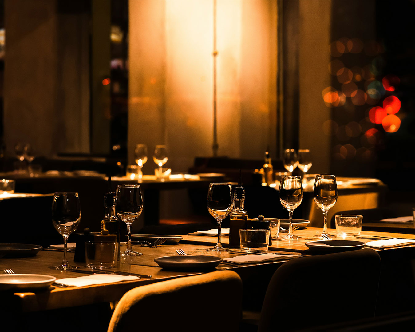
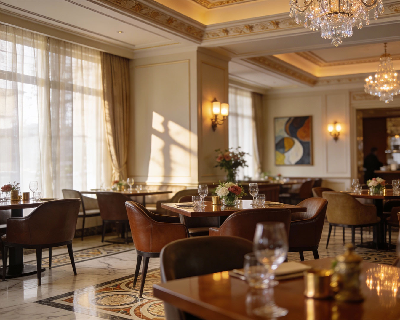
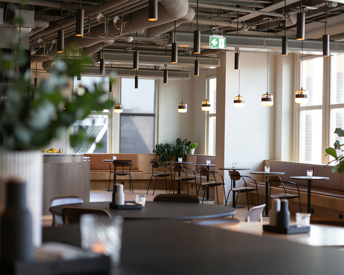
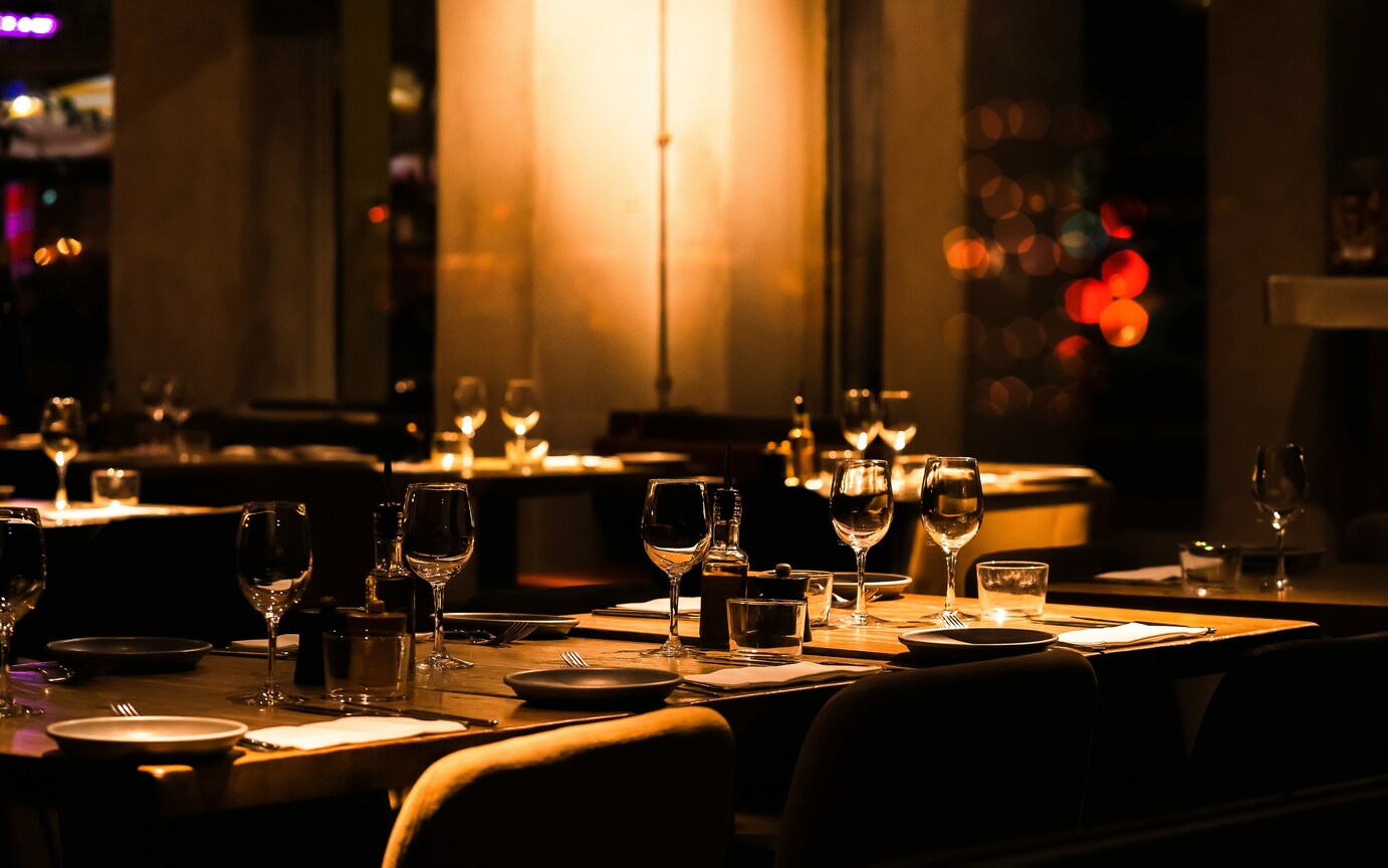
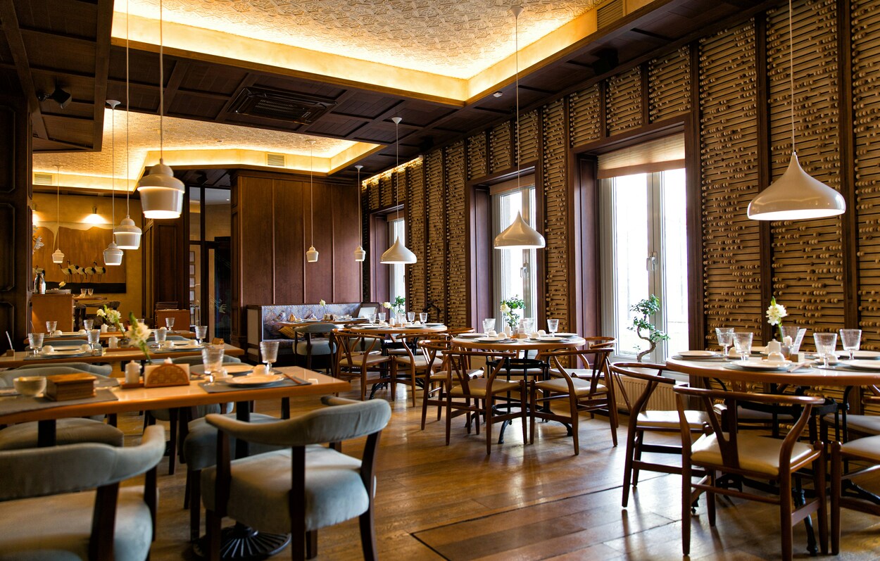
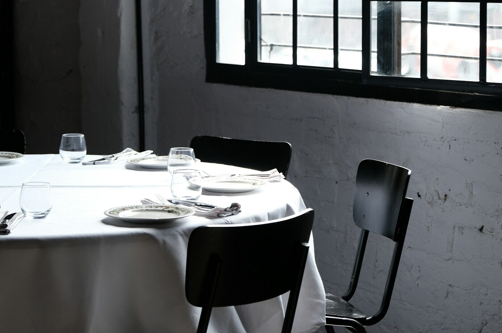
Consistency is the bedrock of trust. If your website feels like a Michelin-starred establishment but your actual restaurant is a casual bistro, you are setting yourself up for a negative review. Your website should be an honest reflection of the experience you provide.
The photography, the tone of voice, and the overall “vibe” of your site must align with your physical space. When a guest walks through your door after visiting your website, they should feel like they are in the right place. This alignment is what transforms a one-time visitor into a regular.