You can spend months finding the best ingredients, tweaking your recipes, and training your kitchen staff to get every plate perfect. But if you hand your guests a messy, hard-to-read menu that looks like a basic spreadsheet, you are losing money. A menu is not just a price list. It is your absolute best tool for making sales. The fonts you pick, where you put your dishes, and how you organize the page change everything. It controls what your guests look at, how they feel about your prices, and how much they end up spending by the time they ask for the bill.
It’s the kind of thing we think about a lot at Atelier Creations, working with restaurants that have gotten the food right but never quite gotten around to the menu itself.
Choosing Fonts That Make Reading Effortless
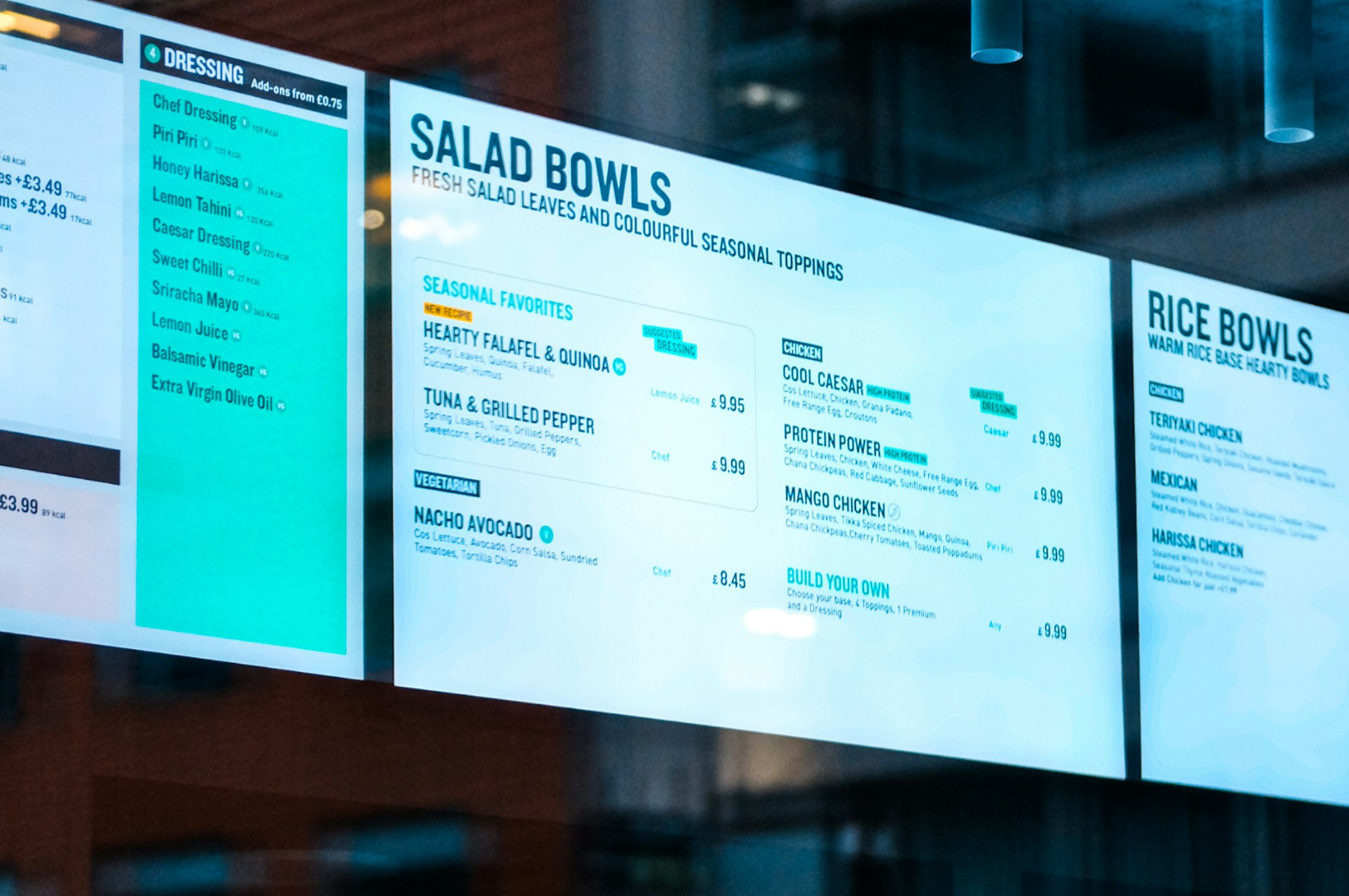
The font you choose tells your guests what kind of restaurant you are before they even read about the food. If your text is too small, uses a weird style, or is hard to read in a dimly lit dining room, your guests get frustrated right away.
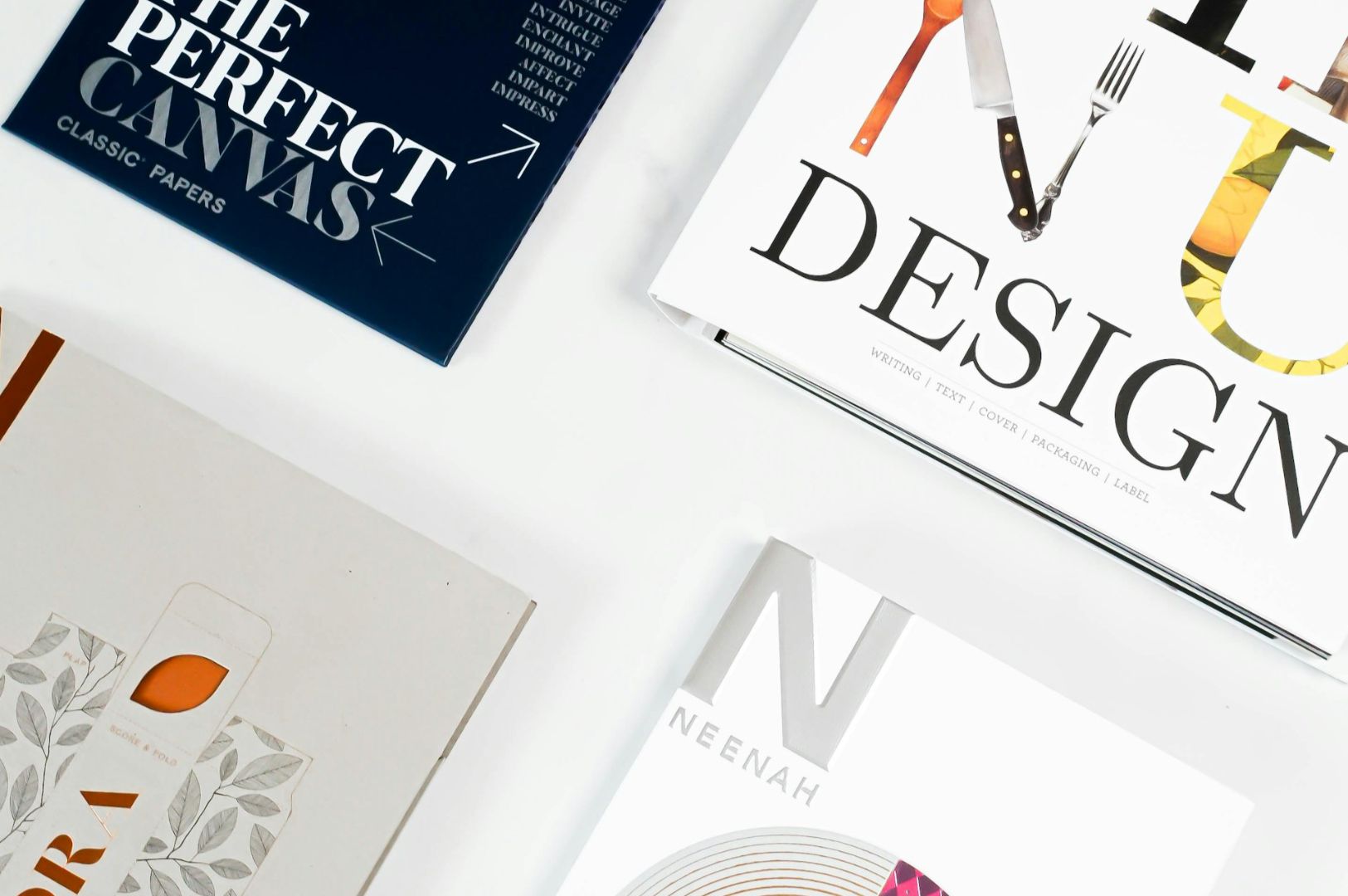
Your font choice also sets the mood and shows how much your food is worth. A fun, bold font is perfect for a burger joint, but it will make a high-end sushi bar look cheap. The lettering needs to look clean and have the right spacing so people can read it easily without straining their eyes. When your menu looks clean and professional, it tells your guests that your kitchen operates the exact same way.
Arranging the Page to Guide the Eye to Key Dishes
Where you place an item on the page changes how well it sells. People’s eyes naturally follow a specific pattern when they look at a menu, and you want your most profitable dishes to be right in their line of sight.
Leaving dish placement to random luck is a massive missed opportunity. Good menu design uses simple tricks to guide your guests:
- The Best Spot: People almost always look at the top-right corner of a two-page menu first. Put your signature dishes or your best-selling items right there where they cannot be missed.
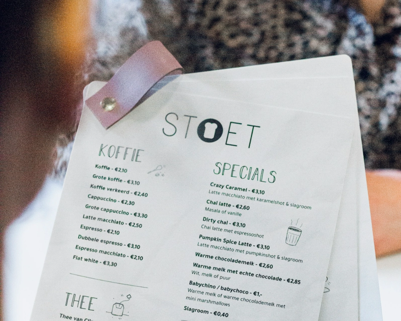
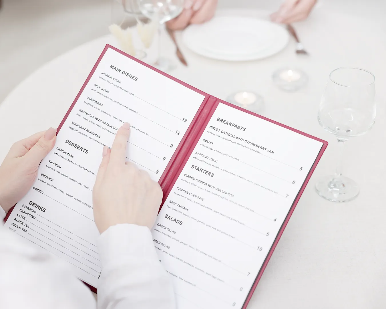
- Hiding the Prices: Do not list your prices in a straight column on the right side of the page with dotted lines leading to them. This makes people shop purely by price. Instead, tuck the price quietly at the very end of the dish description using the same font, and drop the dollar sign ($) to take away the psychological sting of spending.
- The Power of Less: Keep your sections small, around seven to ten items at most. If you give people thirty different pizza options, they get overwhelmed and just default to the cheapest or most basic thing on the list.
Ordering Sections to Build a Complete Meal
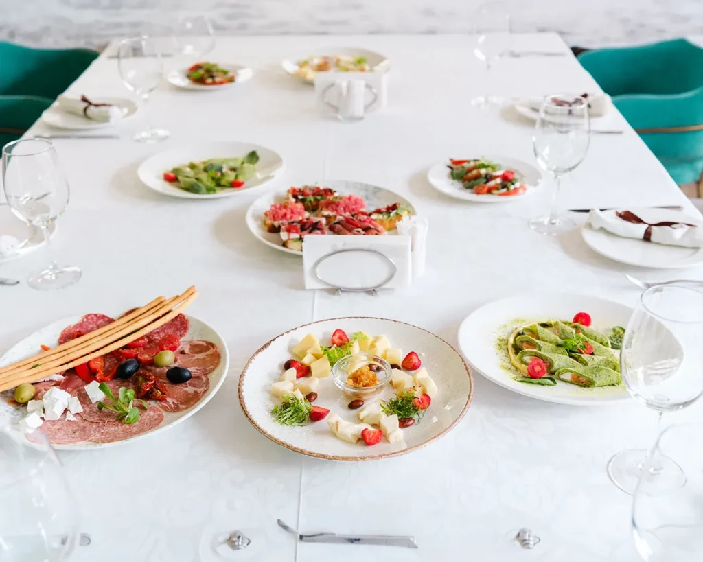
The way you order your sections should match how people actually eat. Your menu should act like a simple roadmap that guides a table from light starters down to heavy main courses and sides.
Group your food logically: small bites, starters, mains, and side dishes. When the menu flows naturally, it does the selling for your staff. It encourages guests to order a full meal instead of just getting a single main dish. By giving your side dishes and appetizers a little bit of breathing room on the page with clean borders, you remind diners to round out their order without your servers having to push for an awkward upsell.
Matching Your Print Menu with Your Online Design
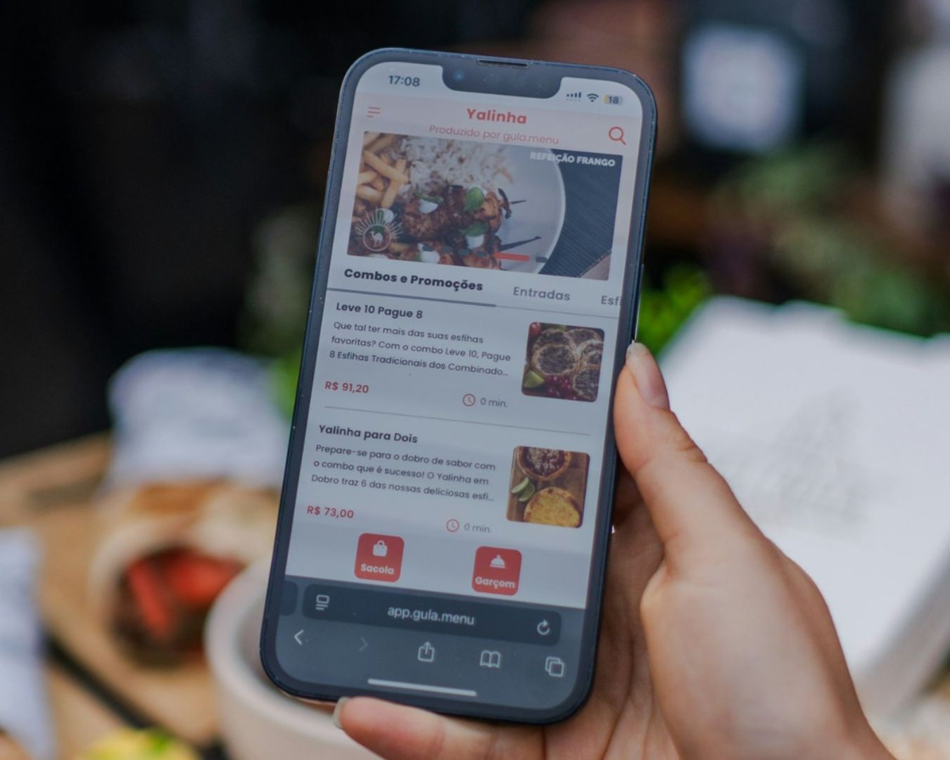
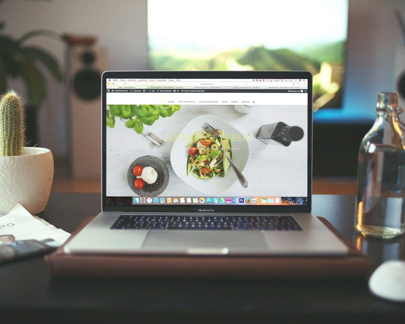
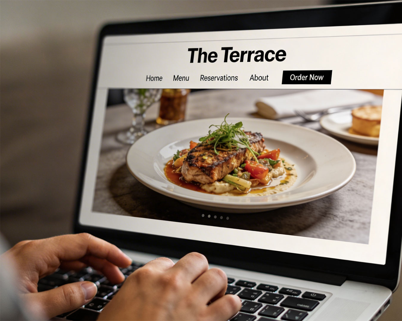
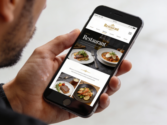
The style of your menu cannot stop at your front door. Most people look at your food online before they ever walk through your doors, so your digital menu needs to look just as good as your physical one.
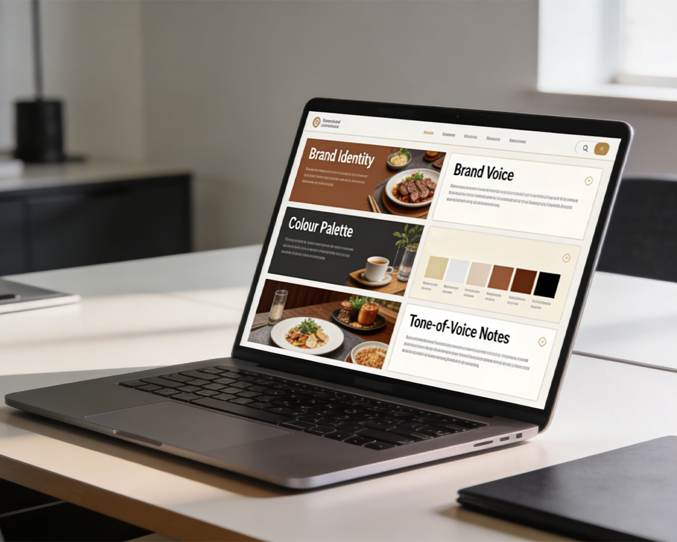
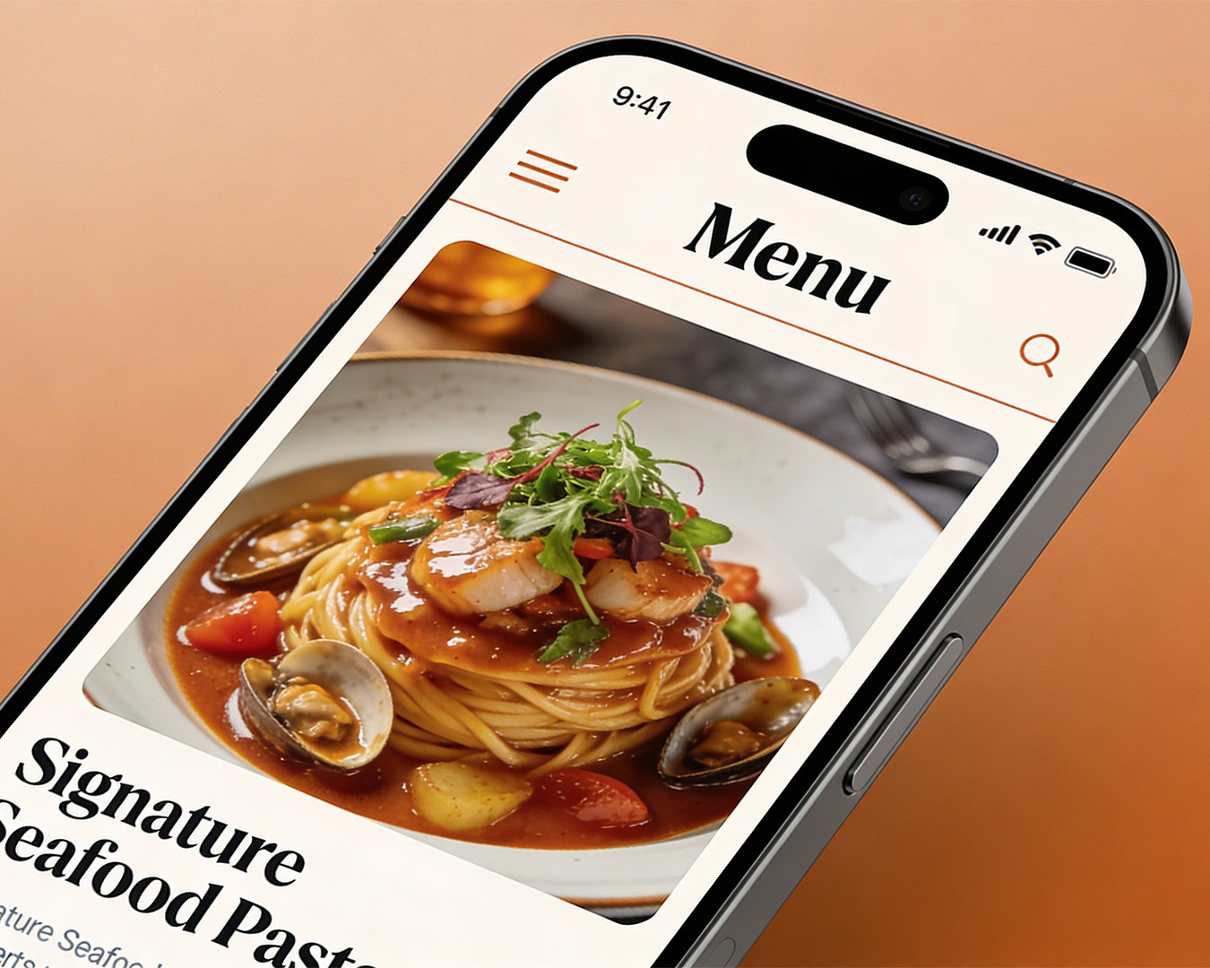
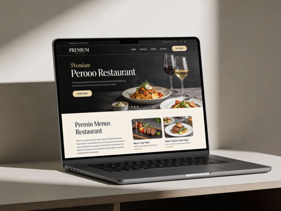
If your paper menu uses beautiful lettering and a clean, spacious look, your website menu shouldn’t be a messy, unoptimized text block or a slow-loading file that people have to pinch and zoom to read on their phones. Make sure your colors, fonts, and layouts look consistent whether someone is reading it at your table or on a smartphone. When your online and offline menus look like they belong to the same restaurant, you build trust with your guests before they even sit down.
Fixing Your Menu Design for Better Sales
Take a look at your menu before your doors open tonight. Is the text clean, easy to read, and a good reflection of your food, or is the design forcing your guests to hunt for the cheapest price?
If your menu isn’t actively helping you make sales, it is time for an update. Atelier Creations help restaurants look at their dish placement, clean up their fonts, and build high-performing menus that protect your profits while making the dining experience better for your guests. Let us review your menu design together to get your sales moving in the right direction.