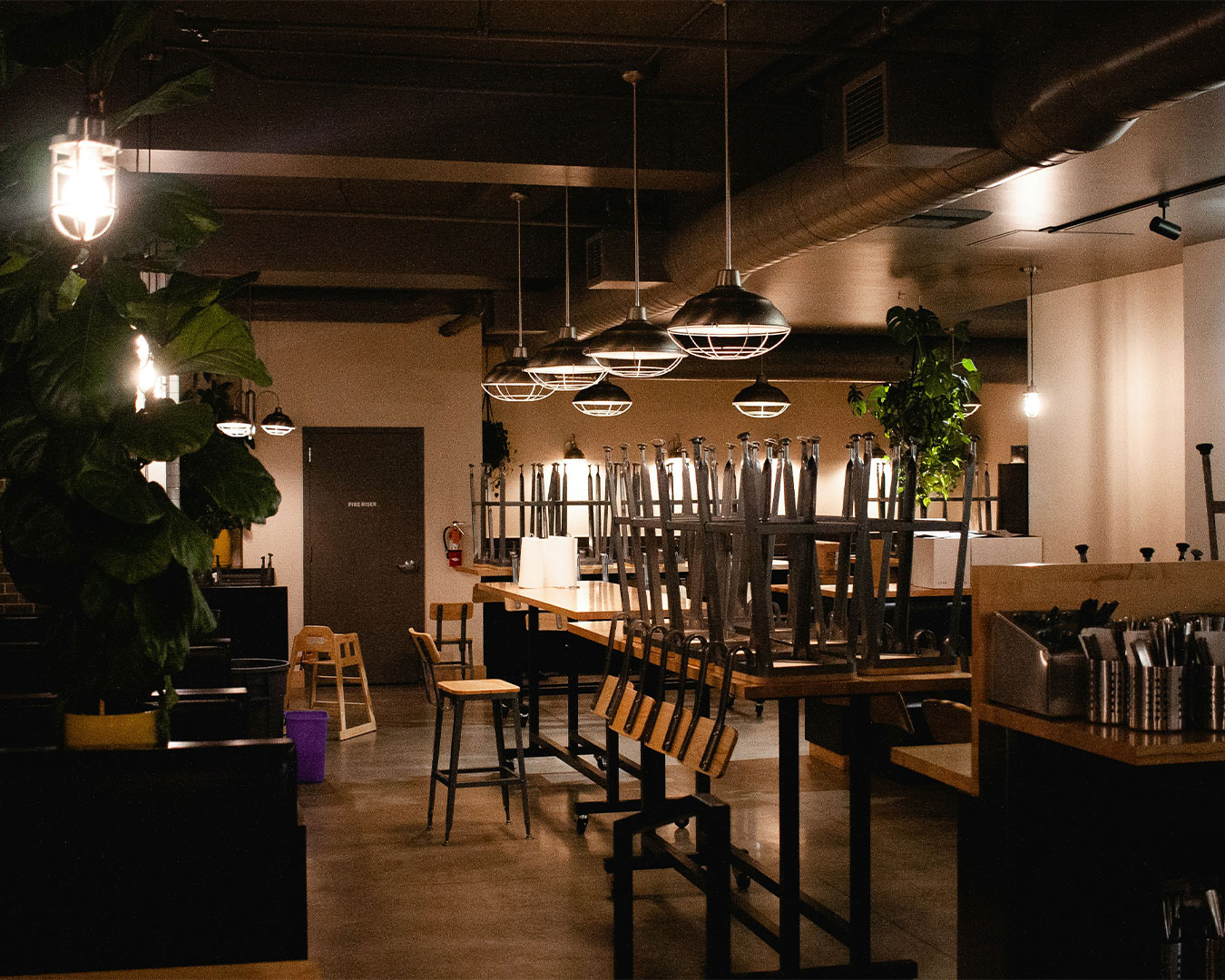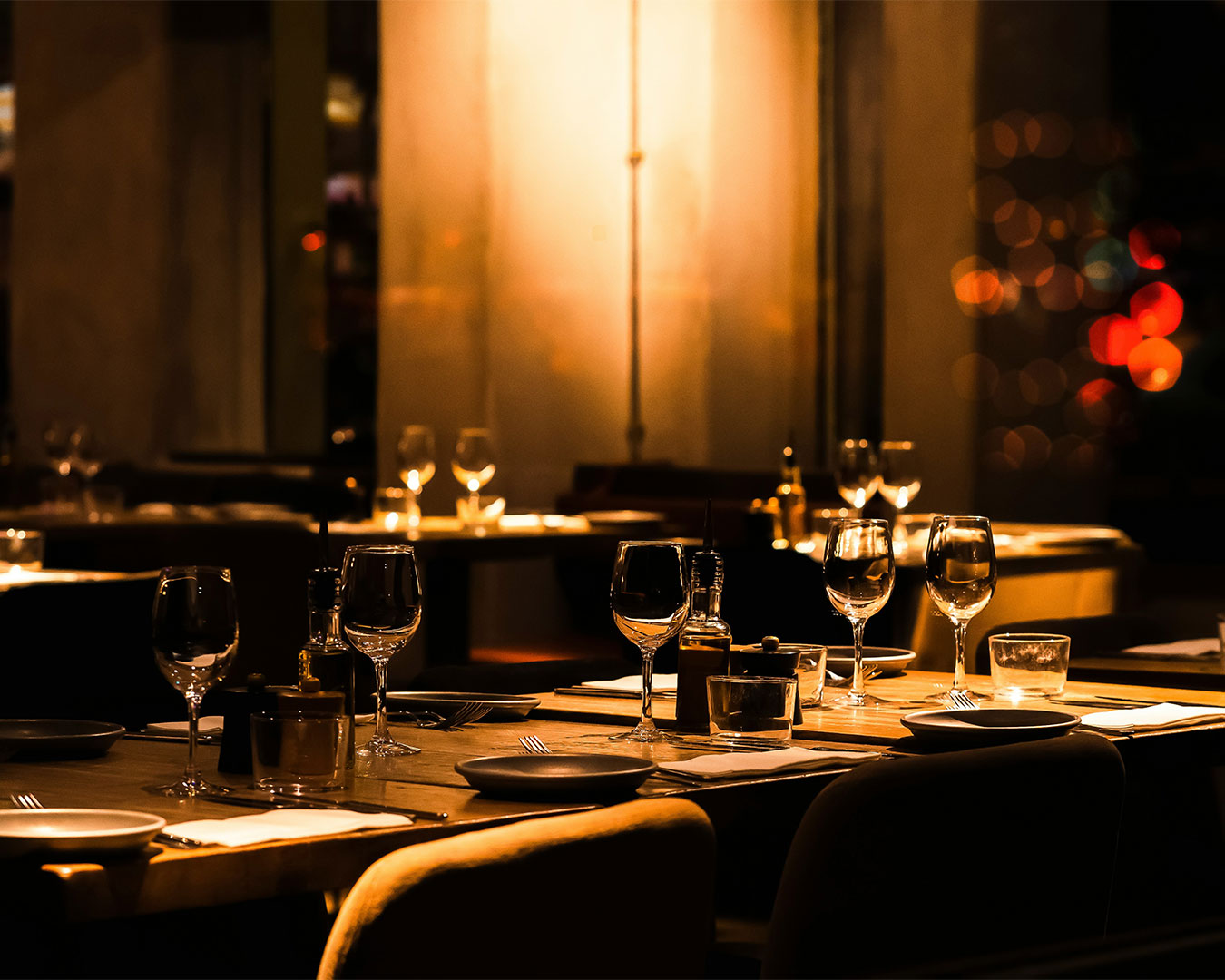
You are sitting in your dining room during the 3 PM lull. You look at your menu, your business card, and your Instagram page. They all feature your logo, yet they feel like they belong to three different businesses. The font on the menu is too small for the dim lighting. The logo on the window is peeling. The colors on the screen do not match the upholstery of your chairs.
Most owners believe that a visual identity for restaurants is just a logo and a color palette. They treat it as a one-time purchase from a designer who has never stepped into a commercial kitchen. This is a mistake. A visual identity is an operational tool. If it does not help your staff sell more wine or help a customer find your entrance in a crowded mall, it is failing.
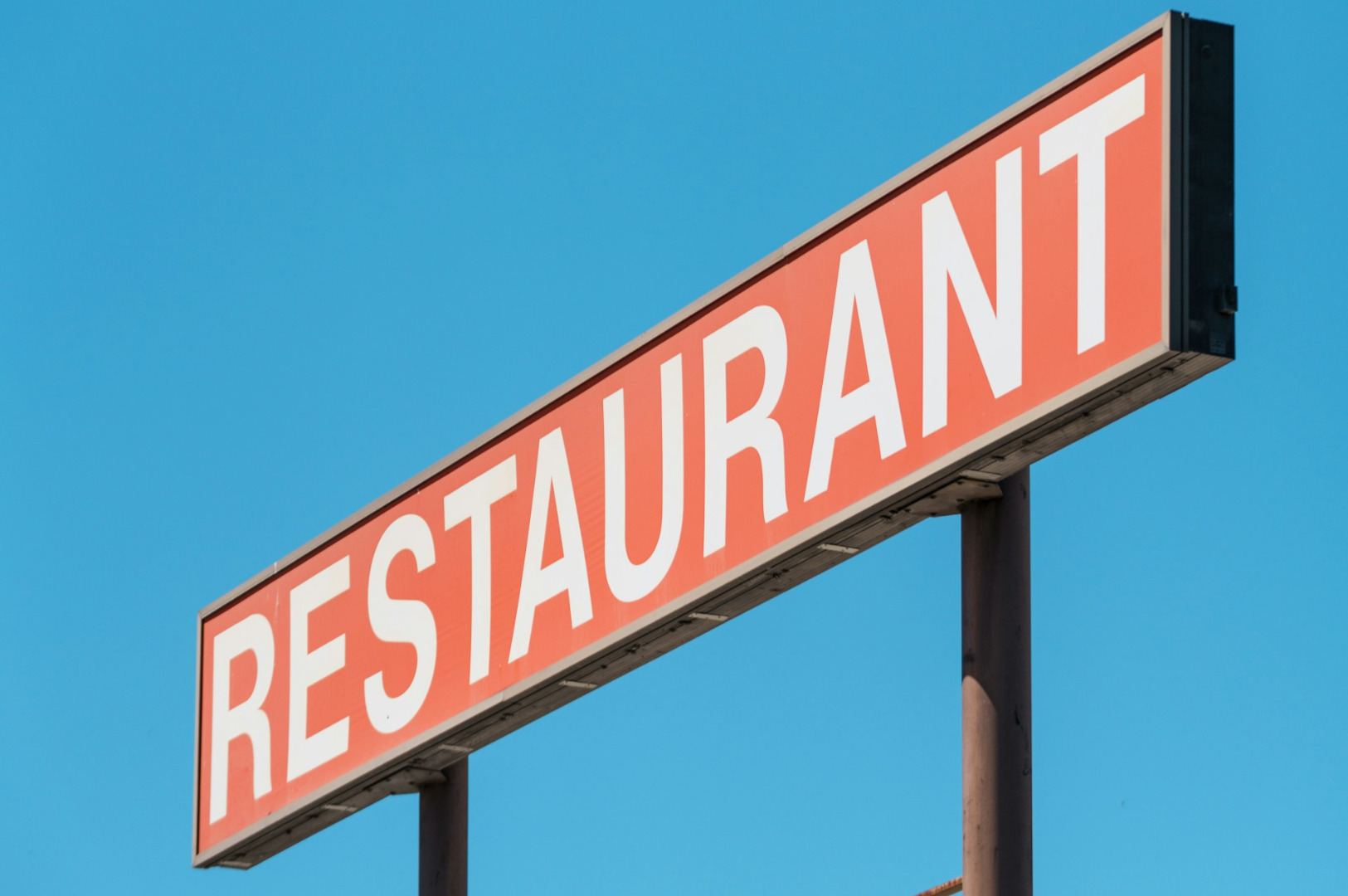
The Legibility Trap
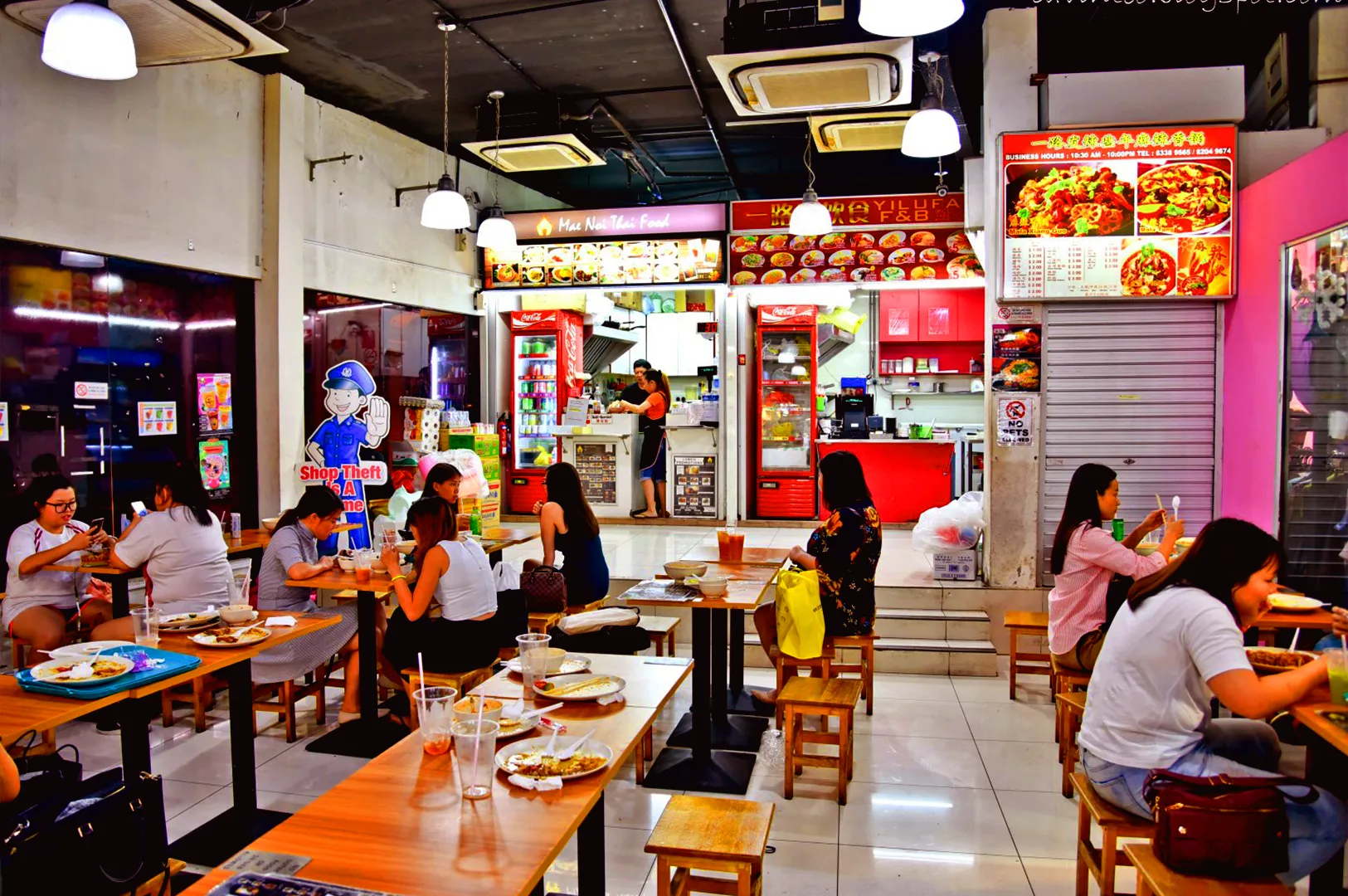
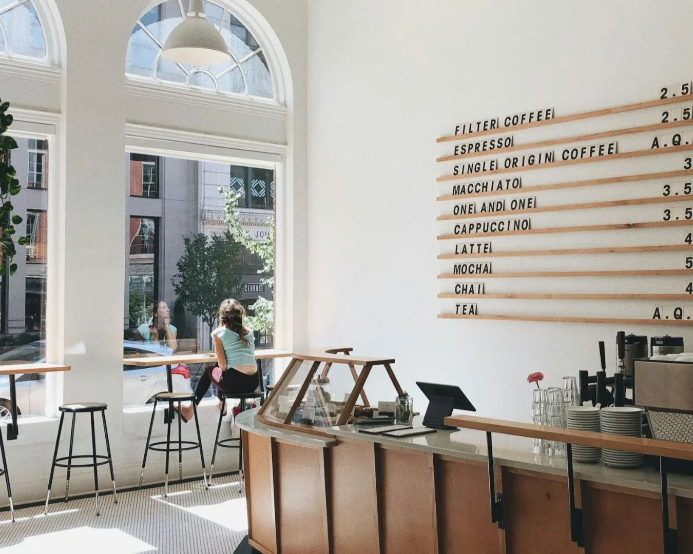
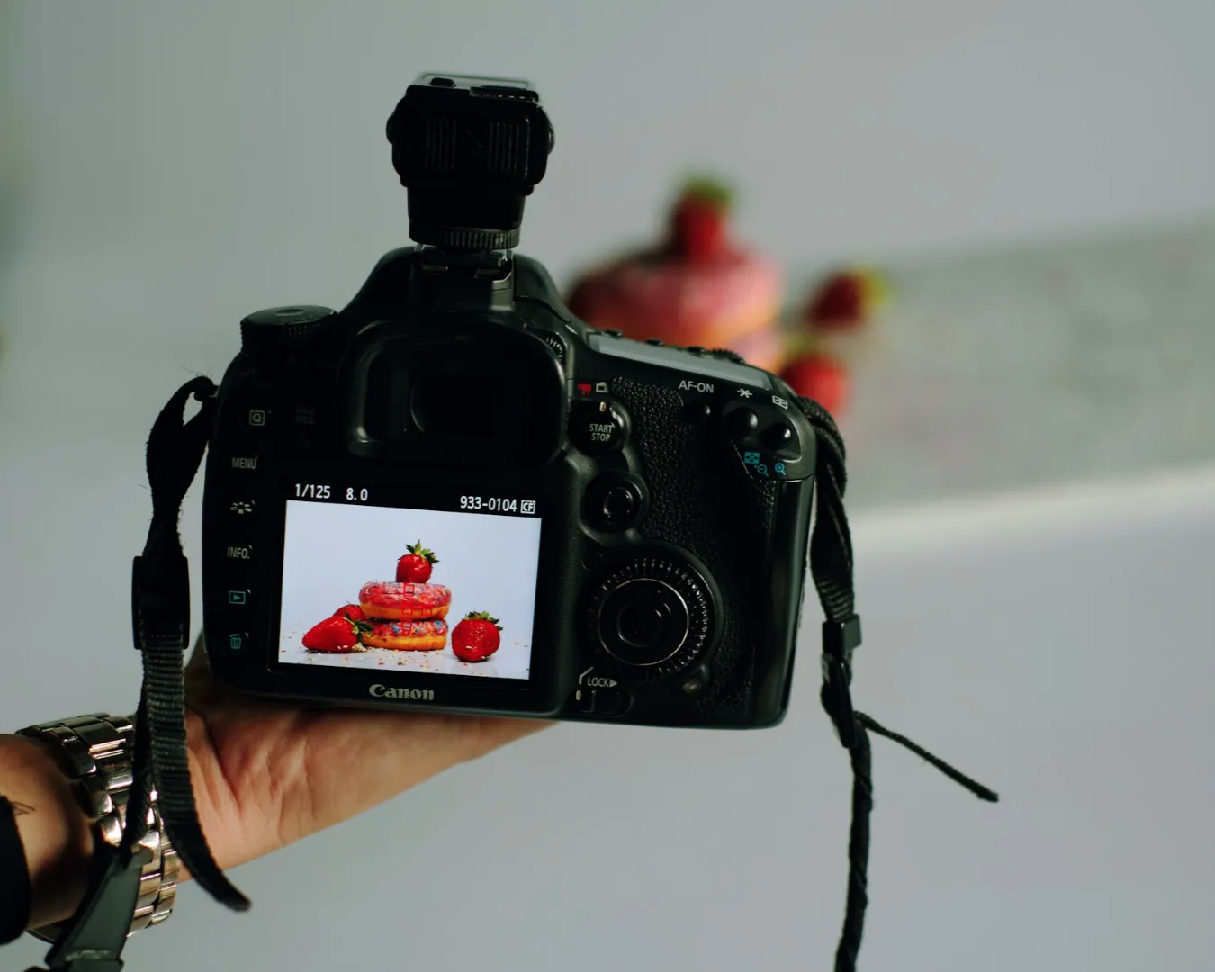
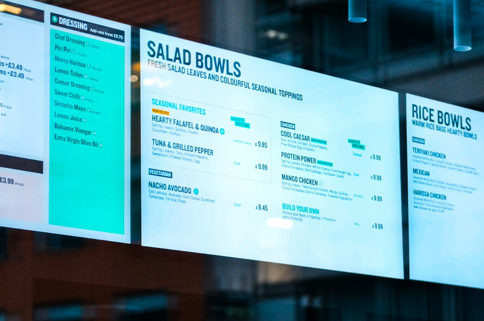
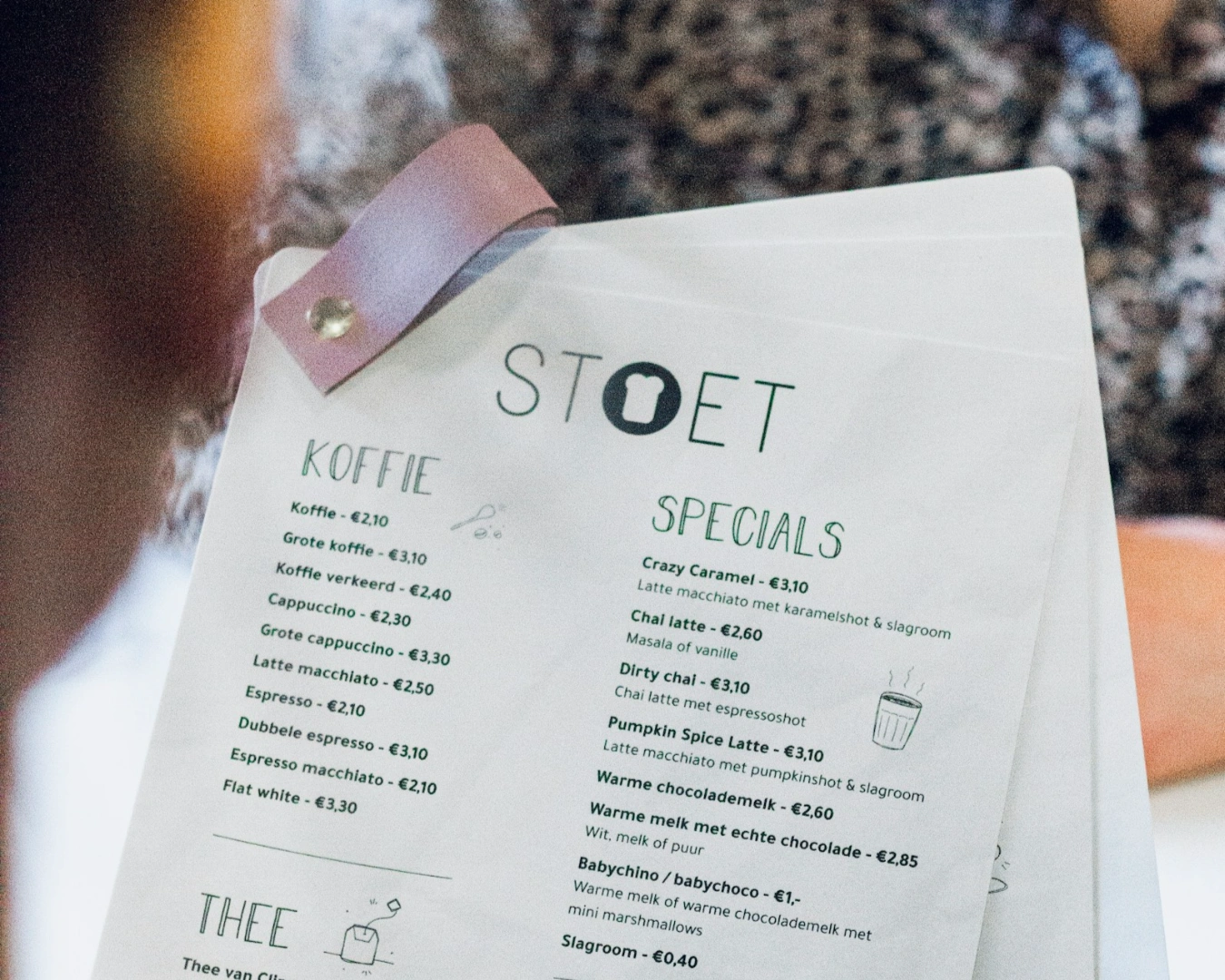
The most common error in visual identity for restaurants is choosing style over function. We see it constantly in Singapore. An owner falls in love with a delicate, cursive font because it looks elegant on a large desktop monitor.
Inside the restaurant, it is a disaster. Your target demographic cannot read the appetizers in the evening light. If a customer has to turn on their phone flashlight to read your prices, you have already lost the “premium” feel you were chasing. Typography must be stress-tested against your actual environment. Good design accounts for shadows, fingerprints on laminated paper, and the three seconds a passerby spends looking at your storefront.
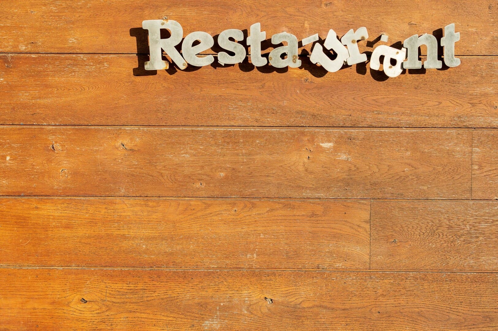
The Logo is Not the Brand
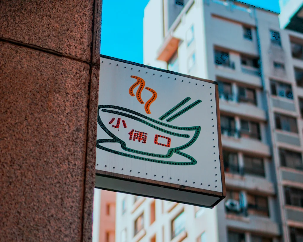
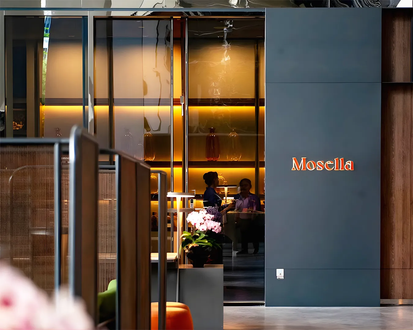
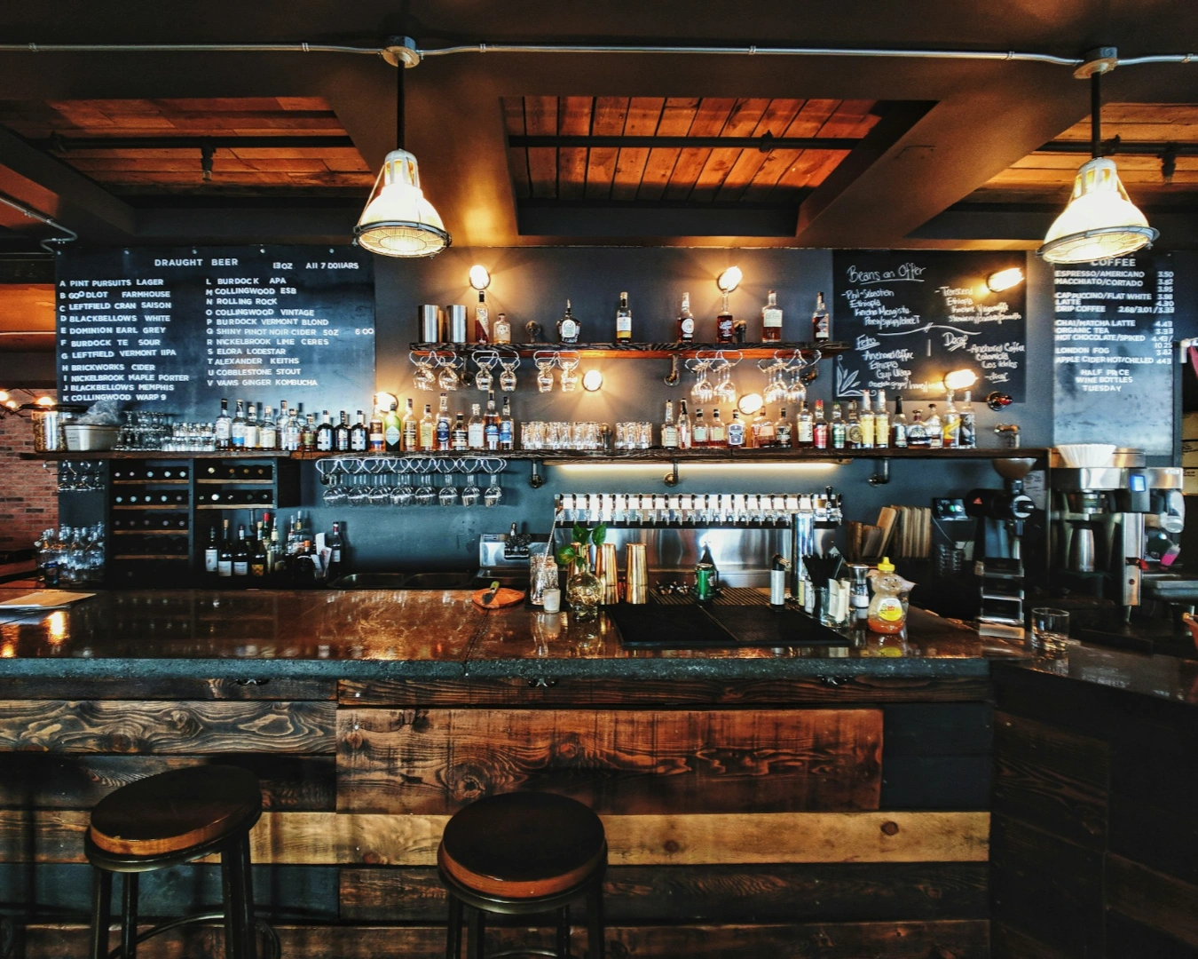
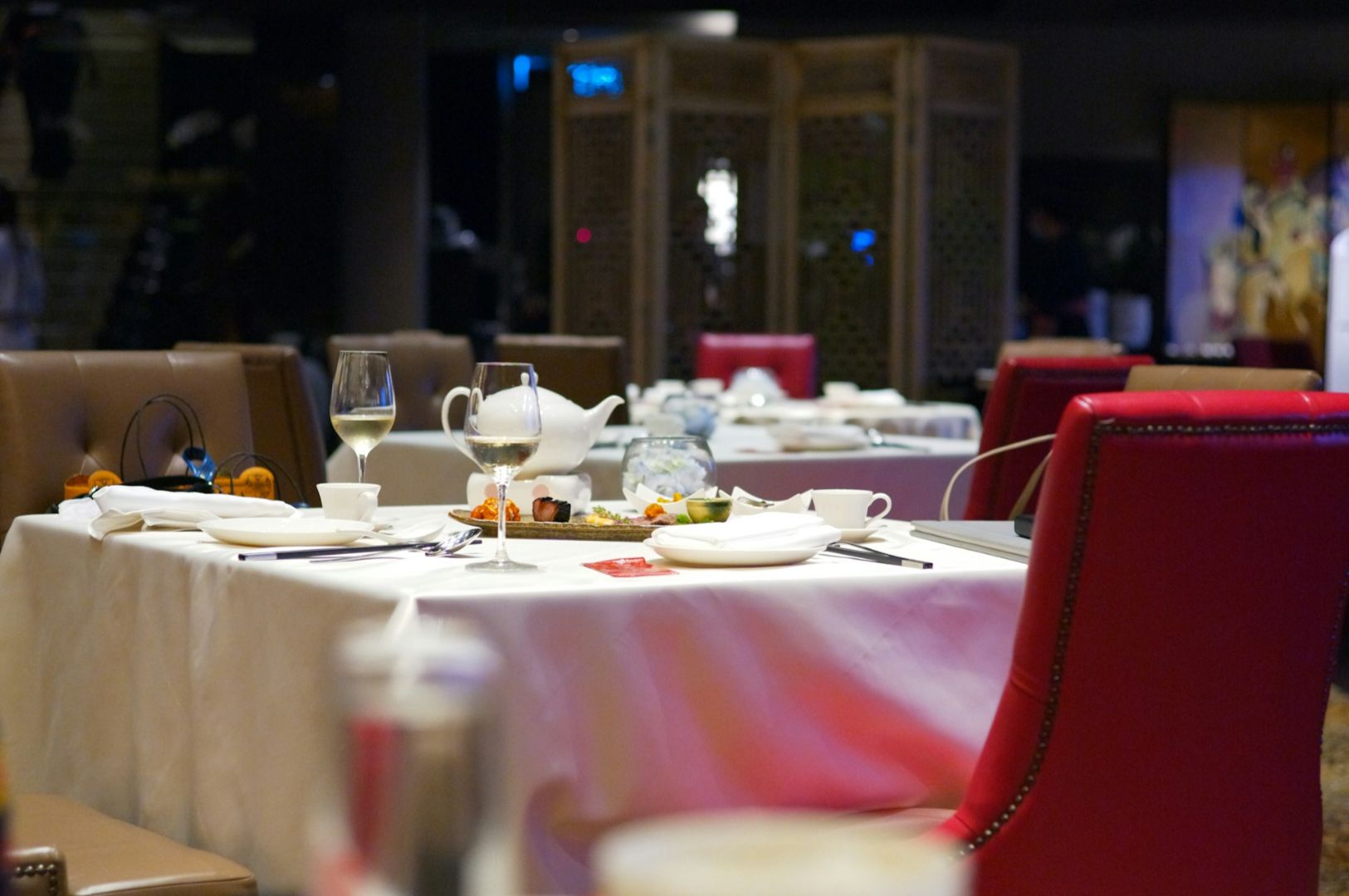
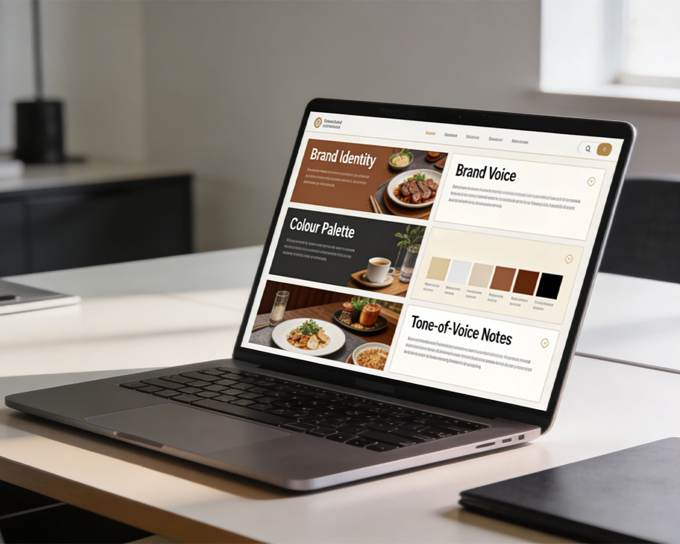
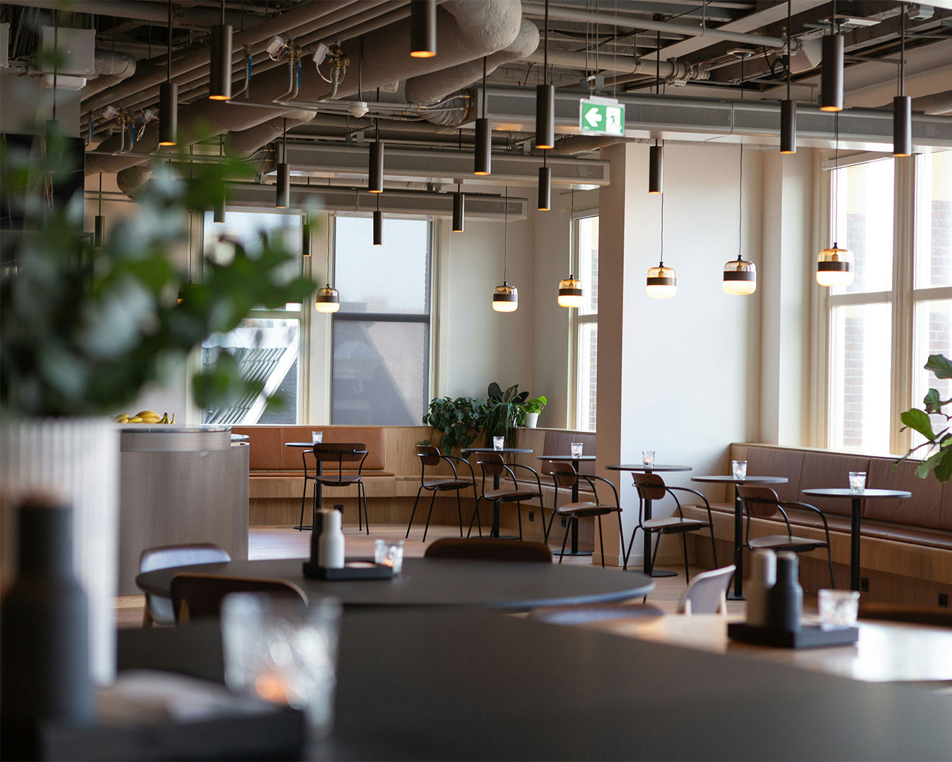
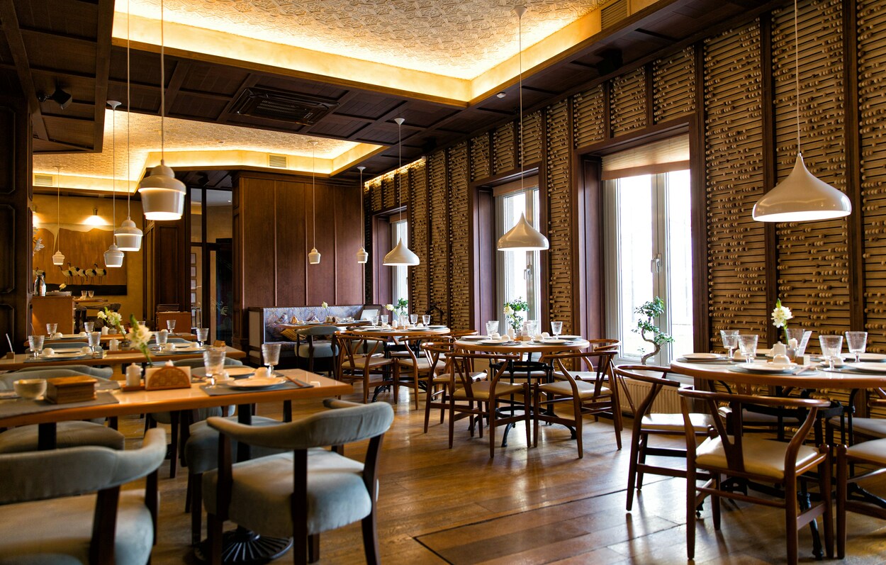
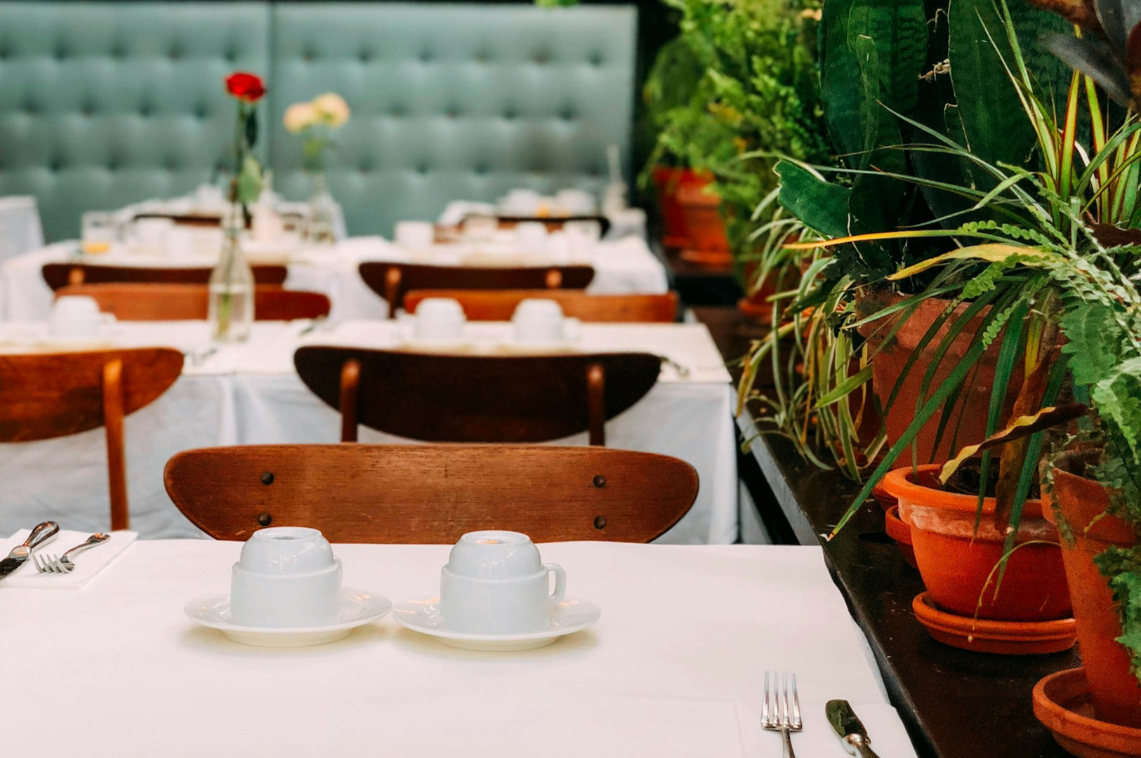
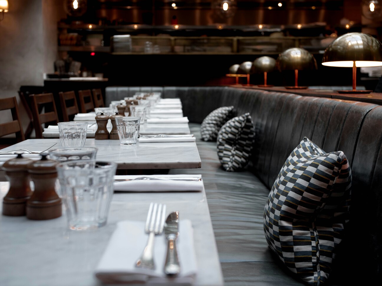
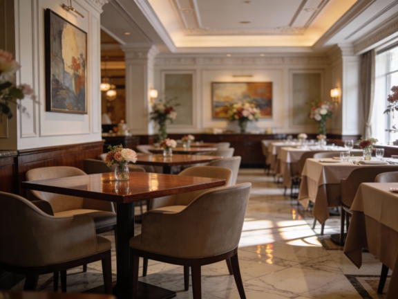
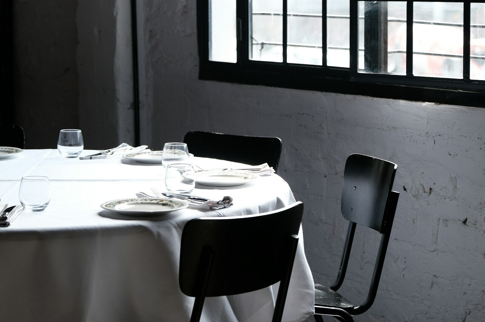
A logo is a signature, not the whole letter. Many owners over-invest in a complex Singapore restaurant logo design while neglecting the rest of the visual language. Your brand is actually communicated through the secondary elements: the weight of your cutlery, the texture of your menu paper, and the way your staff is groomed.
If your logo says “fine dining” but your napkins are thin and scratchy, the visual identity is broken. Consistency is what builds recognition. You do not need a logo on every plate. You need a cohesive look that makes your space feel intentional. When every touchpoint is aligned, the customer subconsciously trusts the kitchen more.
Digital Distortion
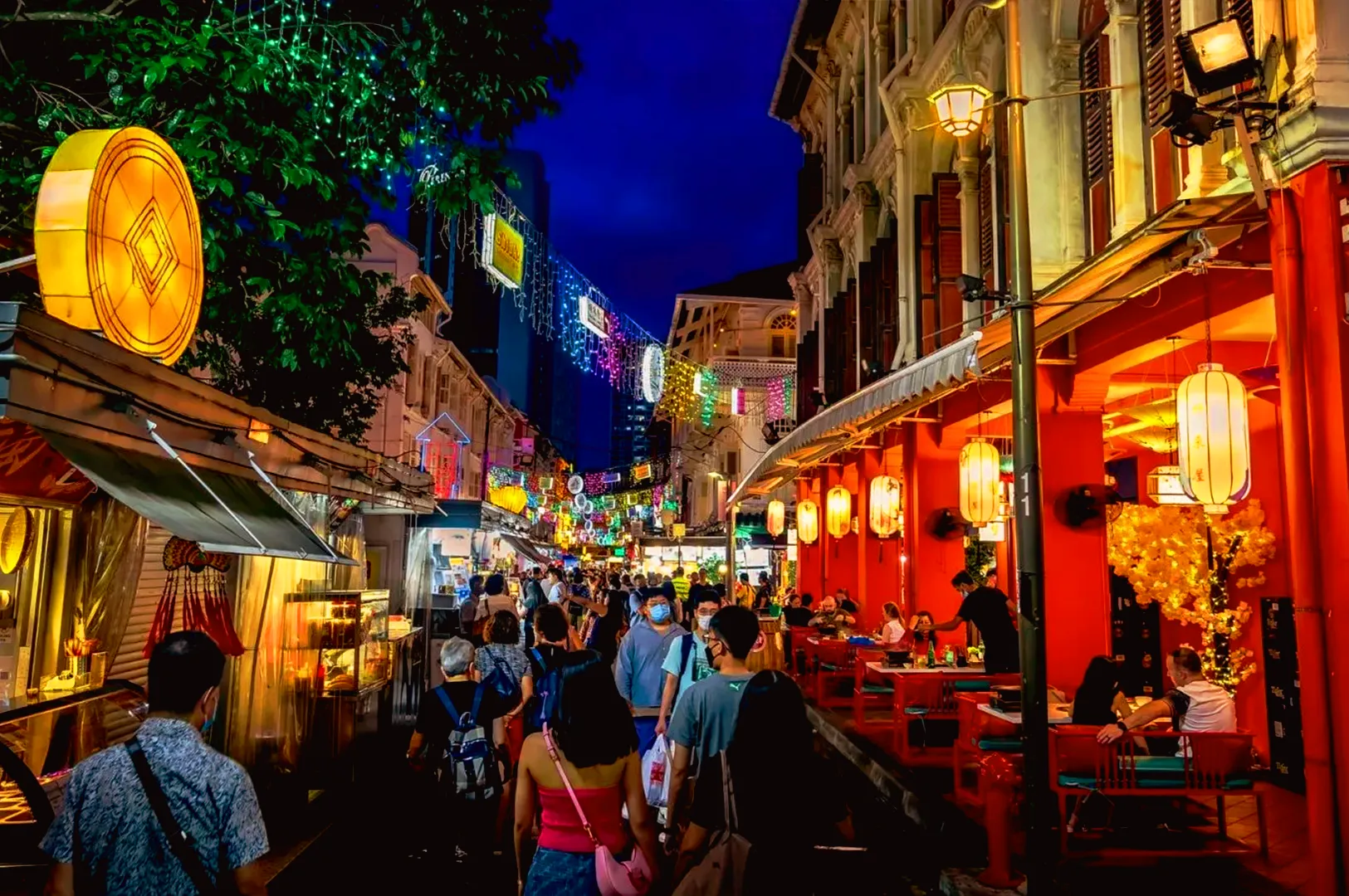
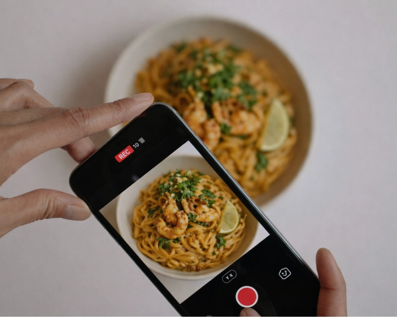
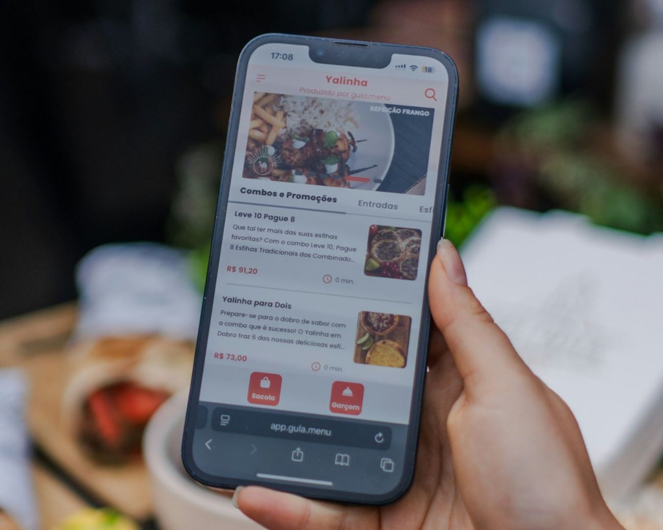
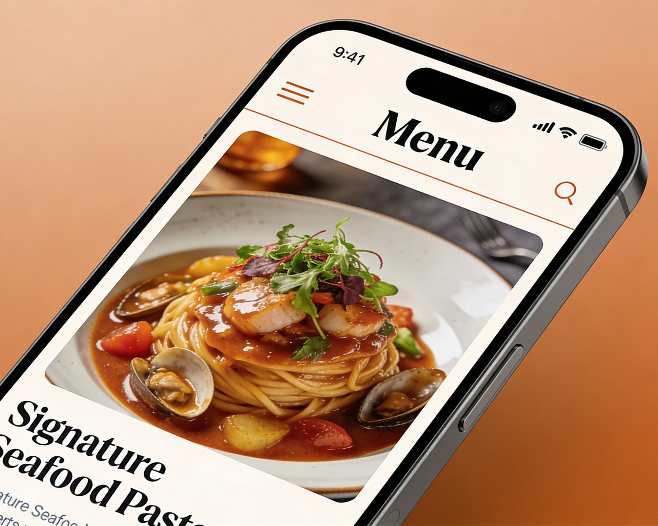
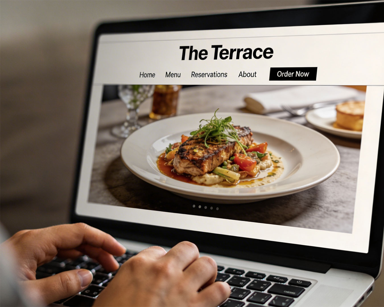
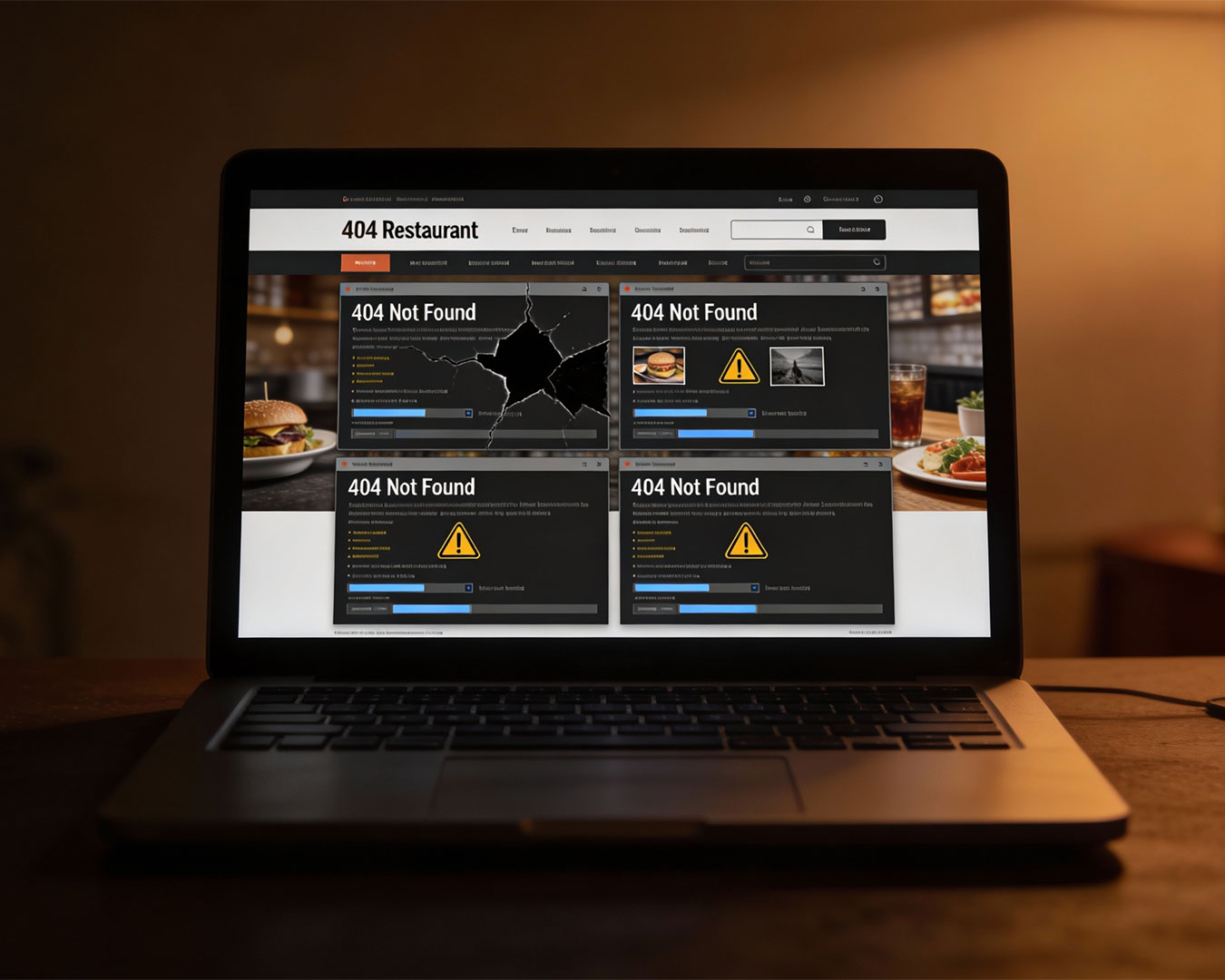
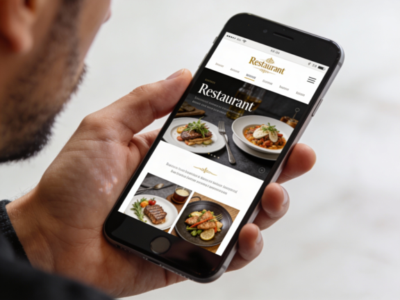
Your visual identity must survive the smartphone. Most customers will meet your brand on a third-party delivery app or a small Instagram grid.
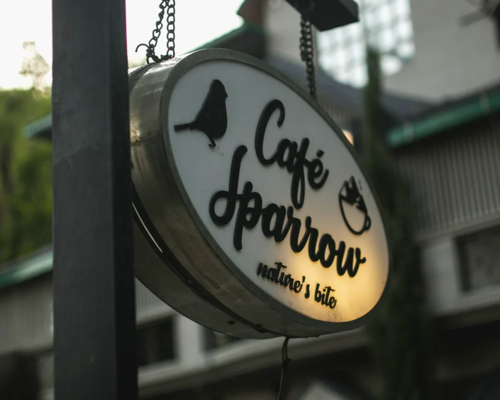
A common pitfall in brand consistency in F&B is using a logo that becomes an unreadable blob when shrunk to the size of a profile picture. Your identity needs to be modular. It should be as effective on a giant outdoor lightbox as it is on a tiny sticker used to seal a delivery bag. If your visual assets are not optimized for the digital “path to purchase,” you are invisible to the modern diner.
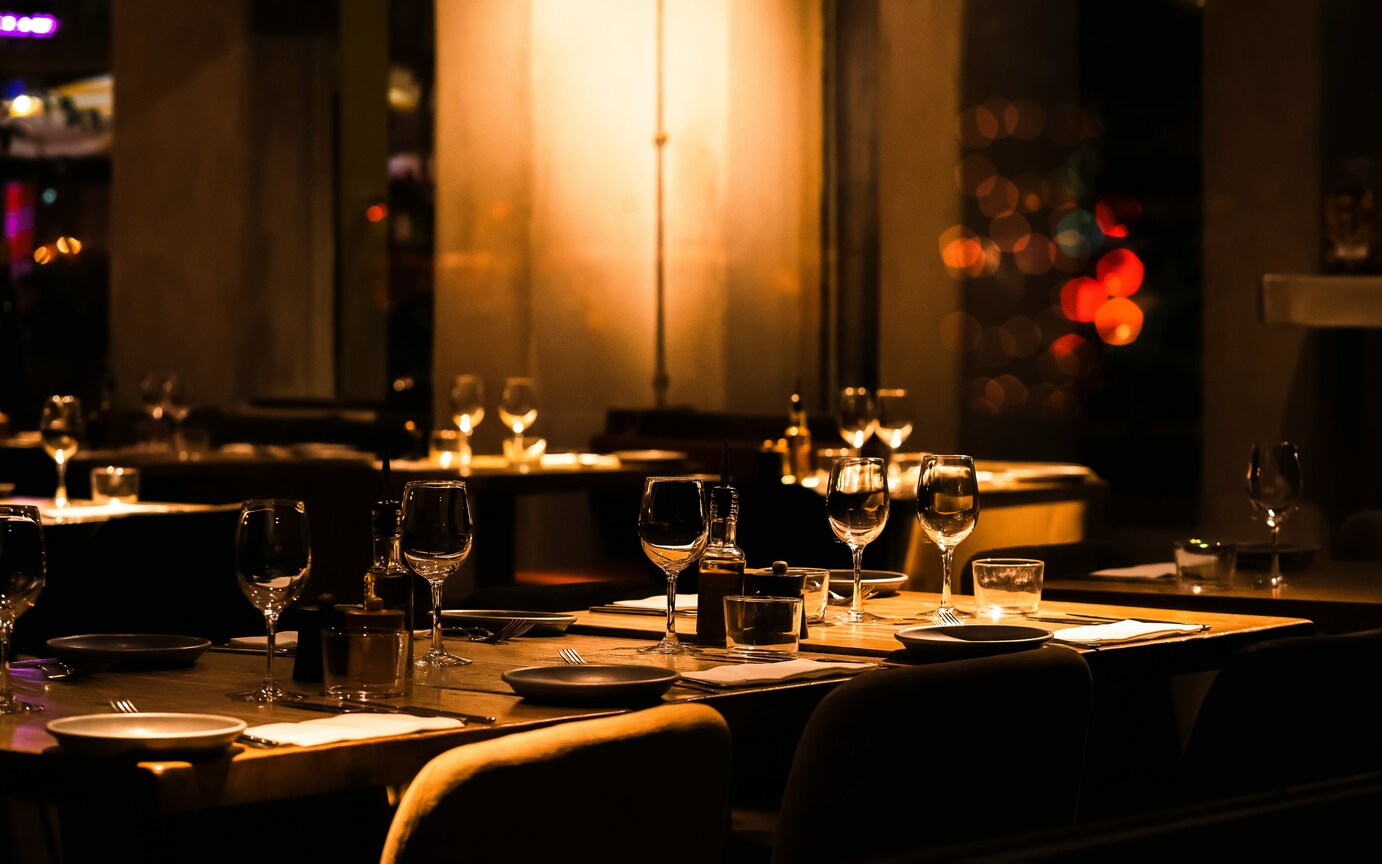
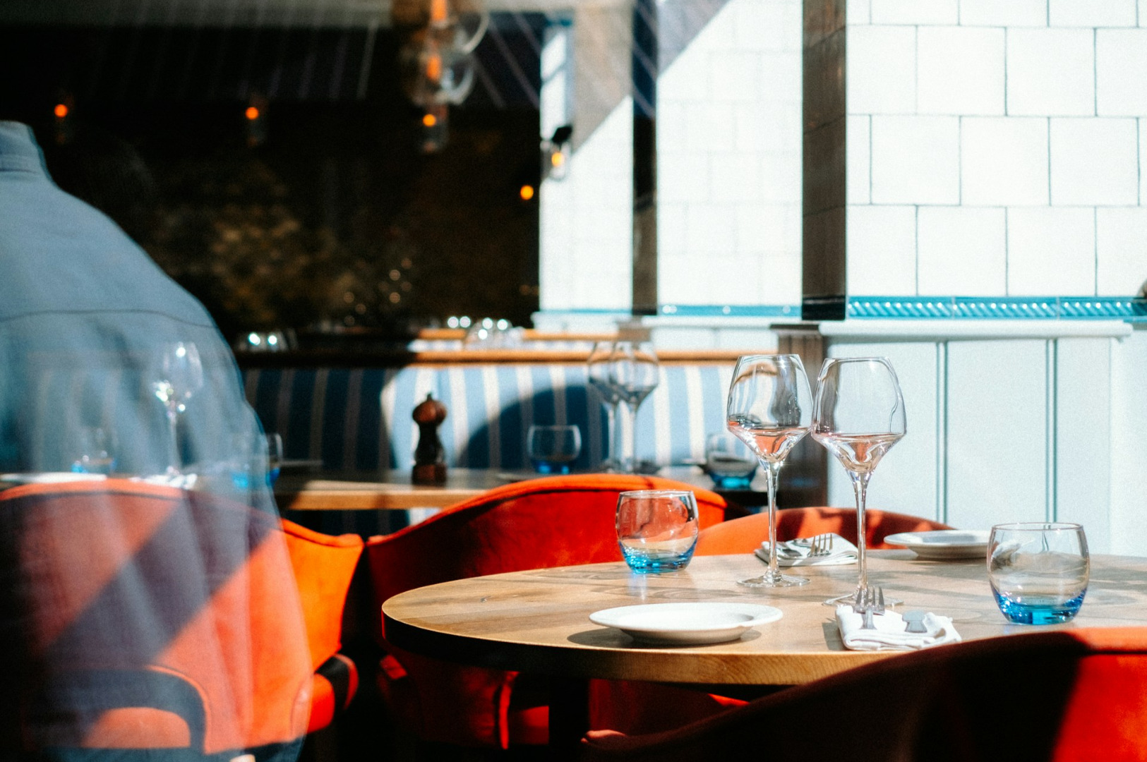
Color and Appetite

There is a reason you rarely see blue in successful restaurant branding. Colors trigger physiological responses. While you might personally love a specific shade of teal, it might be suppressing the appetite of your guests.
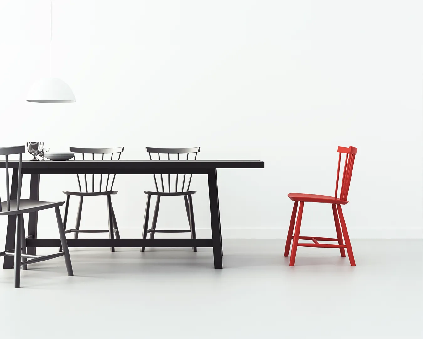
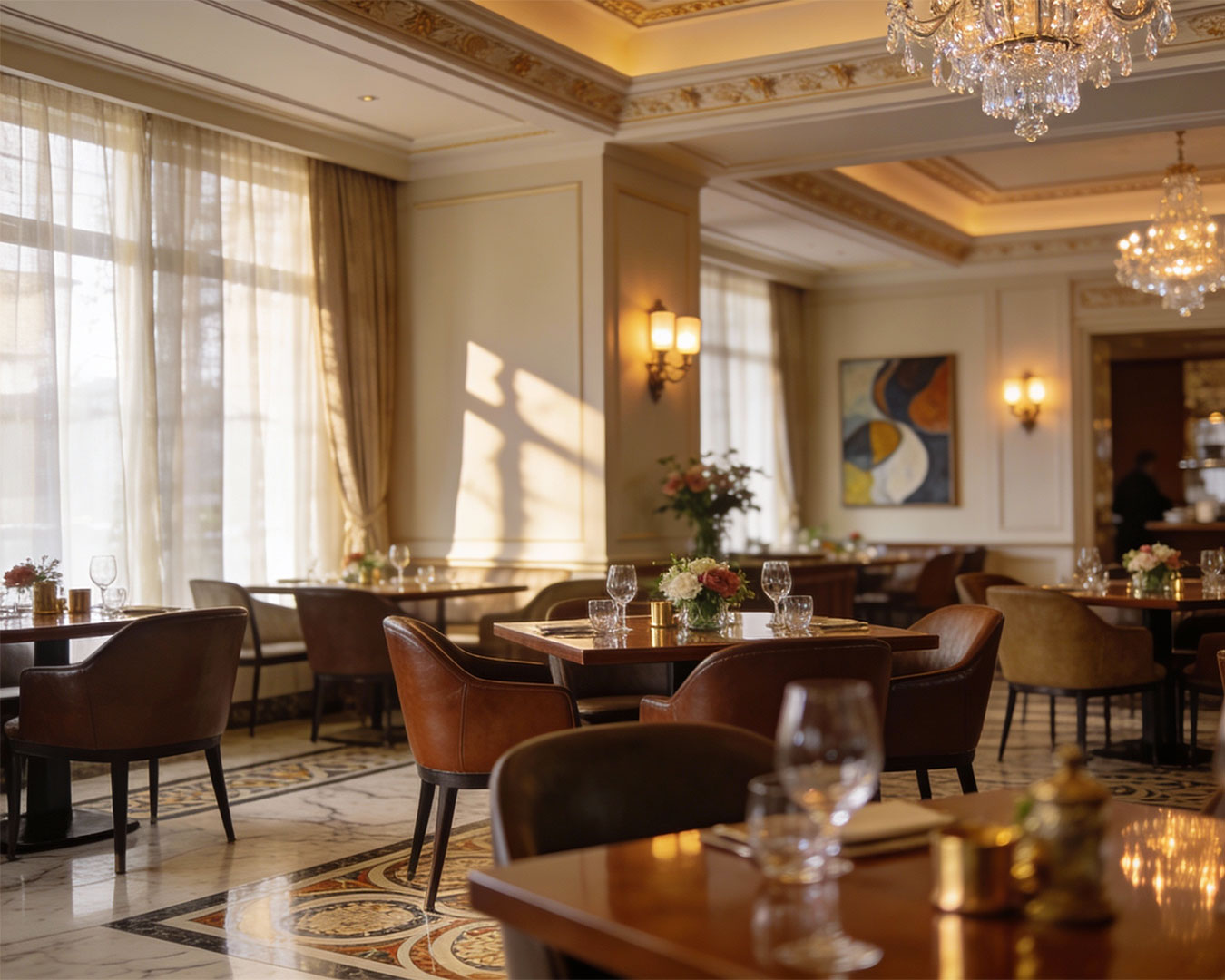
Effective visual identity for restaurants uses color to set a pace. Bright, high-contrast colors encourage fast turnover. Subdued, earthy tones encourage guests to linger and order dessert. Before you approve a color scheme, ask yourself what behavior you are trying to drive. Do not design for your personal preference. Design for your desired table turn rate.
Design is only useful if it can be replicated. If your identity requires expensive custom printing for every daily special, you will eventually stop doing it. Your visual system should be easy for your manager to maintain. It should be a set of rules that simplifies your life, not a set of constraints that makes daily operations harder.
A strong identity is a quiet one. It supports the food and the service without shouting for attention. When you get the visuals right, the rest of the experience feels effortless.