If you stripped the logo off your menu, your Instagram feed, and your takeaway packaging, would a regular customer still know the food came from your kitchen?
Most owners mistake a logo for a brand. They spend thousands on a graphic designer for a launch and then spend the next three years diluting that investment. One week the promotional flyer uses a neon script. The next month the staff wear mismatched aprons. By the end of the first year, the business looks like three different restaurants fighting for space in one unit. Achieving visual consistency restaurant owners can actually maintain is about discipline, not a massive marketing budget.
Why Consistency Outperforms Novelty
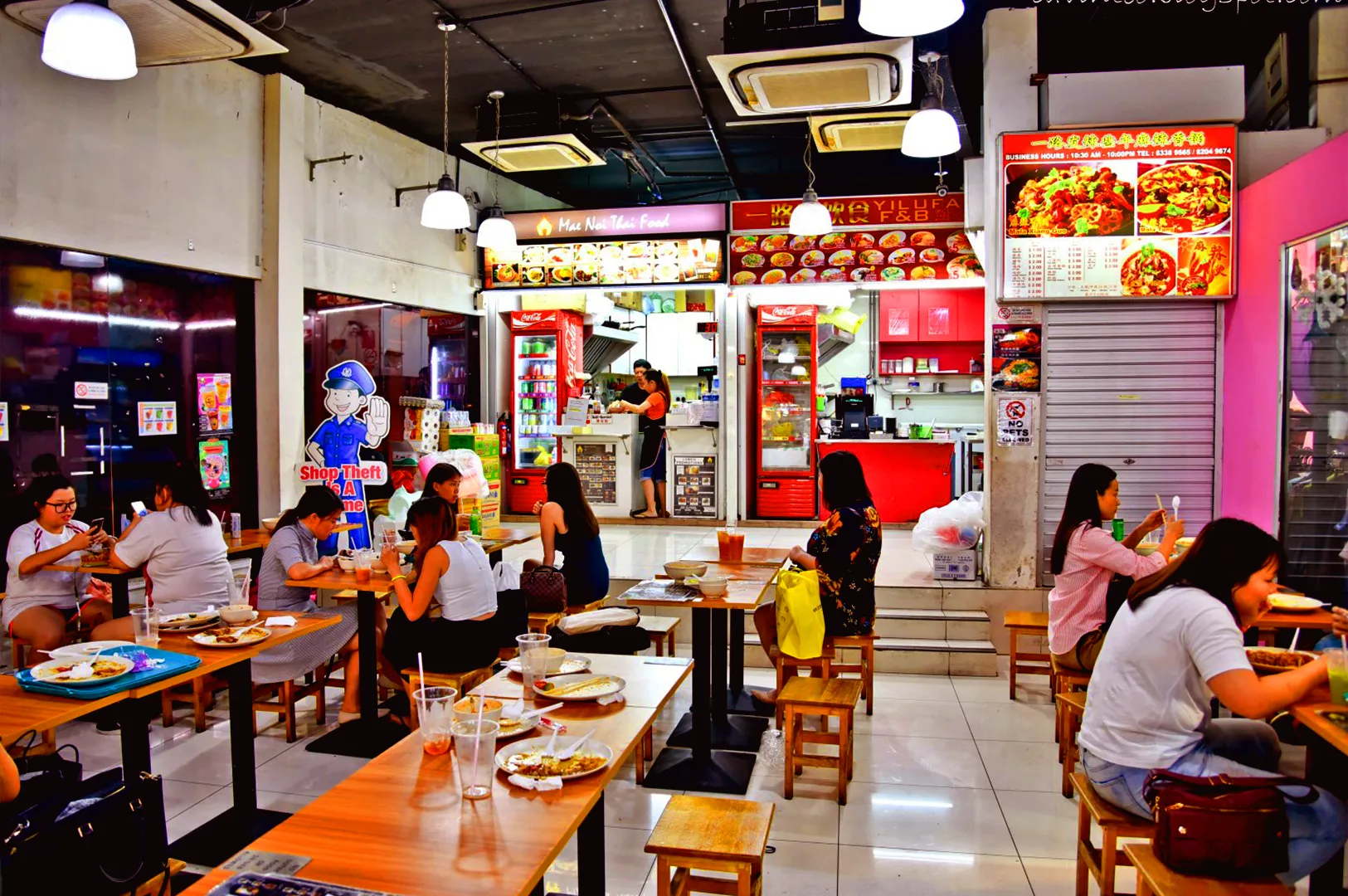
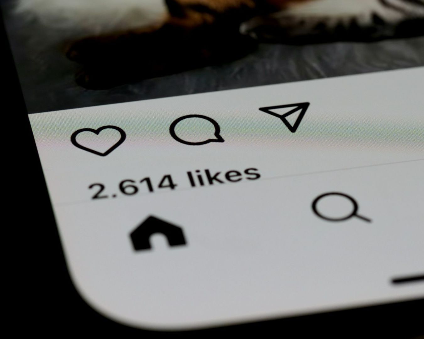
In the Singapore F&B market, diners are overstimulated. They are bombarded by thousands of images daily. When your visual output is fragmented, you force the customer to work harder to recognize you. You lose the cumulative effect of your marketing spend.
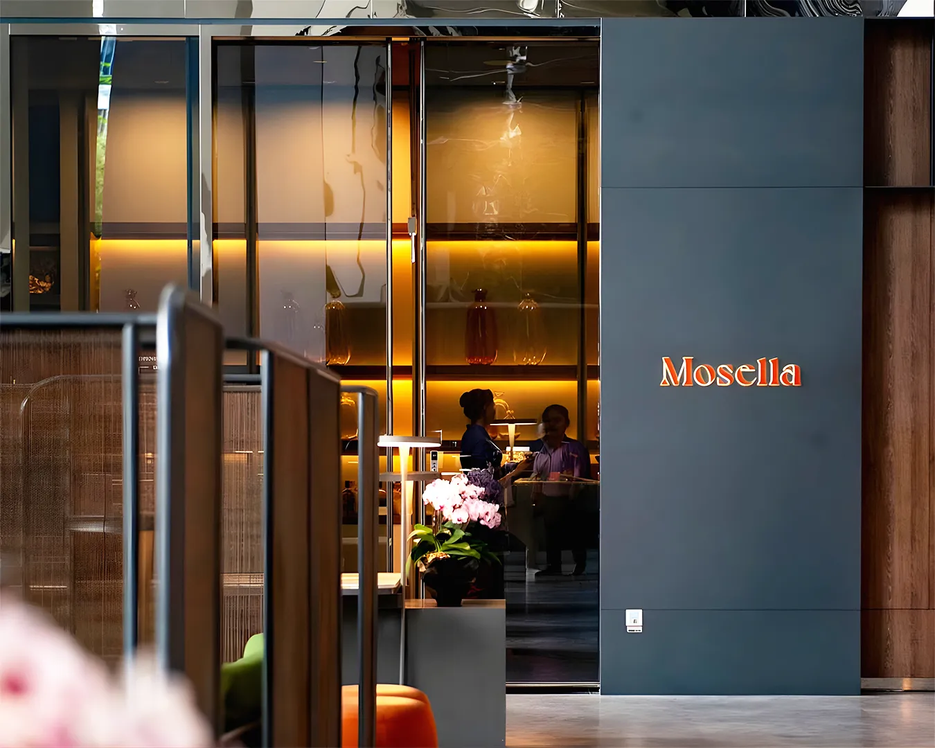
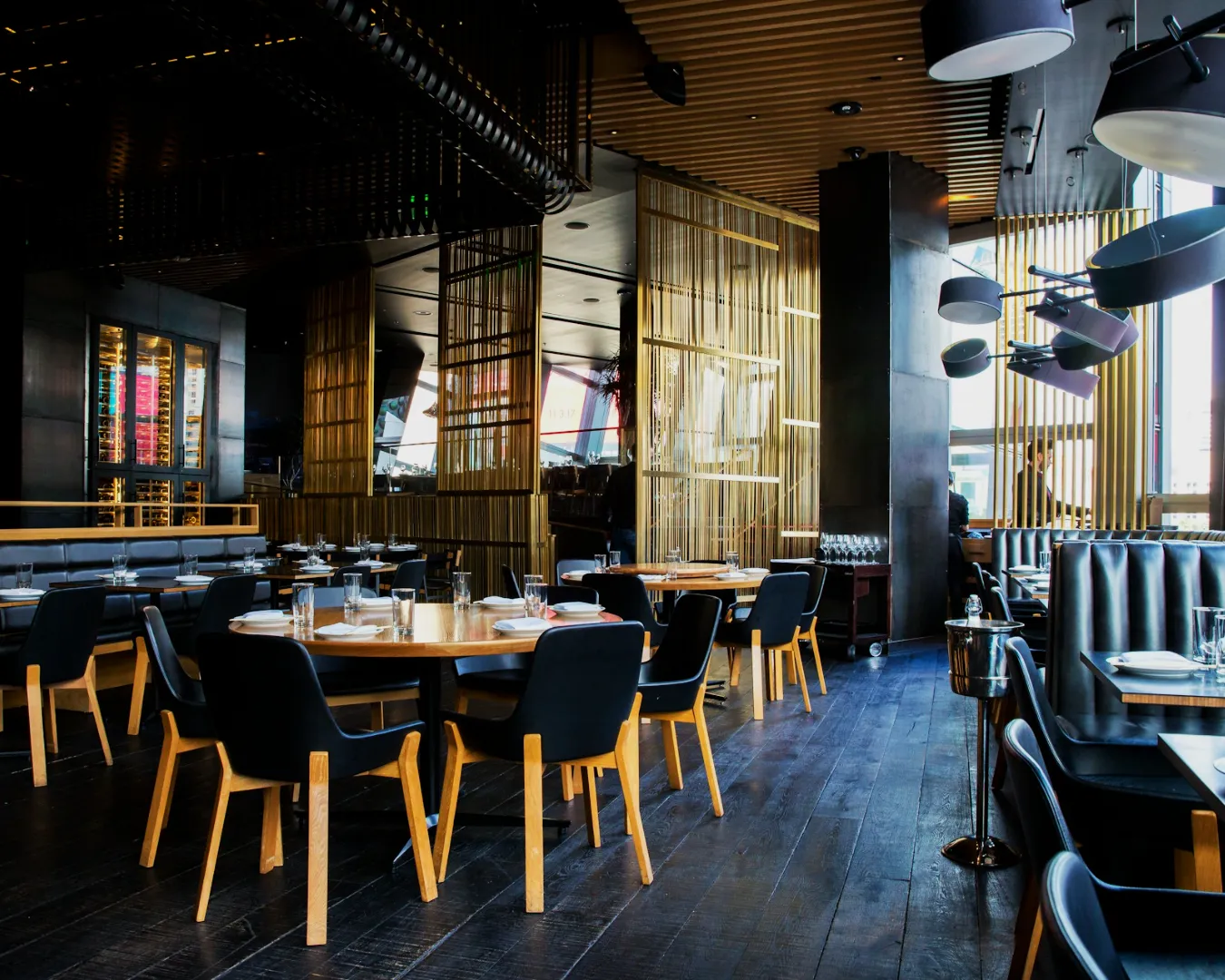
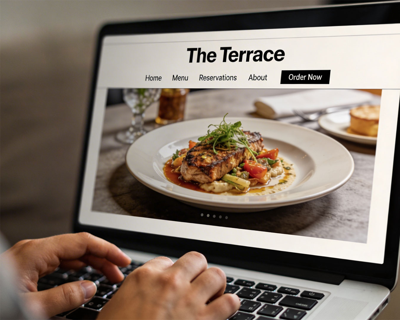
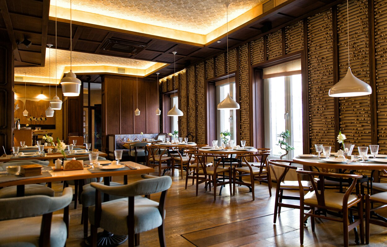
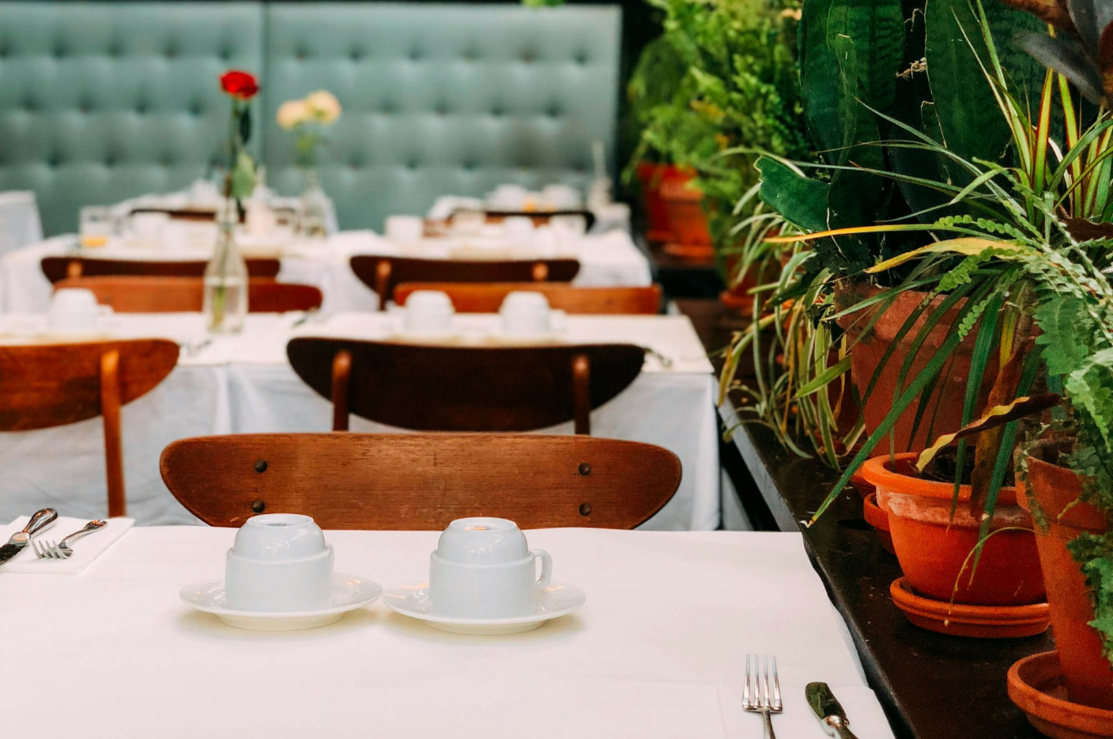
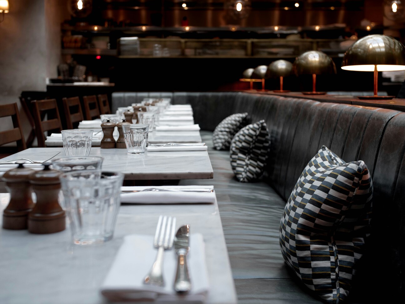
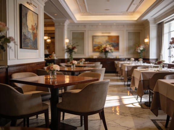
A brand is a pattern. When a diner sees a specific shade of forest green or a particular font on a sandwich wrap, their brain should automatically trigger a memory of your signature dish. If your visuals are constantly changing, that cognitive shortcut never forms. Visual consistency restaurant standards ensure that every touchpoint reinforces the last one. It builds a sense of operational stability. If the branding is organized, the customer assumes the kitchen is too.
The Cost of Visual Drift
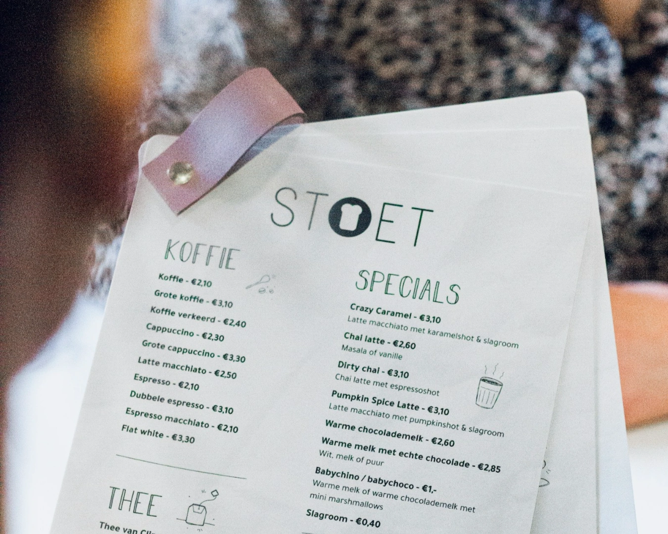
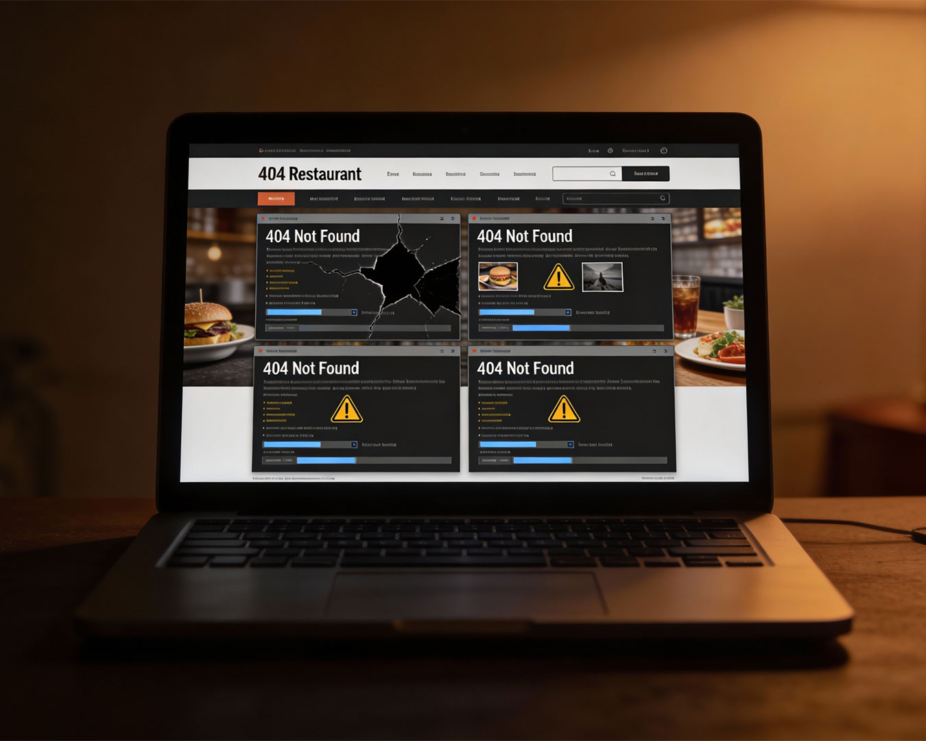
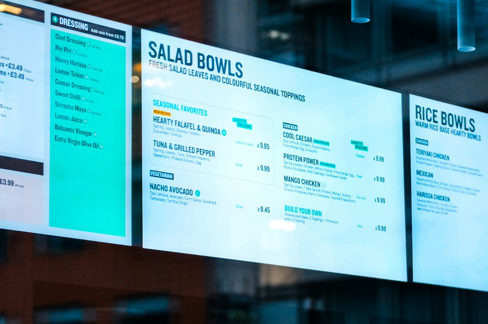
Visual drift happens during the daily grind. You need a quick sign for a seasonal special. You ask a floor manager to “just whip something up” on a free design app. You choose a font that looks nice in the moment but bears no relation to your main menu.
This creates a “budget” feel that erodes your price authority. When your brand looks fragmented, you cannot justify premium pricing. People pay for the experience and the expectation of quality. A lack of cohesion signals a lack of attention to detail. If you cannot get the font right on the table talker, why should the guest trust the consistency of your wagyu source?
Establishing Your Visual Rules
You do not need a hundred-page brand book. You need three non-negotiable rules that every member of your team can follow.
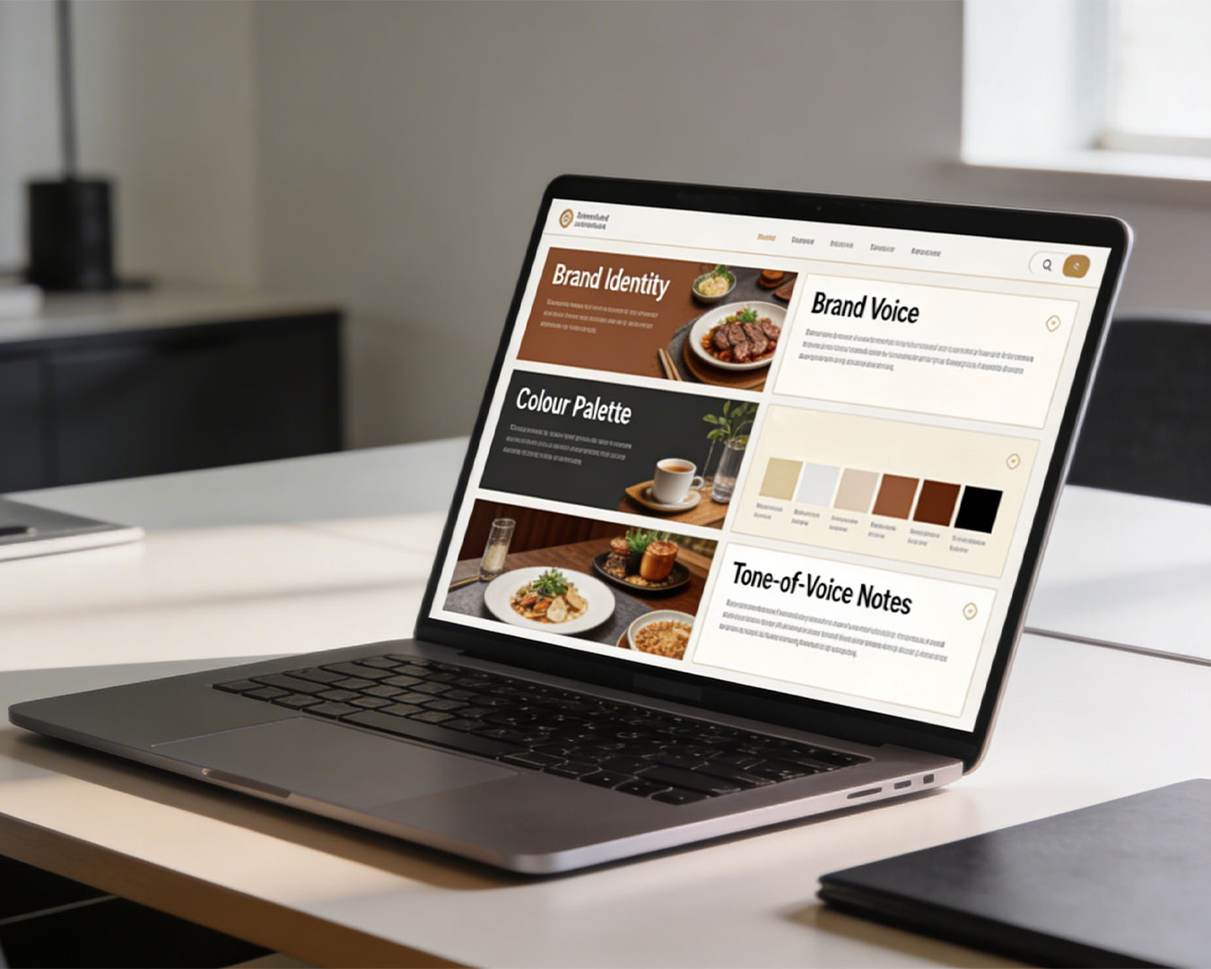
1. The Color Anchor

Pick two primary colors. Use them everywhere. From the stitching on the uniforms to the highlights on your website. If you run a high-volume zi char concept, your colors might be bold and high-contrast. If it is a quiet cafe in Tiong Bahru, they might be muted. Whatever
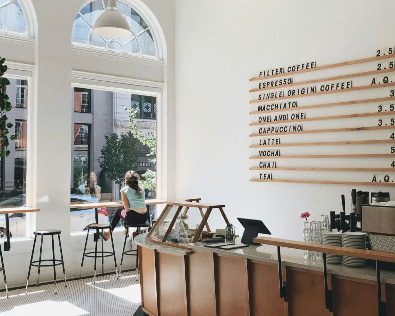
2. Typography Hierarchy
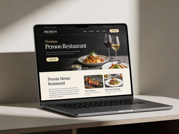
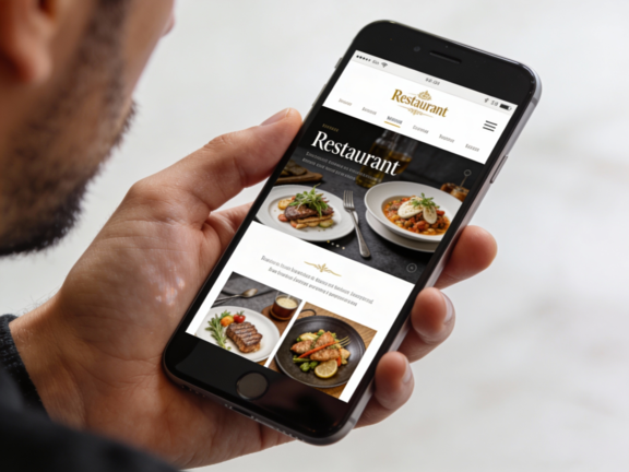
Select two fonts. One for headings and one for body text. Use these for your menus, your Instagram Stories, and your recruitment posters. This creates a subconscious “voice” for your brand. It makes your communications look professional and intentional.
3. Photography Style

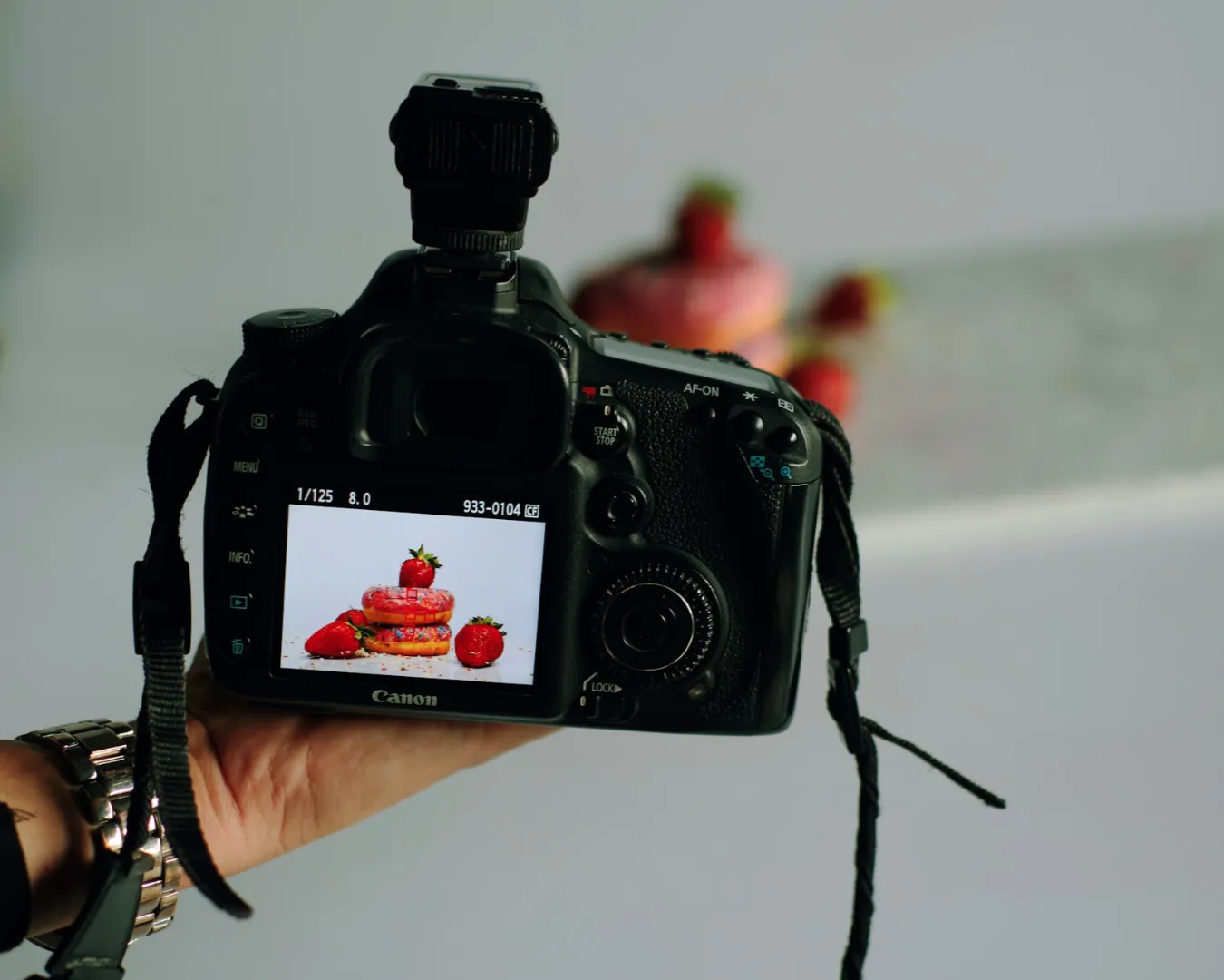
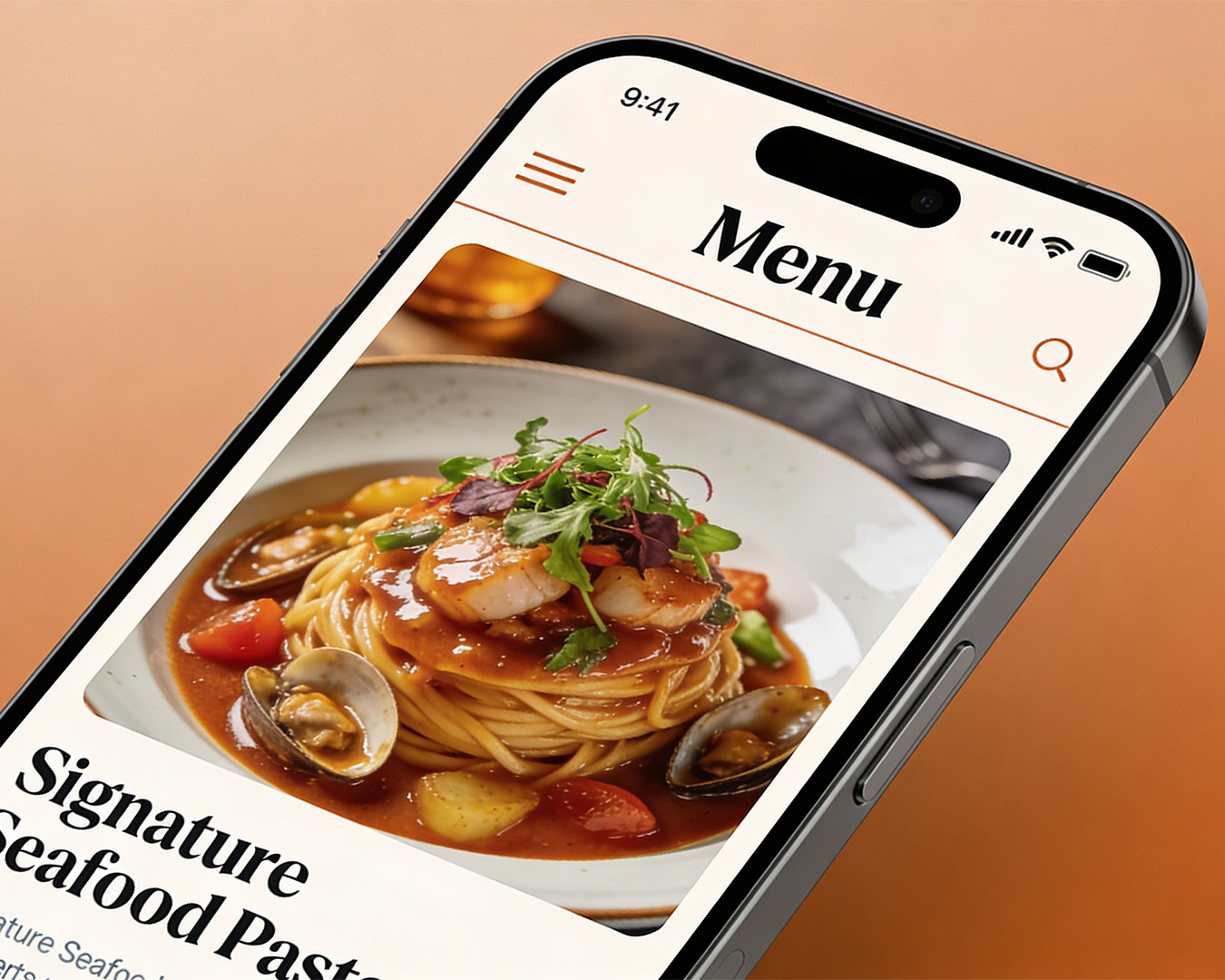
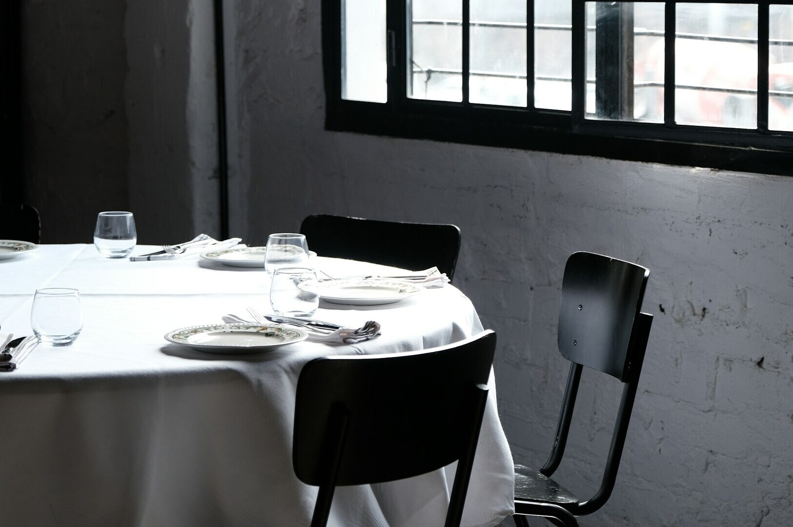
Decide how your food is captured. Is it harsh, direct lighting that shows every texture? Or is it soft, natural light for a lifestyle feel? Stick to one. A feed that mixes professional studio shots with blurry, yellow-tinted phone photos looks amateur.
Practical Implementation
The goal is to make restaurant brand consistency management a passive habit. Create a simple folder on the cloud. Put your logos, your two fonts, and your color codes inside. Give access to your social media person and your printer.
This is not about being “creative” every morning. It is about being a custodian of your brand. Great brands in Singapore are built on the relentless repetition of a few core elements.
A Final Word on Brand Longevity

Building a recognizable brand takes time. It requires you to be bored of your own visuals long before the customer even begins to notice them. When you feel the urge to change your style because you want something “fresh,” resist it. That is the moment your brand is finally starting to stick.
Take a moment after the dinner rush tonight to lay out your menu, a takeaway box, and your latest social media post side by side. If they do not look like they belong to the same family, you are leaking brand equity.
Would you like us to perform a quiet review of your current digital presence to identify where your visual gaps are?