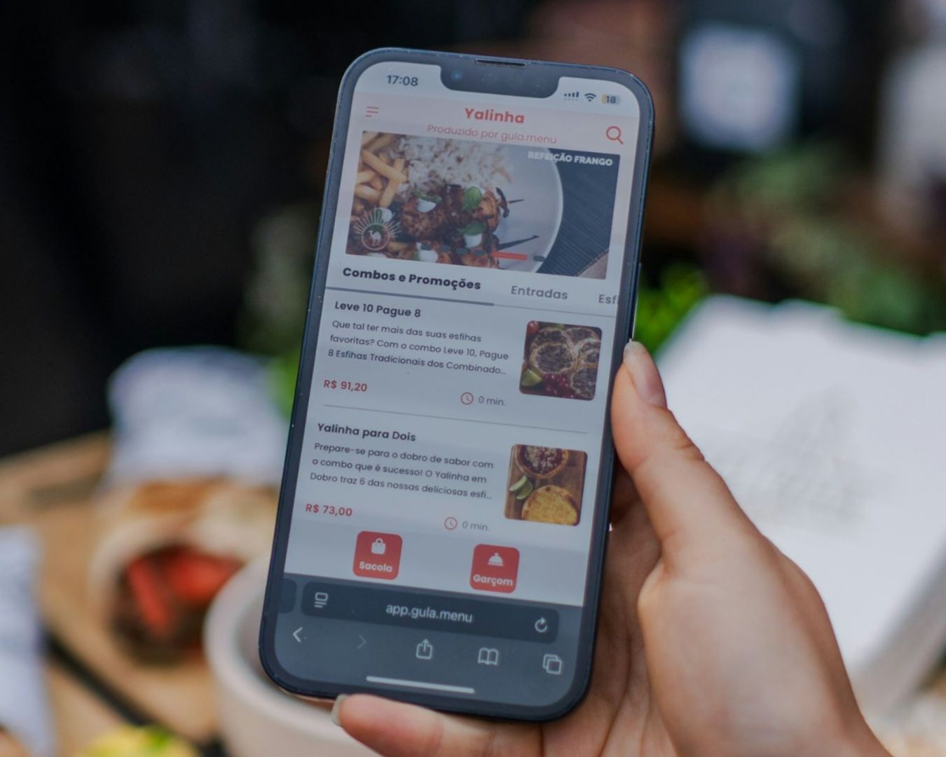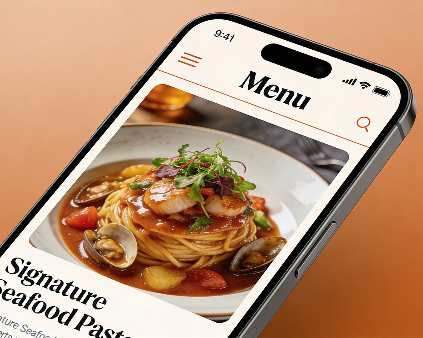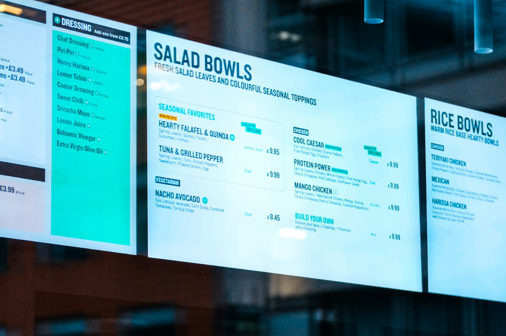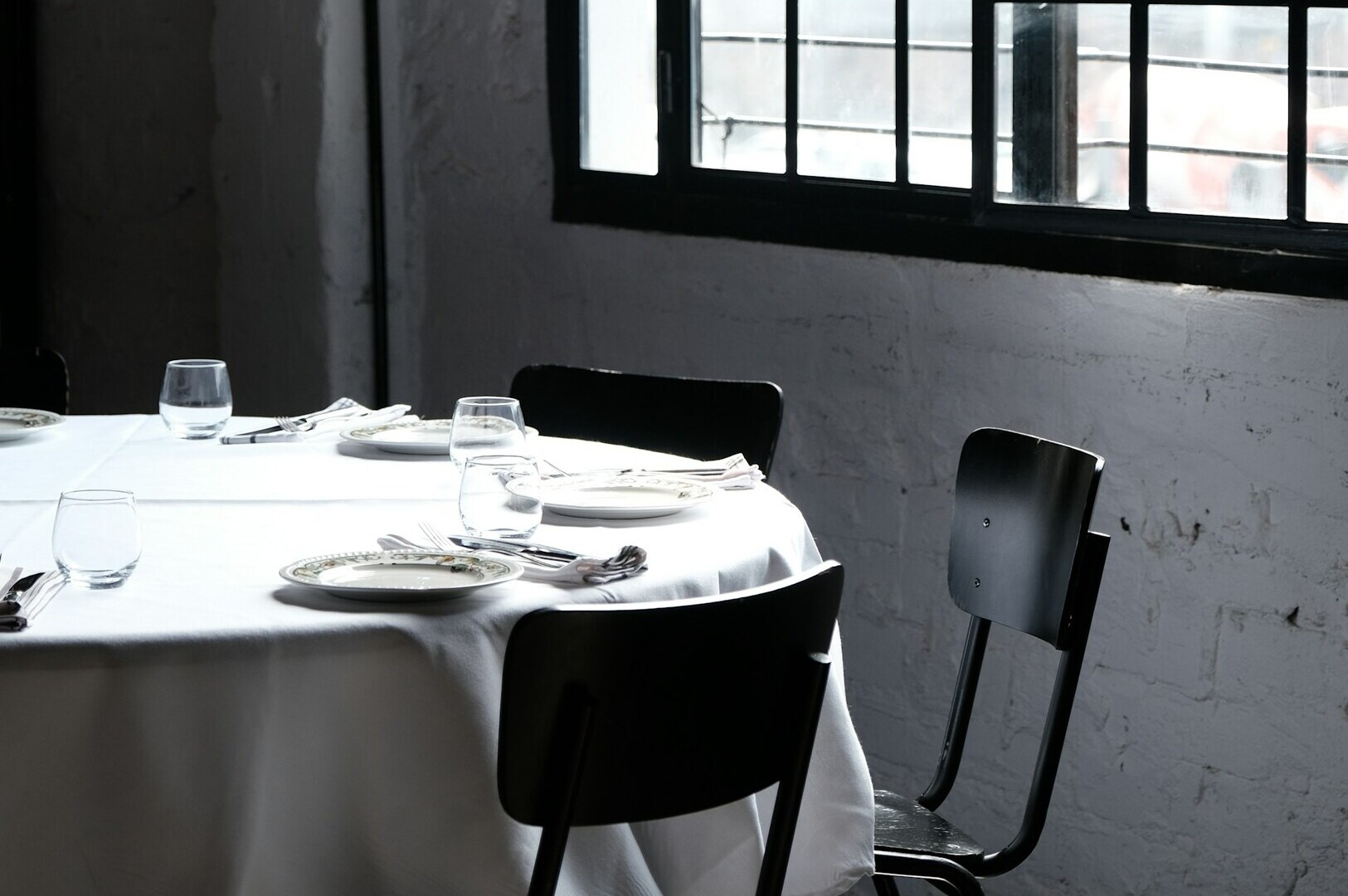
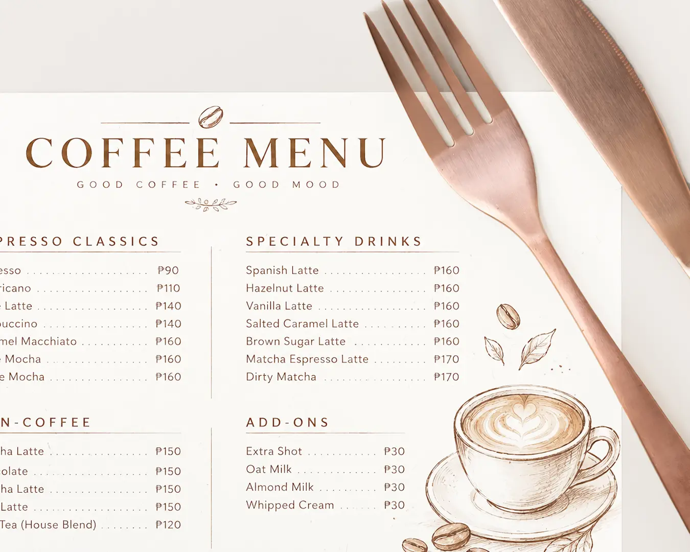
When a guest picks up a physical menu or scans a digital ordering board, their perception of value is established before they read a single dish description. While food quality and ingredient sourcing dictate long term guest satisfaction, visual framing dictates willingness to pay.
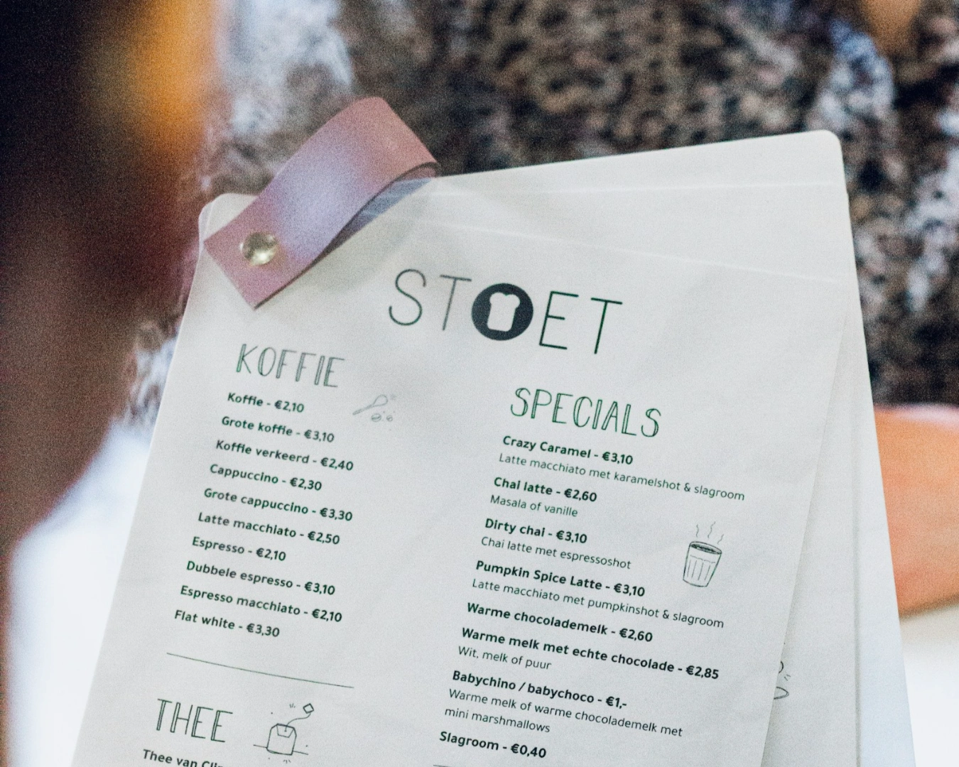
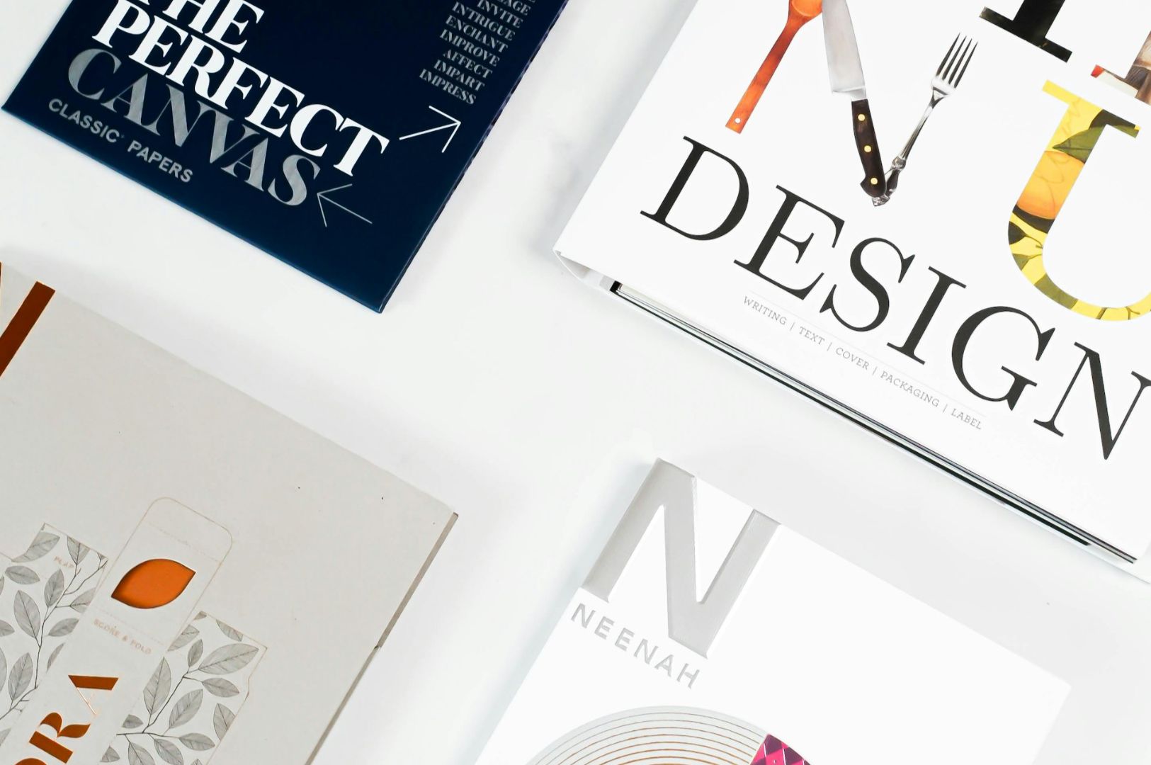
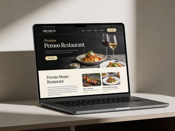
Typography is the most direct, cost effective lever an operator can pull to elevate perceived value. Strategic type choices make a menu feel expensive without raising prices by leveraging subconscious visual cues that signal craftsmanship, restraint, and culinary authority.
The Psychological Weight of Typography in F&B
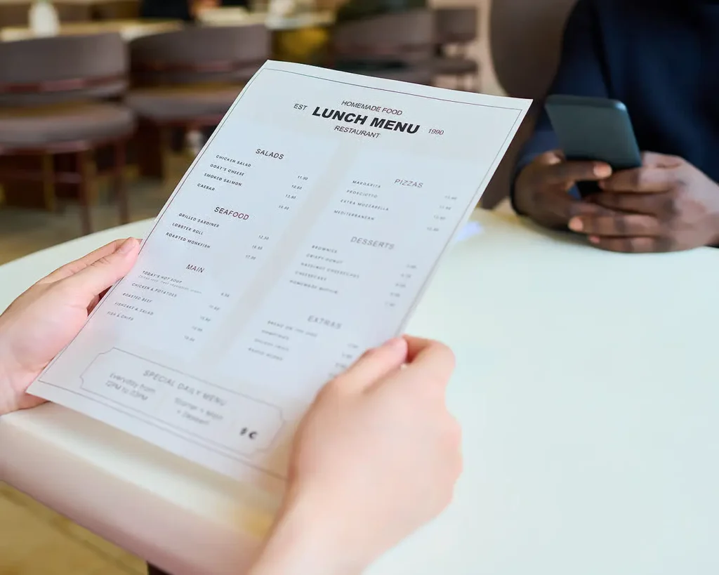
Typography operates on an implicit psychological level. Just as heavy cutlery or linen napkins signal a higher price tier, refined font choices communicate precision and quality. Conversely, cluttered layout, poor font pairings, or default system typefaces cheapen the presentation of even the most elevated culinary creations.
Key visual mechanics that influence guest price perception include:
- Visual Hierarchy and Space: Generous line height and generous negative margins give dishes breathing room, signalling an unhurried, premium dining pace.
- Proportional Contrast: Subtle size differences between dish titles and descriptions convey sophistication, whereas overly large, bold text feels aggressive and low end.
- Letterform Precision: Custom or classical typefaces with refined serifs or balanced geometric proportions instantly project heritage and culinary skill.
Font Classifications and Their Value Cues
Different typeface families communicate distinct price tiers and concept styles. Choosing the wrong category creates a visual mismatch that lowers perceived value.
| Type Category | Design Characteristics | Perceived Value Signal | Best Suited Concept |
| High-Contrast Serifs | Delicate thin strokes with sharp, refined serifs | Exclusivity, fine dining, traditional heritage | Premium steak houses, wine bars, elevated omakase |
| Geometric Sans-Serifs | Clean, balanced proportions with uniform stroke weight | Modern sophistication, curated quality, restraint | Contemporary fast casual, specialty cafes, craft bistros |
| Monospaced Accents | Fixed-width, technical typewriter aesthetic | Artisanal precision, ingredient focus, provenance | Farm to table concepts, craft cocktail bars, micro-breweries |
| Overly Scripted / Decorative | Excessive flourishes, imitation handwriting, heavy weight | Low perceived value, mass market casual | Inexpensive diners, generic takeaway concepts |
Tactical Layout Adjustments That Elevate Presentation
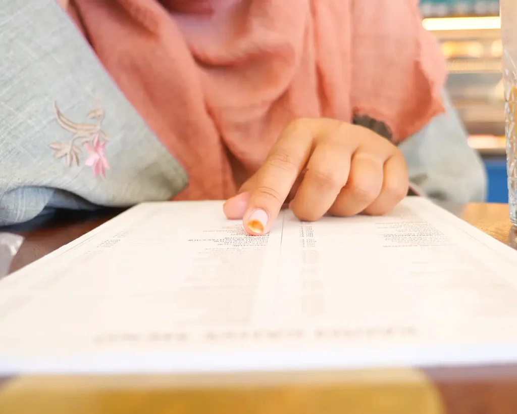
Upgrading the perception of your menu requires more than swapping a font file. The structural arrangement of text on the page reinforces high end positioning.
At Atelier Creations, we implement specific typography and layout guidelines to help operators maximize cover yields without altering dish costs:
- Eliminate Dot Leaders: Avoid connecting dish titles to prices using dotted lines. Dot leaders encourage guests to scan down the right side of the page to compare prices rather than reading dish descriptions.
- Soft-Pedal Price Placement: Position prices quietly at the end of the dish description or directly under the title using the same font weight and size, keeping the emphasis strictly on the culinary description.
- Limit Font Families: Stick to a maximum of two complimentary typefaces per menu. One refined serif or display font for section headings paired with a highly legible sans-serif for descriptions maintains an uncluttered, authoritative look.
- Utilize All-Caps With Generous Tracking: Setting section titles or category headers in uppercase letters with wider letter spacing creates a clean, architectural structure that feels deliberate and high end.
Avoiding Common Typographic Pitfalls
Small typographical errors degrade the perceived quality of a venue and undermine expensive interior investments.
Audit your current menu layout for these operational mistakes:
- Using Default System Fonts: Relying on default system typefaces like Arial or Times New Roman signals a lack of professional design attention.
- Overusing Bold Text: Bolding entire descriptions creates visual noise that overwhelms the eye and cheapens the layout.
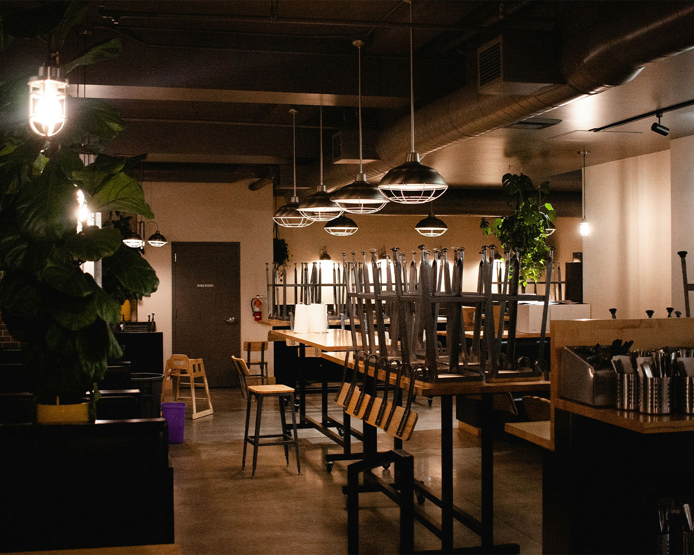
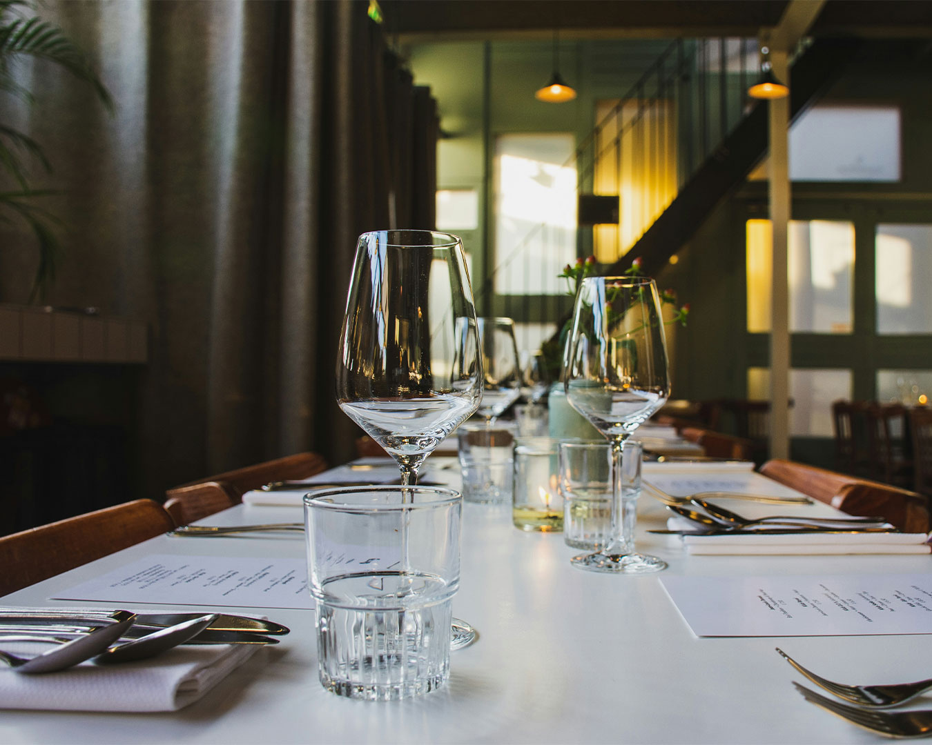
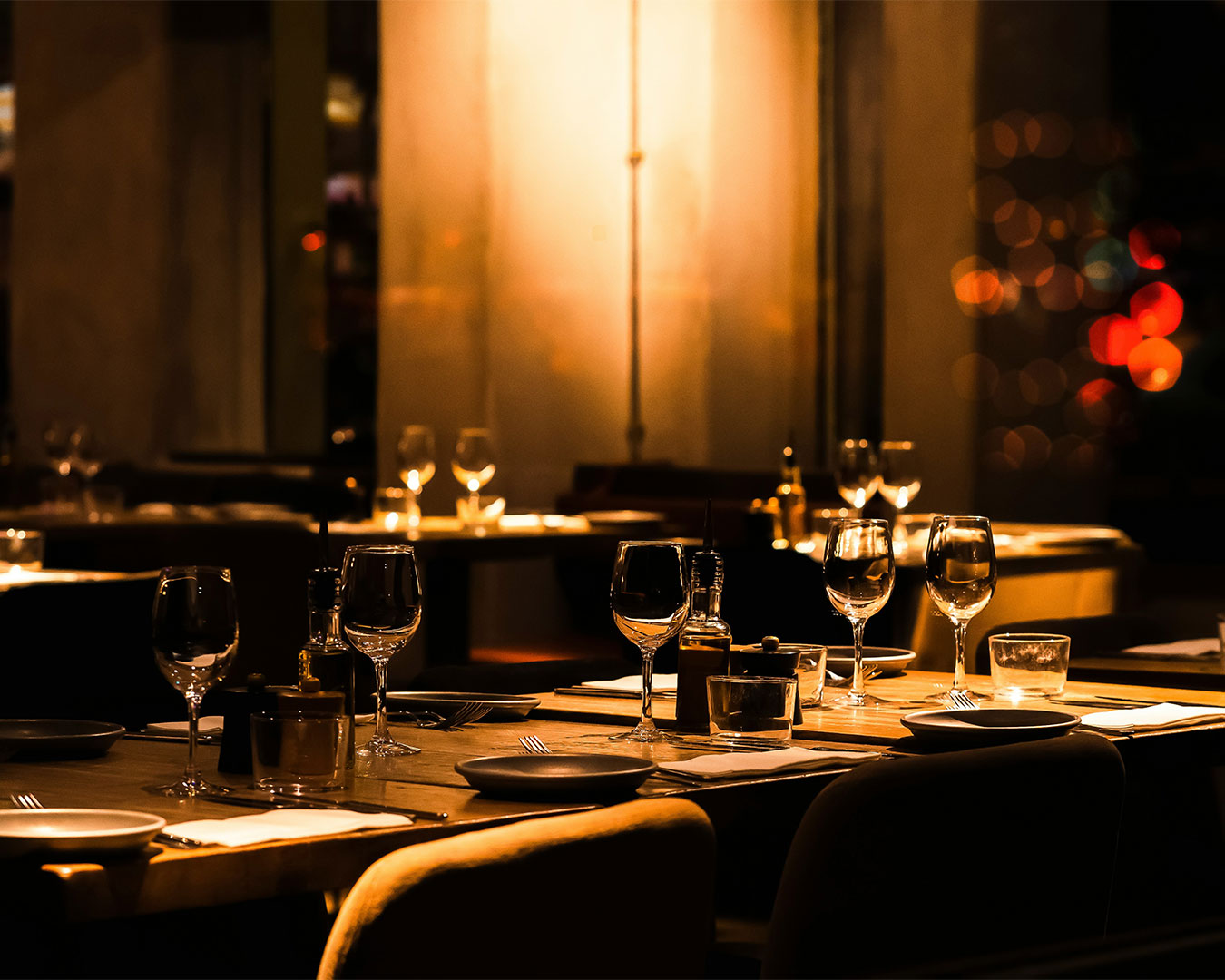
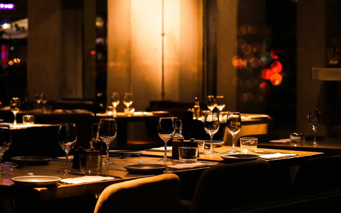
- Ignoring Font Legibility in Dim Lighting: High end venues often feature ambient, low light settings. Test your chosen font weight and size on the actual floor to ensure guests can read comfortably without using phone flashlights.
Framing Culinary Value Through Design
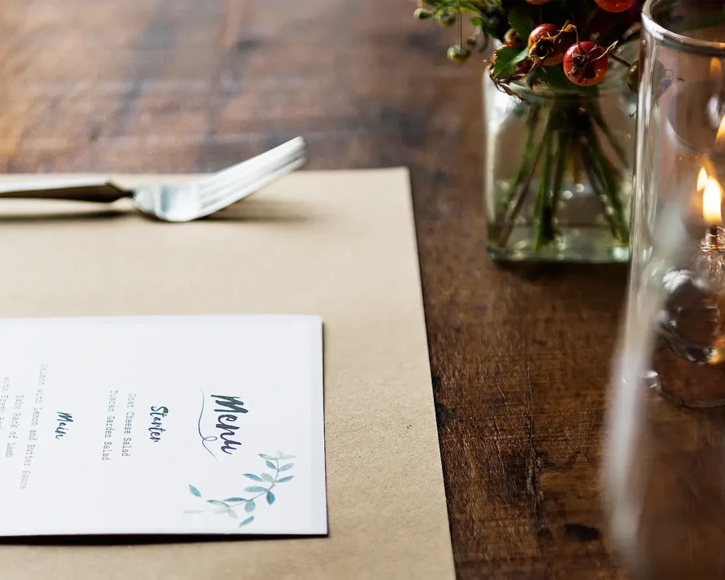
Perceived value is a function of presentation. By applying disciplined typography rules, refined layout spacing, and deliberate typeface pairings, operators elevate the guest experience and justify premium market positioning. Strategic menu design turns your existing dish offerings into high margin visual assets shift after shift.
Unlocking these subtle shifts in perception requires an objective, trained eye on your brand assets. If you are ready to refine your visual positioning and optimize your menu architecture for higher profitability, connect with our team to audit your current dining touchpoints.