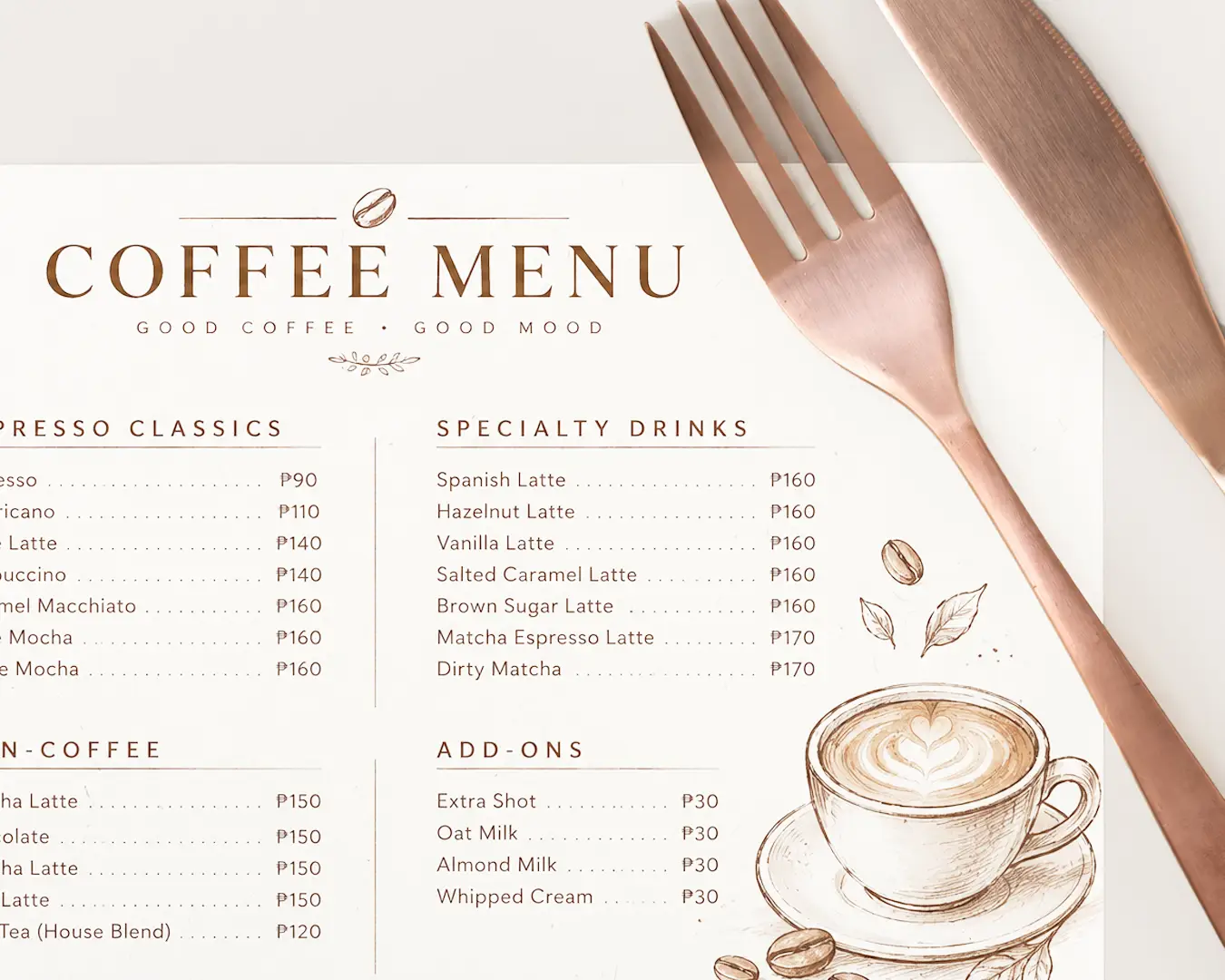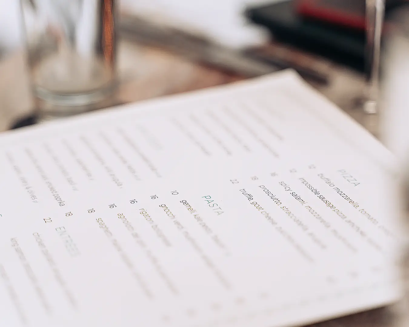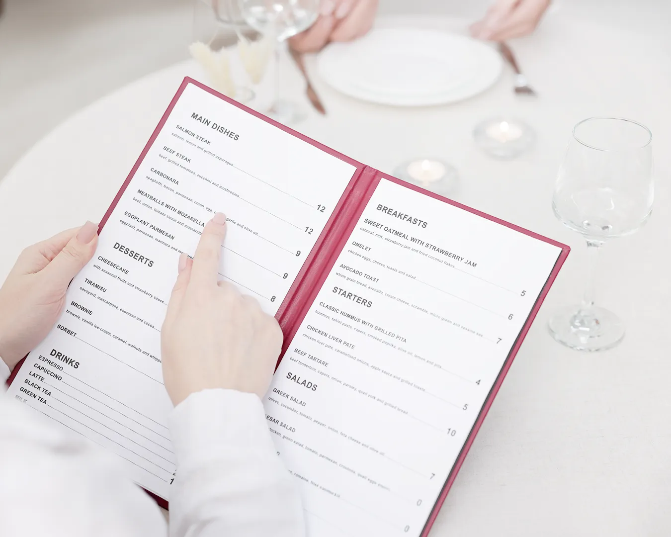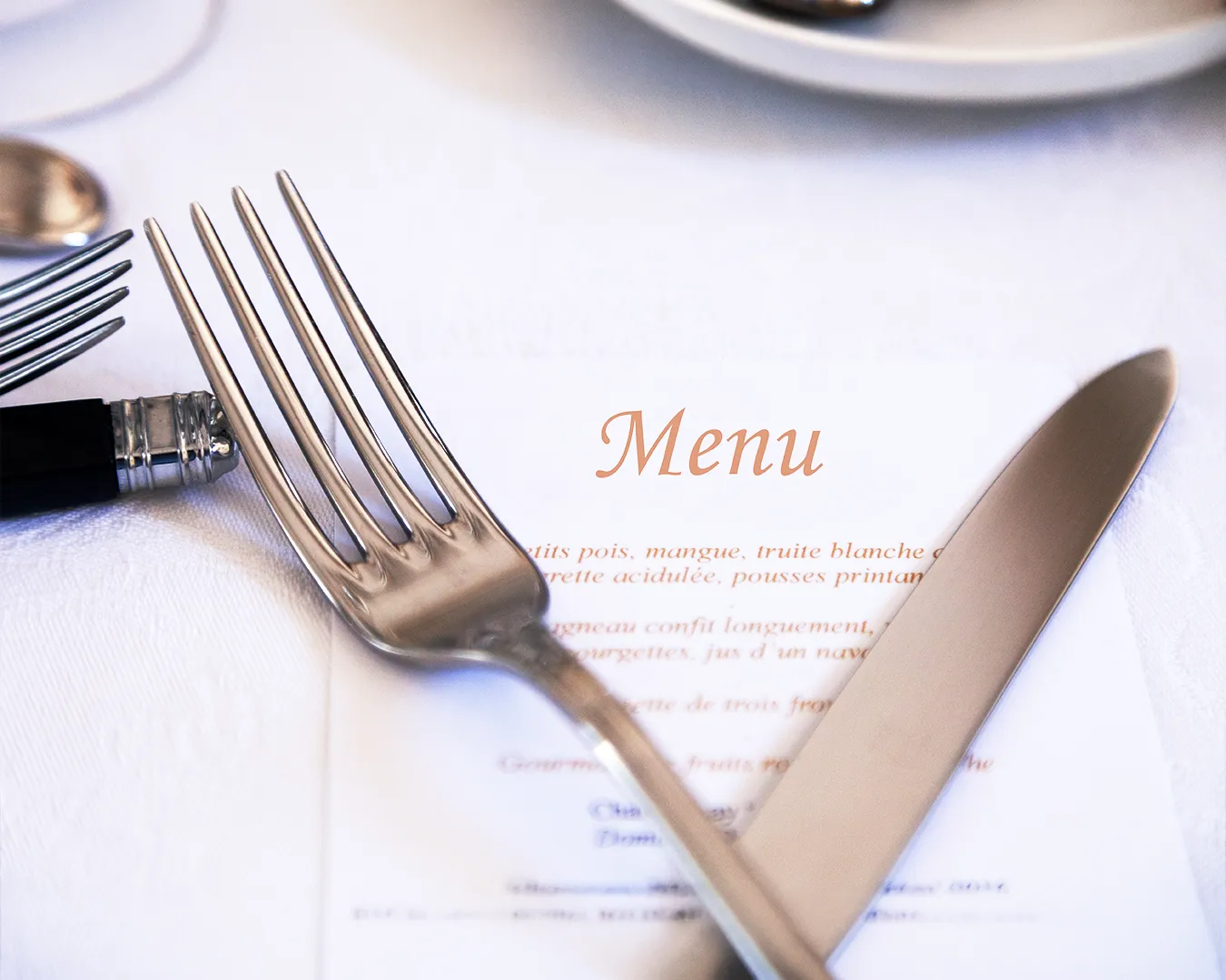
You are standing at the printer, holding your new menu. The font looked sharp on the laptop. On paper, under kopitiam lighting, the script font blurs into a smudge. Your regular squints. He orders the same thing he always orders, because he cannot read the new special.
This is where font pairing actually lives. Not in a mood board. In a customer’s hands, at 7pm, with limited patience. It is also, quietly, part of branding for restaurants: the font decides how trustworthy, cheap or premium your food feels before anyone takes a bite. Consider this a font pairing guide built for the floor, not the classroom.
Why Font Combinations Make or Break Your Menu
Most owners treat fonts as decoration. They are not. A font is a delivery system for price, dish name and description. Get the font pairing wrong and diners either misread the menu, or worse, associate the confusion with your food.
Good font combinations do one job well: they create visual interest and contrast, so the eye knows where to look first. Two typefaces, used with intent, will always beat one font stretched too thin. A title font pulls attention. A paragraph font explains. Legibility is the entire brief.
The Basics of Font Pairing Anyone Can Use
You do not need a typography degree. You need two complementary fonts that behave differently. Pair a serif font with a clean sans serif font, or use two different fonts from the same family at contrasting weights. That’s the shortcut most designers won’t tell you.
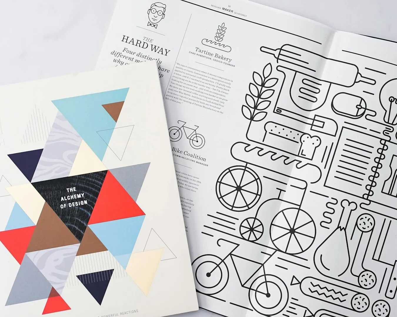
A serif has small strokes at the letter ends, associated with heritage and craft. A sans serif is plain, modern, easy to scan with clean lines on a phone screen. Put a serif headline over a sans serif body and you get instant hierarchy without saying a word. Your font choices should feel like a decision, not an accident. At Atelier Creations, we treat this as a five minute fix that most owners have simply never been shown.
When a Display Font Earns Its Place
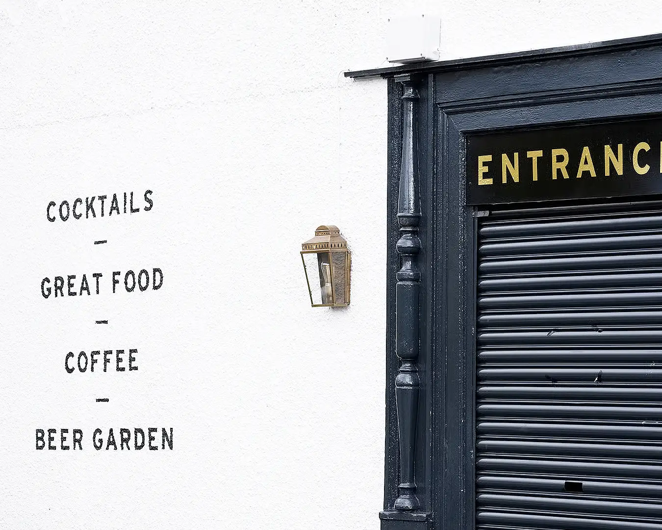
A display font is bold, often decorative, built to draw attention from across the room. It belongs on your signage or your logo, not in your dessert descriptions. Save any artistic or vintage fonts, and geometric typefaces with big personality, for headings only. Playfair Display is a reliable example here, elegant enough for a title, wrong for a paragraph. Body copy should stay quiet.
Fira Sans, Century Gothic and Finding Your Best Font
Most owners pick a font because they’ve seen it before. That’s not a strategy, it’s a habit. Here’s what these three actually do on a menu:
- Fira Sans is a dependable choice for body text if you want a modern sans serif that still feels warm.
- Century Gothic reads as a neutral sans serif with geometric confidence, but its tall x height can feel cold in long paragraphs, so use it sparingly, mostly for short labels.
- Helvetica remains the safest of modern fonts if you want something that simply disappears and lets the food talk.
There is no single best font for every concept. There is only the right one for your kitchen’s story.
Best Font Pairings for Singapore Restaurant Menus
For hawker-inspired or heritage brands, a warm serif paired with Open Sans or Source Sans Pro reads as trustworthy without trying hard. That’s a great example of a pairing that works because the two fonts trust each other to do different jobs.
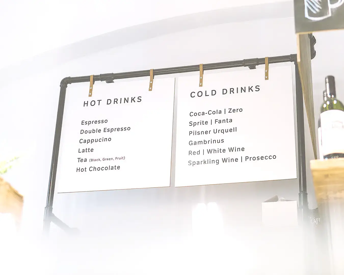
For contemporary cafes chasing modern styles, two sans serif fonts in different weights, kept consistent from your printed menu to your web design, create a perfect match with far less effort than mixing families.
Bebas Neue and Different Weights Worth Knowing
Bebas Neue remains a solid display font for bold, all-caps headings on chalkboards or specials boards. It carries a bold weight on its own, so resist adding a second decorative font beside it. One strong headline, one steady paragraph font at one weight underneath. A third font, however tempting, rarely earns its place.
Font Superfamilies: The Easiest Way to Avoid Mistakes
If choosing pairing fonts feels risky, use a font superfamily instead: a single family with matching serif and sans serif versions, built by the same type designer, often going back to typeface systems developed through the twentieth century. You get harmony automatically, with none of the guesswork. Google Fonts offers several strong, free options in this category, which keeps testing low cost and low risk.
What a Perfect Font Pairing Actually Looks Like
A great font pairing rarely announces itself. Nobody compliments a menu’s typography on their way out. They just read it easily, order quickly, and come back. That’s the real top tip here: restraint is a style choice, not a limitation.
If you’re unsure whether your current fonts work for or against your brand, we’re happy to take a quiet look. No pitch, just a straight read of what’s on your menu today.