If you think your logo needs to be a complex piece of art to be memorable, you’re making an expensive mistake. Many restaurant owners fall into the trap of over-designing, hoping to tell their life story in a single icon. This often stems from confusing a logo with a brand identity. In reality, the most effective logo design tips focus on one thing: legibility at a glance. Your logo isn’t a painting; it’s a functional beacon. Its primary job is to be recognized from across a crowded street or while a hungry customer is scrolling through a delivery app at high speed.
The Three-Second Rule
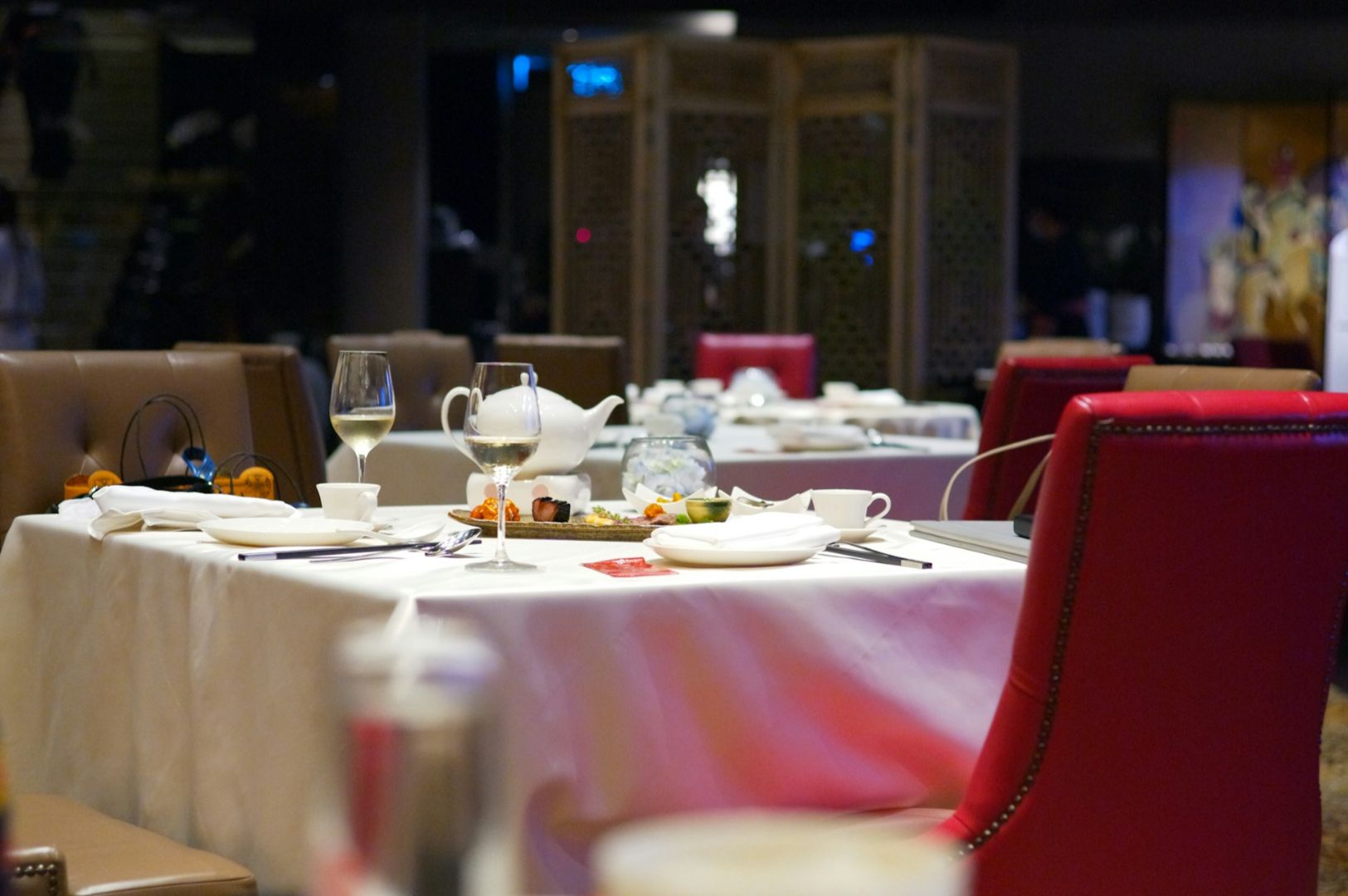
A restaurant logo exists in a high-friction environment. Most people will interact with it for less than three seconds. If they have to squint to read your name or if they cannot tell what you serve within that window, you have lost the sale.
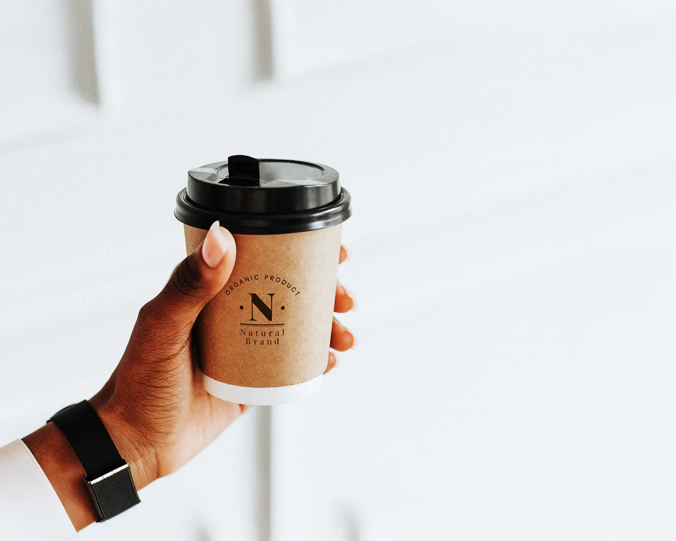
At Atelier Creations, we advocate for simplicity. A complex logo with intricate lines and six different colors might look beautiful on a large computer monitor. However, that same logo will turn into an unrecognizable smudge when shrunk down for a social media profile picture or printed on a small thermal receipt. Designing for the smallest application first is one of the most practical logo design restaurant tips we can offer. If it works on a toothpick flag, it will work on a billboard.
Designing for Operational Reality
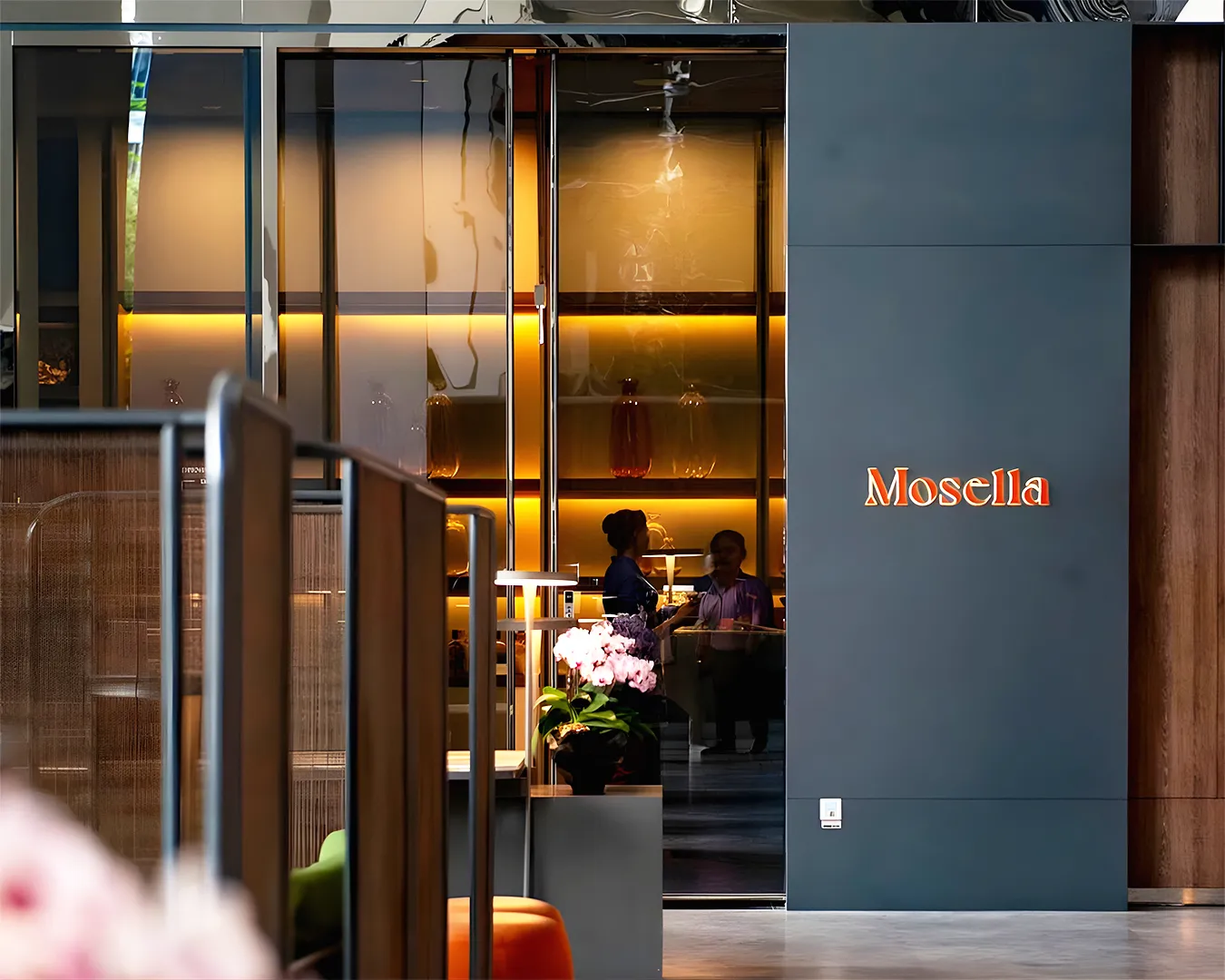
Your logo must live in the real world. This means it has to survive different lighting conditions and printing methods. A thin, elegant font might look sophisticated in a pitch deck, but it will disappear when backlit on a neon sign or etched into a dark wooden menu cover.
An effective logo is versatile. You need a version that works in solid black for administrative documents and a version that pops against high-contrast backgrounds for your storefront. Avoid relying on gradients or shadows to convey meaning. If your logo loses its power when converted to a single color, the design is structurally weak.
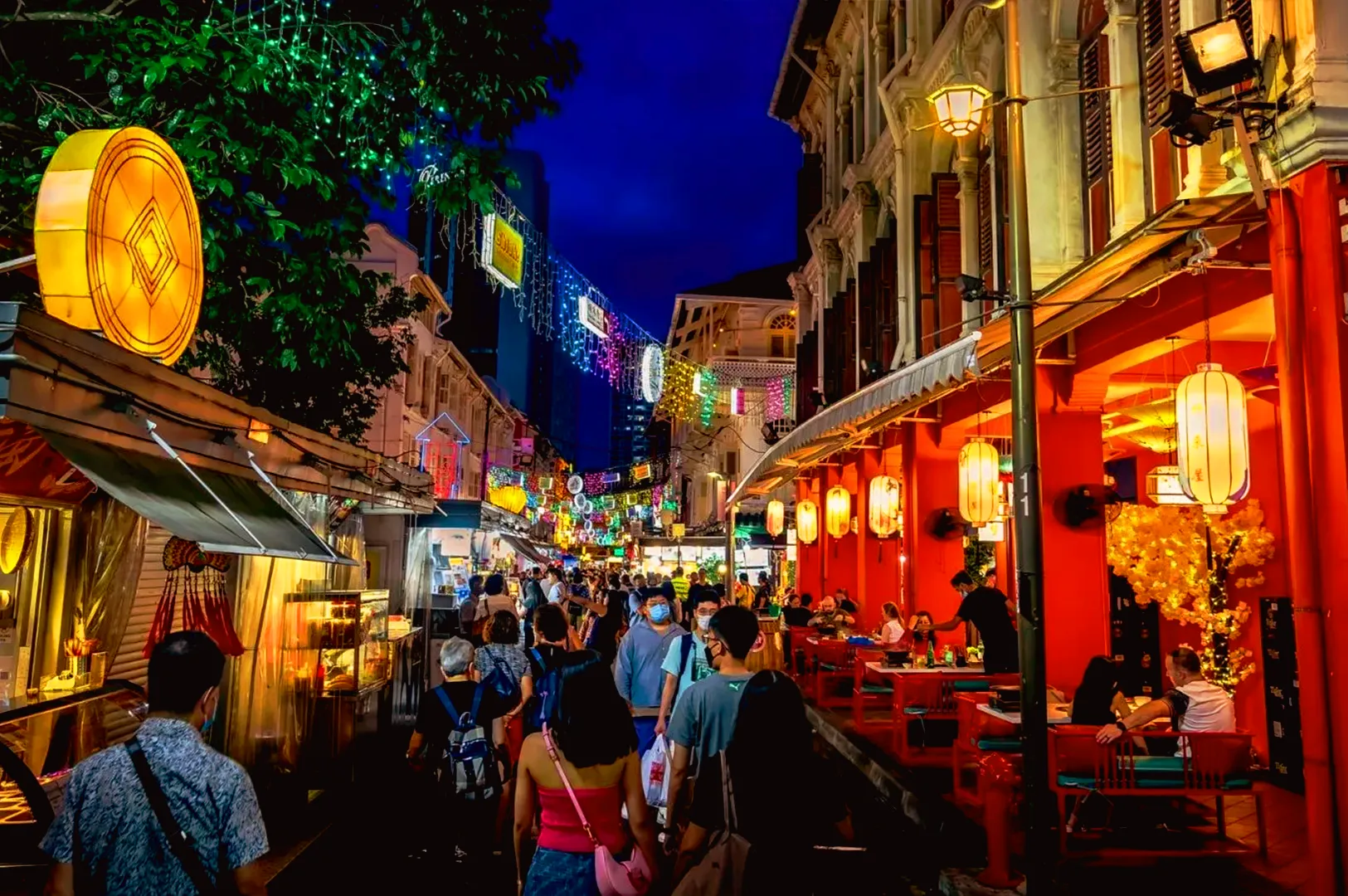
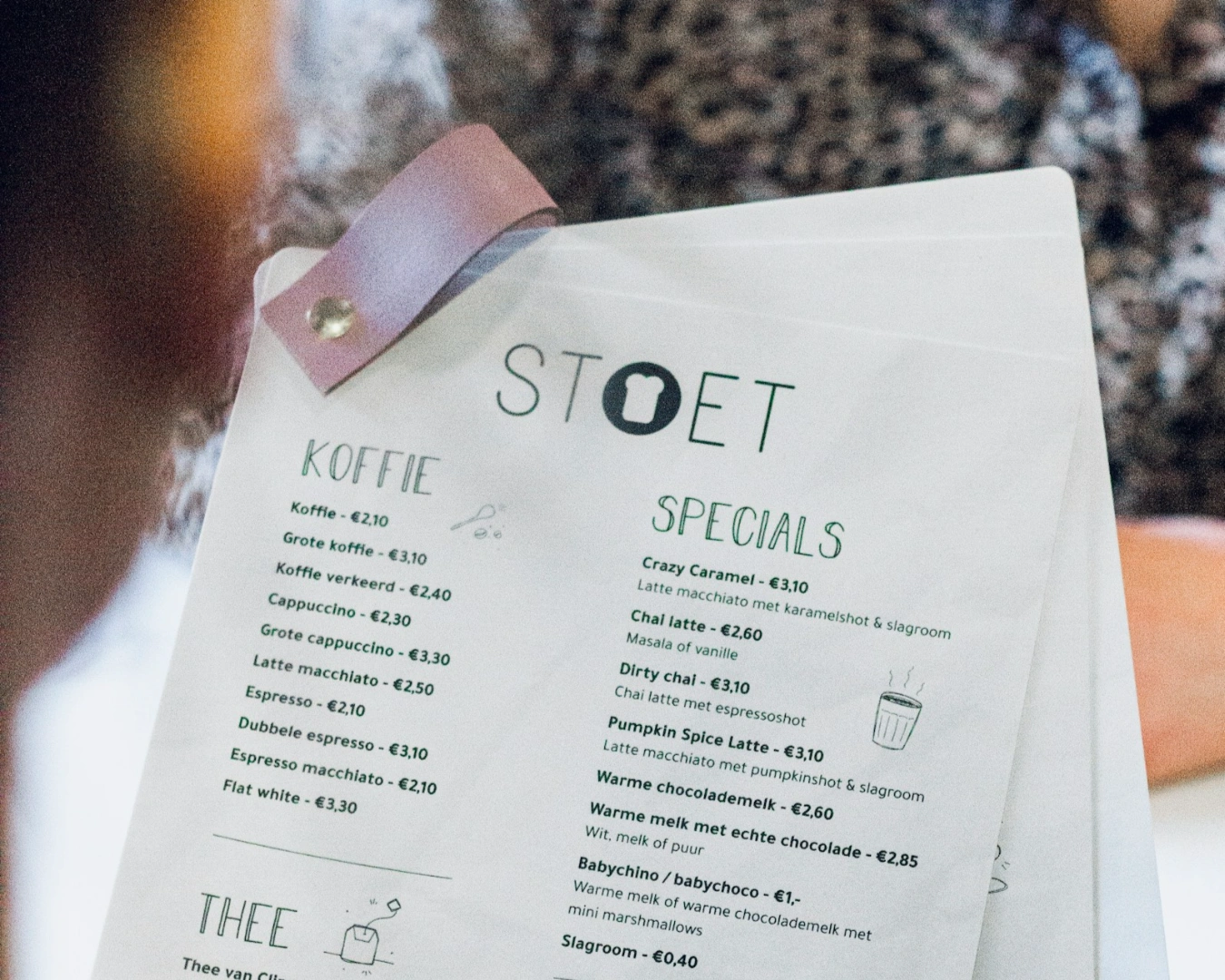
The Role of Color and Psychology
Color is the first thing the human brain registers, long before it processes text or shapes. Red and yellow are famously used in fast-casual settings to stimulate appetite and speed, while greens and muted earth tones signal health and slow-paced dining.
Choose a palette that reflects your price point and service style. A high-end omakase concept using bright neon pink will confuse the market. Similarly, a family-style prata shop using muted greys may appear cold and uninviting. Your colors should do the heavy lifting of setting the mood so your staff does not have to work twice as hard to convince the guest once they sit down.
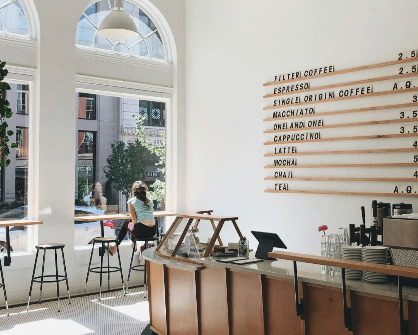
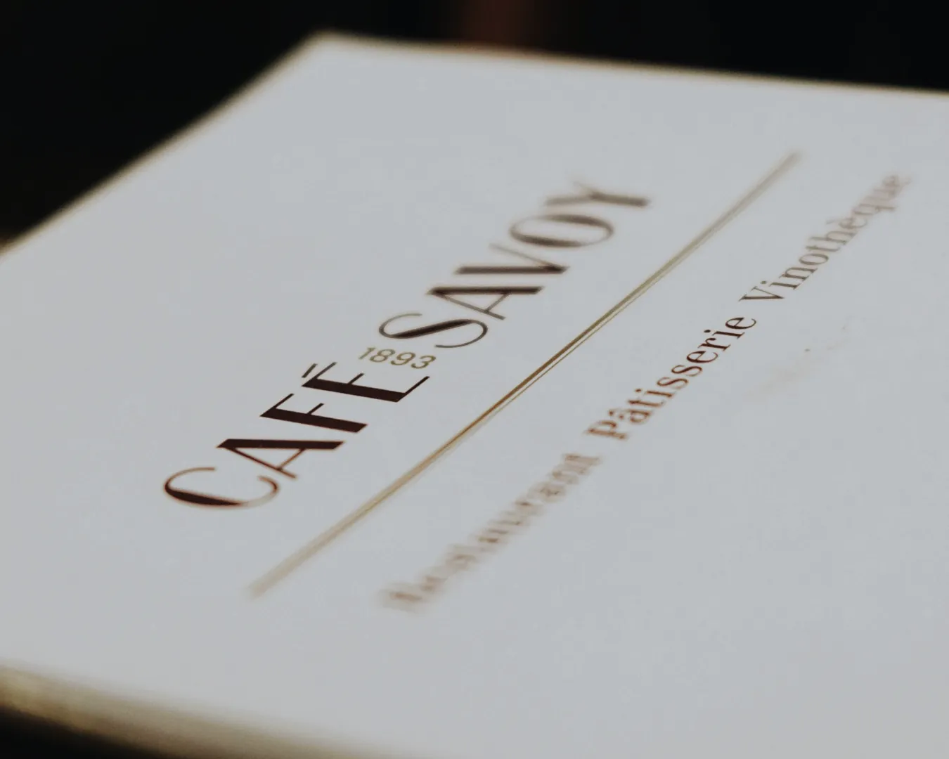
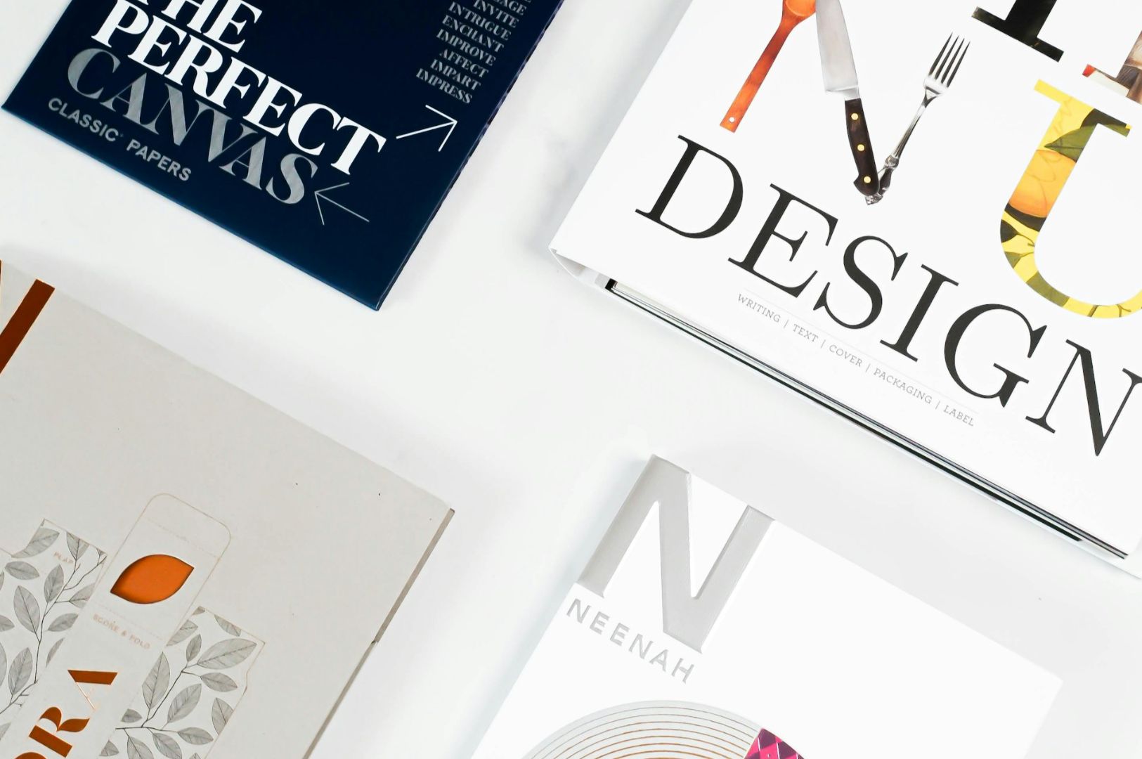
Typography as a Brand Anchor
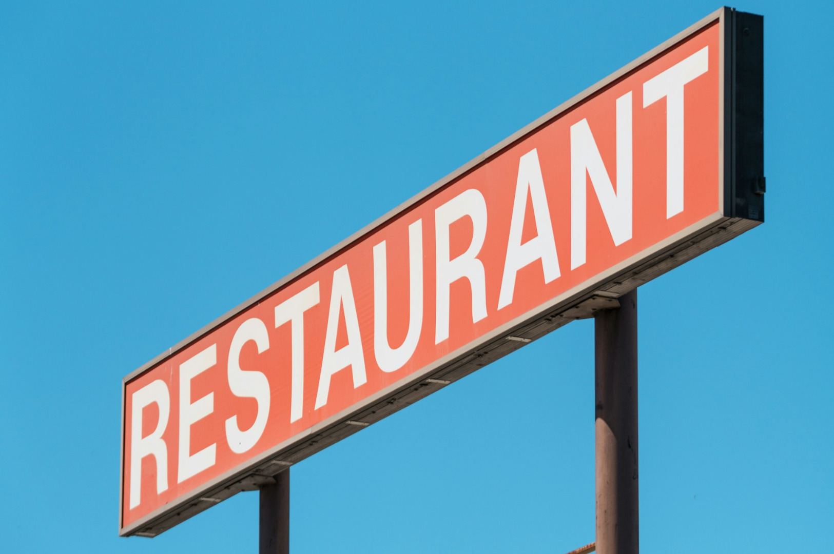
The font you choose carries more weight than the icon itself. Typography communicates personality. A bold, sans-serif font suggests modern efficiency. A classic serif suggests heritage and reliability.
Avoid trendy fonts that will look dated in eighteen months. You are building a business for the long term. Choose a typeface that is clean, professional, and reflects the “voice” of your kitchen. If your food is honest and straightforward, your typography should be too. Clarity is always more persuasive than decoration.
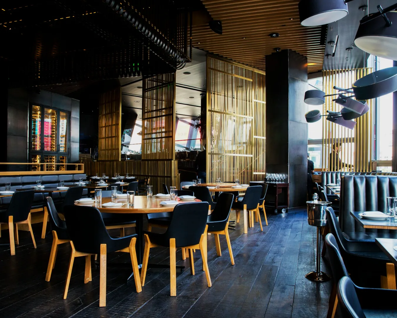
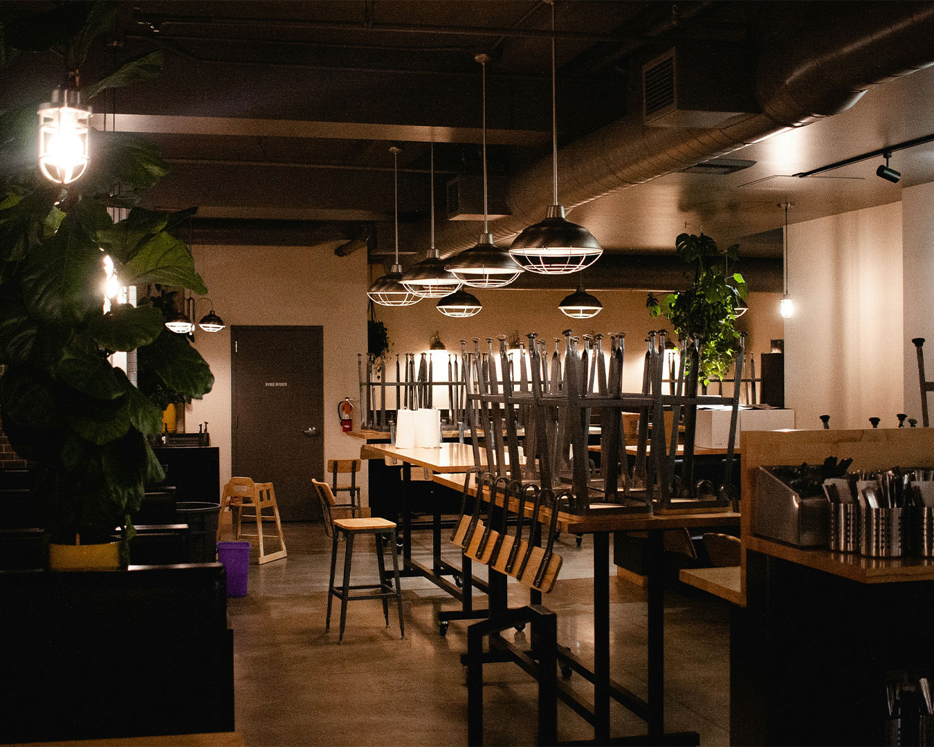
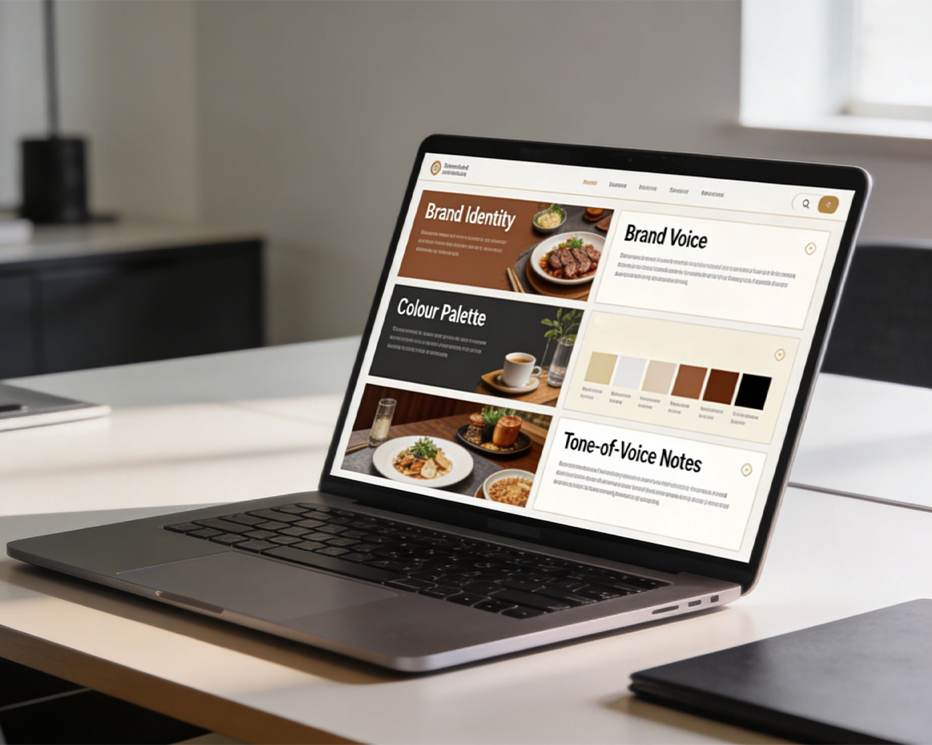
Beyond the Screen
A logo is a tool for recognition. It should create a cohesive thread through your entire operation. It should appear on your staff uniforms, your floor mats, and your digital receipts with the same level of impact. Consistency is how you build a brand in the mind of a Singaporean diner. When they see that specific mark, they should immediately recall the taste of your food and the quality of your service.
A Quiet Review of Your Visuals
Take a walk out of your shop right now. Stand on the opposite side of the road and look at your signage. Is it the clearest thing on the block? If you find yourself having to explain what your logo represents, it is likely working against you rather than for you.
Branding for restaurants is about clarity. We can help you strip away the clutter and find a visual identity that actually drives foot traffic. Let us perform a brand audit to see if your current logo is helping or hurting your bottom line. We can review your digital and physical presence together.