
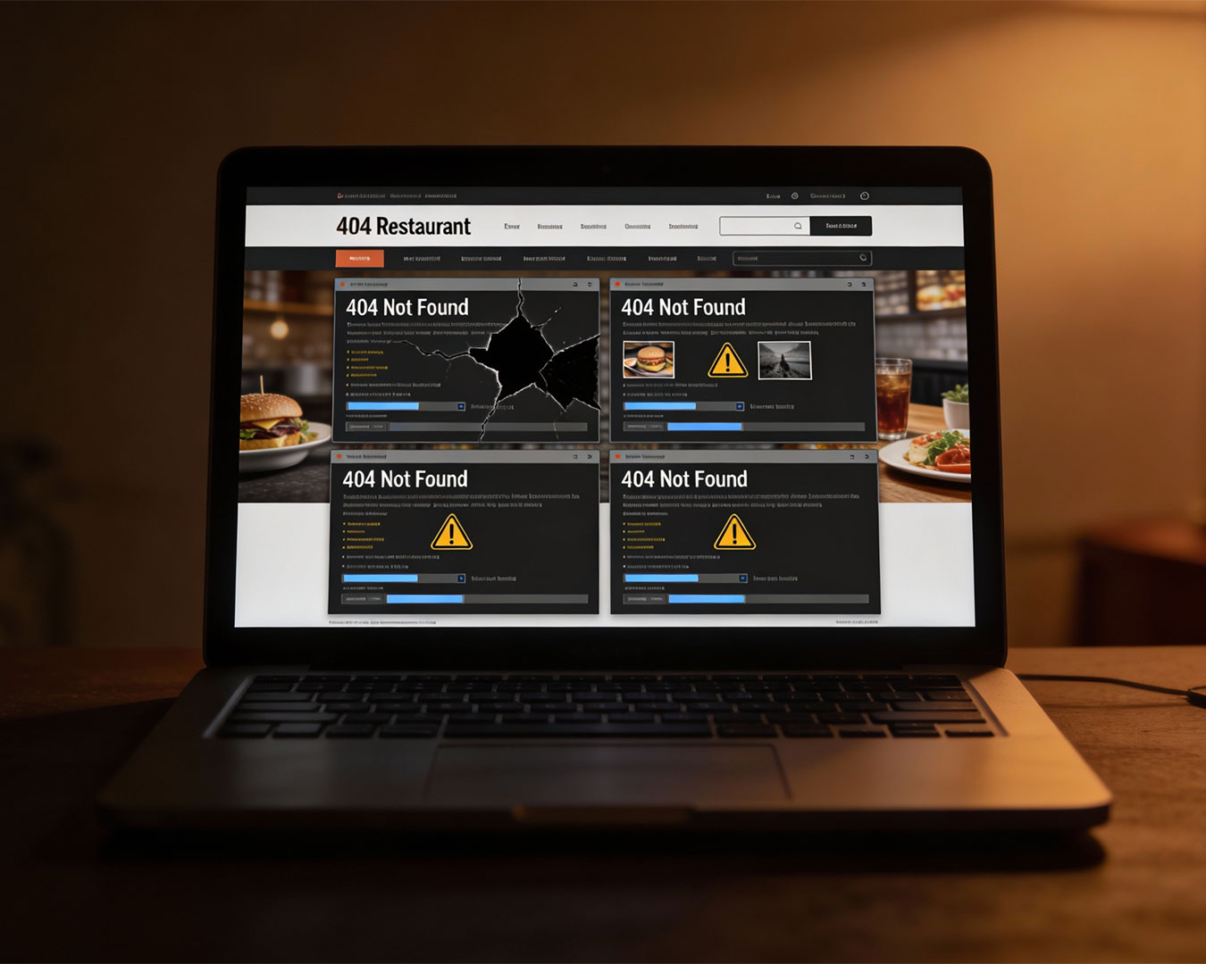
How many potential diners did you lose during the lunch rush because your digital menu wouldn’t load on a shaky 4G connection? Many operators poured their life savings into marble countertops and designer lighting, only to let a clunky, desktop-only interface gatekeep their front door.
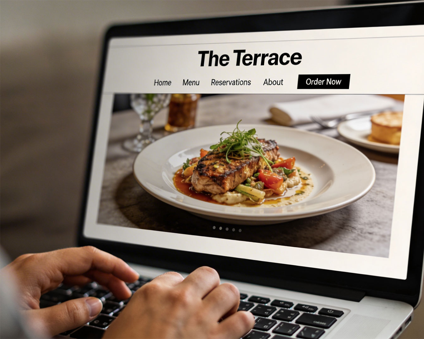
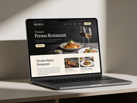
A mobile friendly restaurant website is not a digital vanity project. It is a vital piece of the service line. In an environment where the journey from “I’m hungry” to “Book Now” happens entirely on a five-inch screen, technical friction is equivalent to a “Closed” sign.
The Frictionless Path to a Table
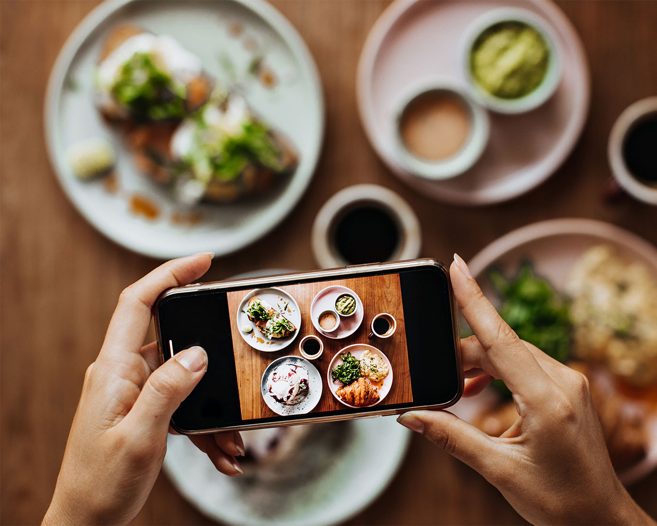
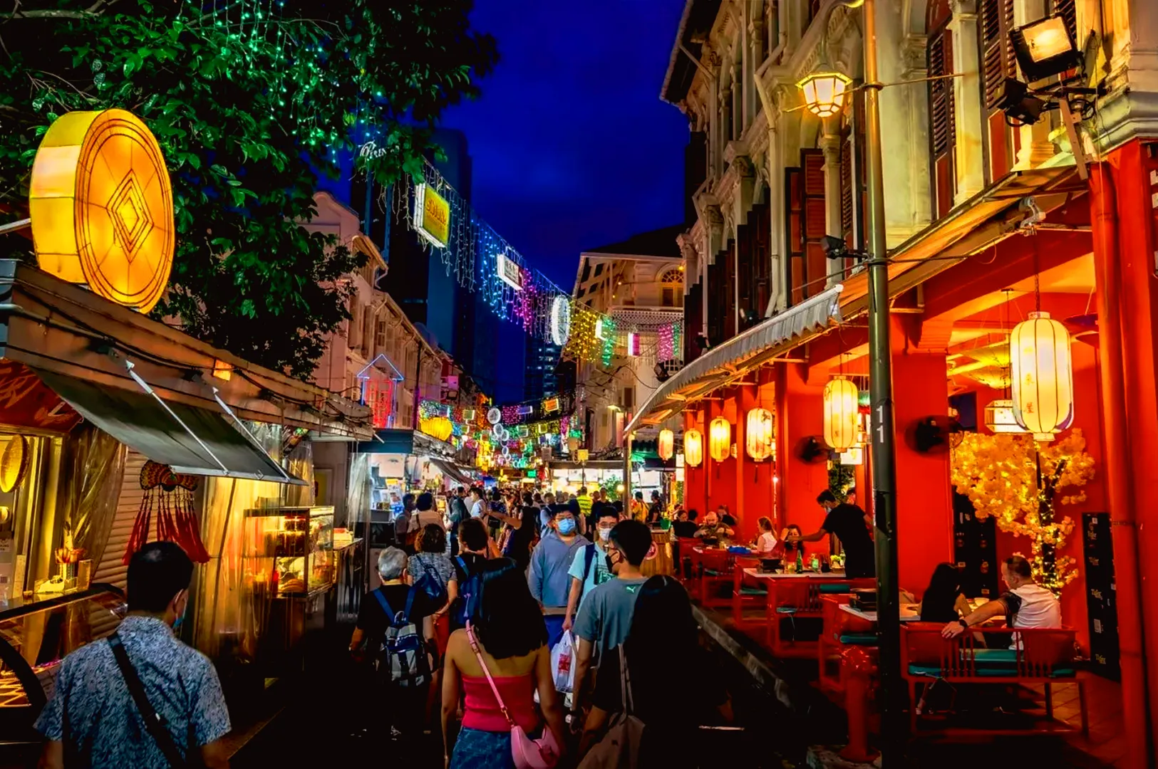
The logic of a mobile-first approach is simple: convenience is the primary driver of spontaneous dining. Most of your guests are searching for you while they are on the move. They are checking your location on a train or looking for a menu while walking down the street.
When you invest in a mobile friendly restaurant website, you are removing the friction between a craving and a reservation. A responsive site ensures that your “Book Now” button is always accessible and your phone number is a single tap away. If a guest has to search for your contact details for more than five seconds, they will bounce.
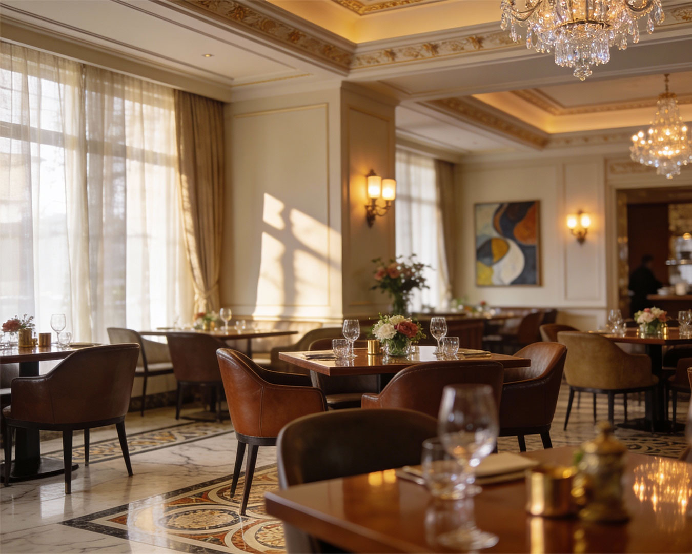
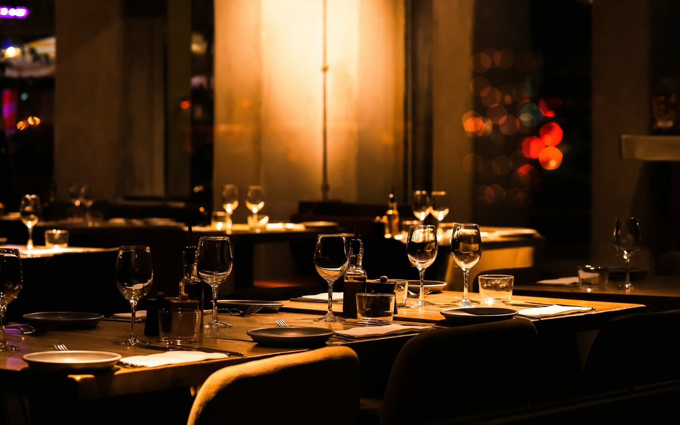
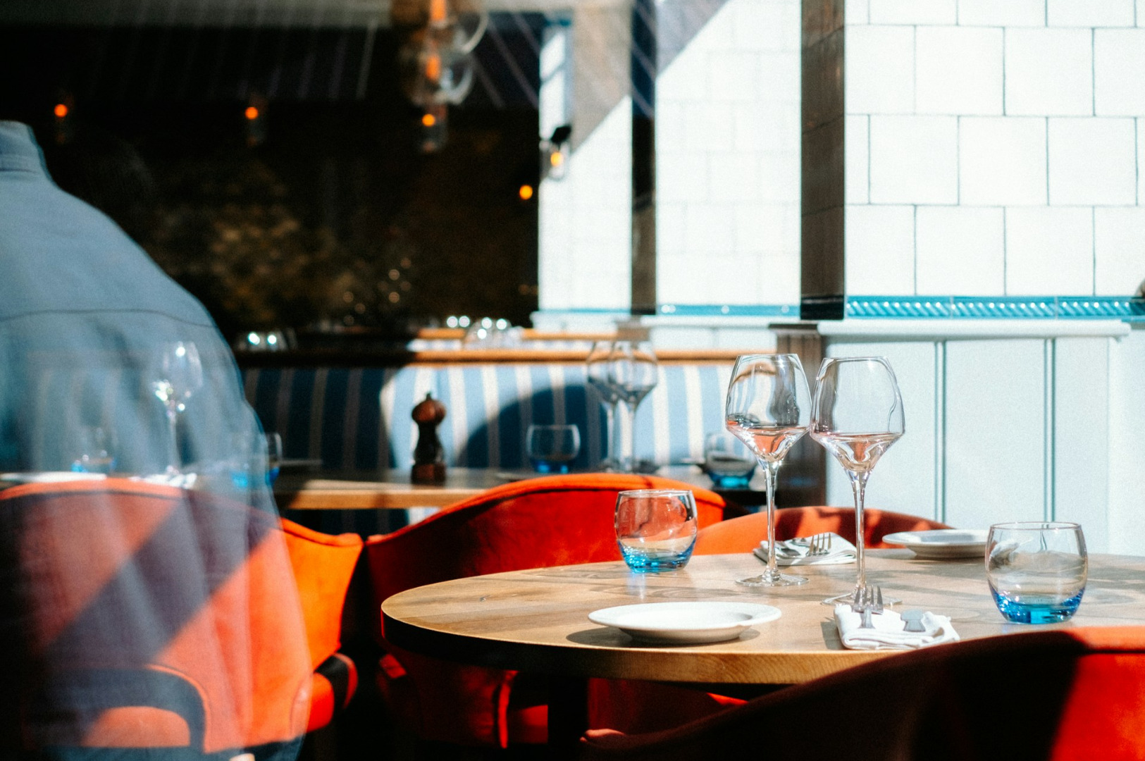
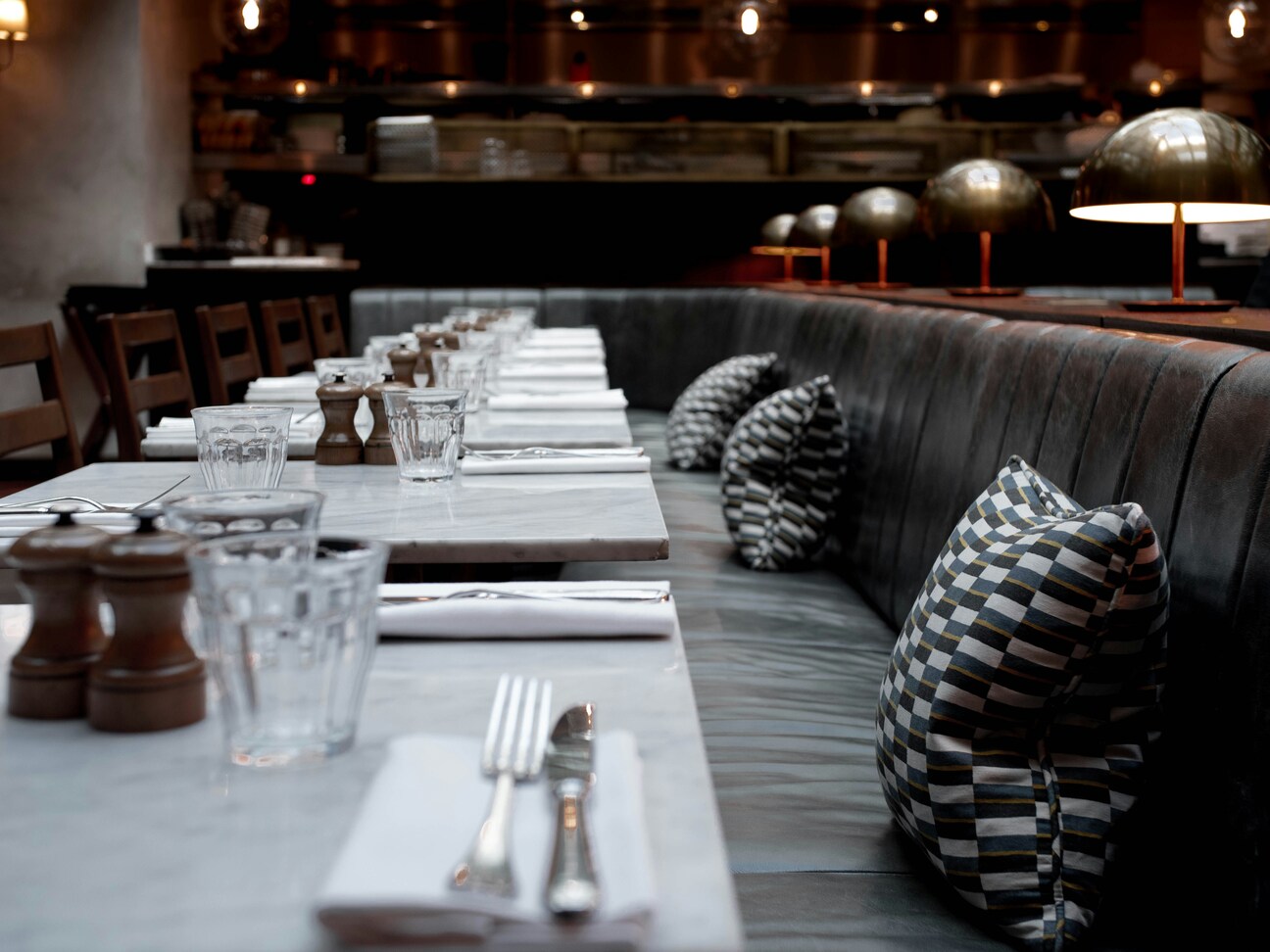
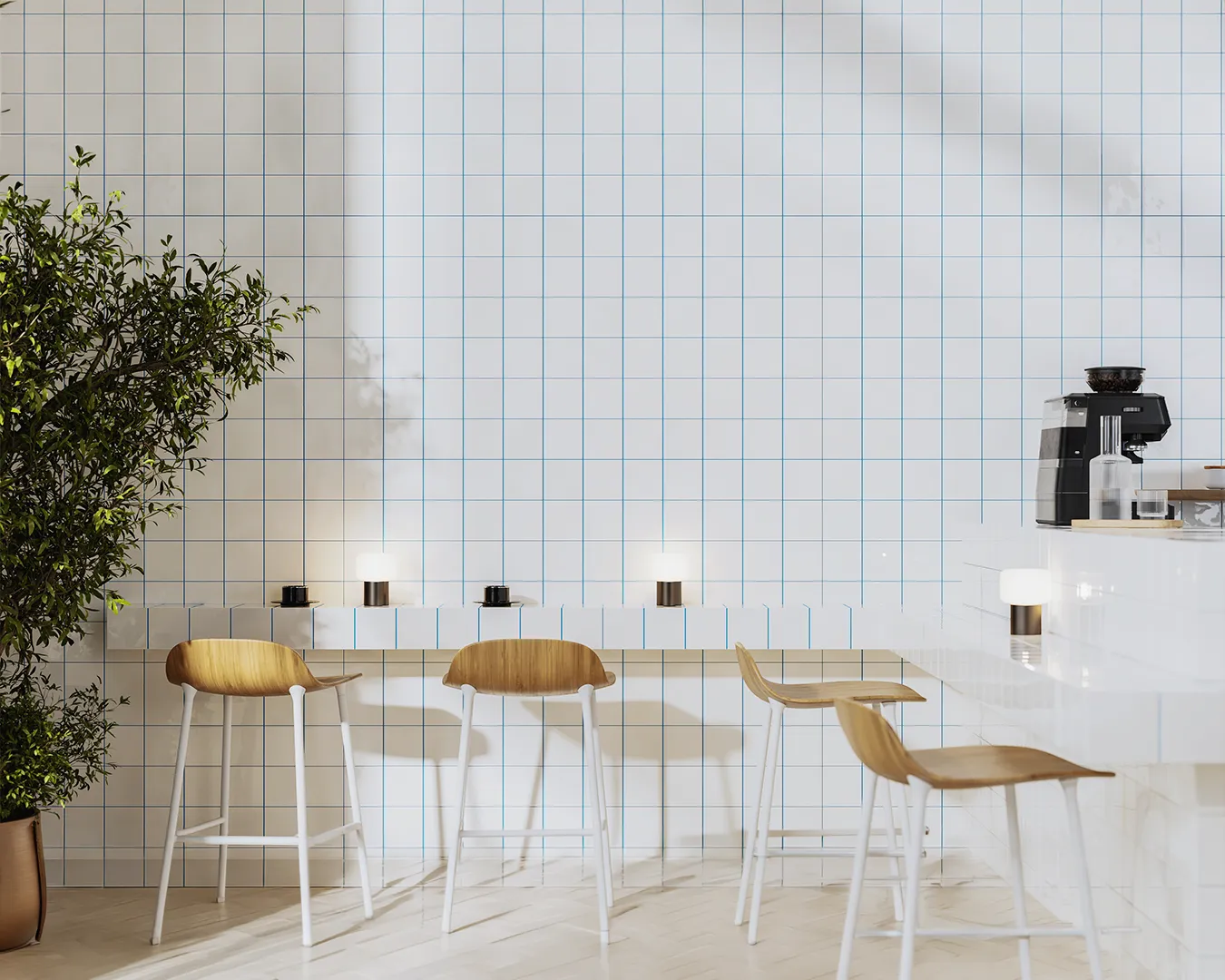
At Atelier Creations, we see this happen daily. Operators spend thousands on interior design but neglect the digital doorway that leads people into that space.
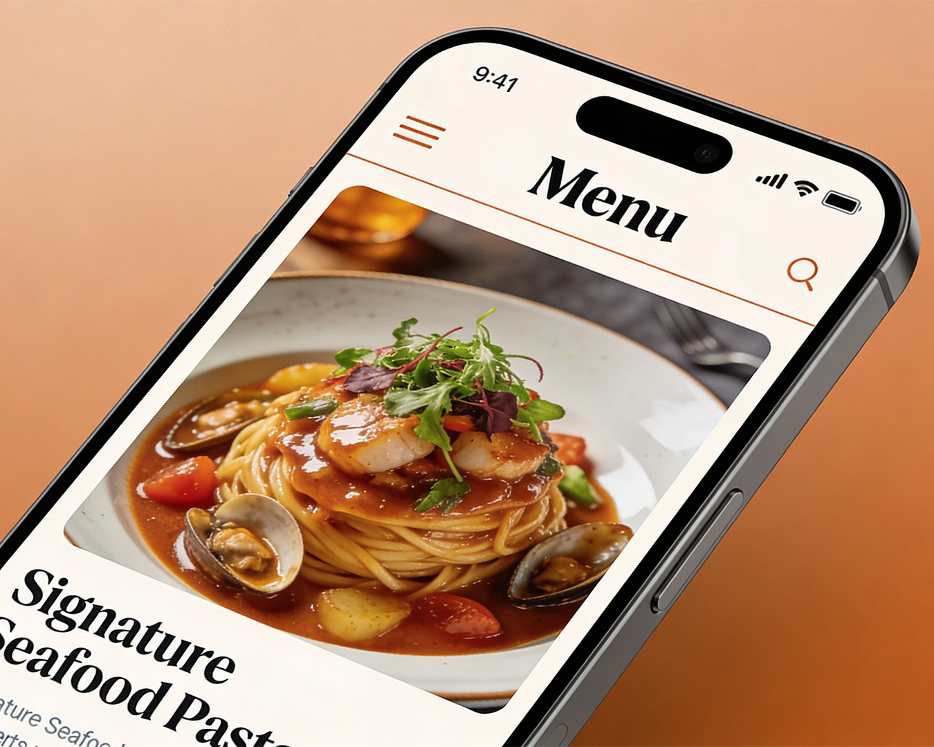
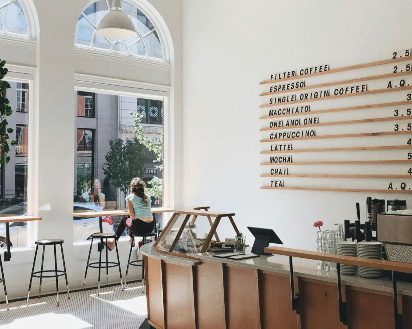
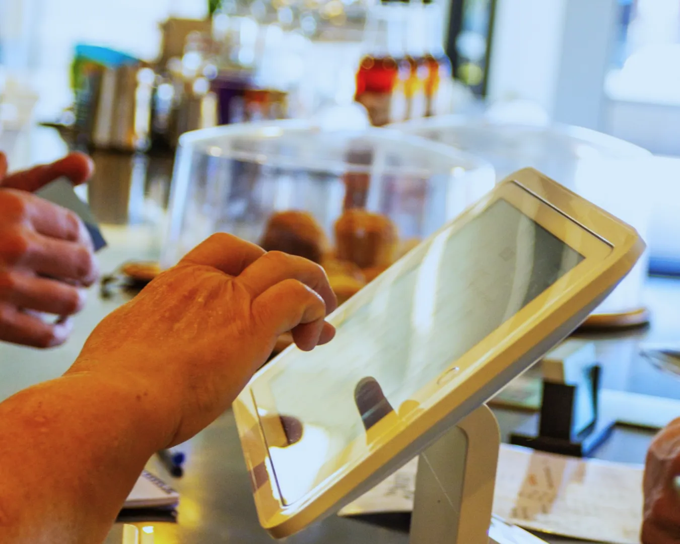
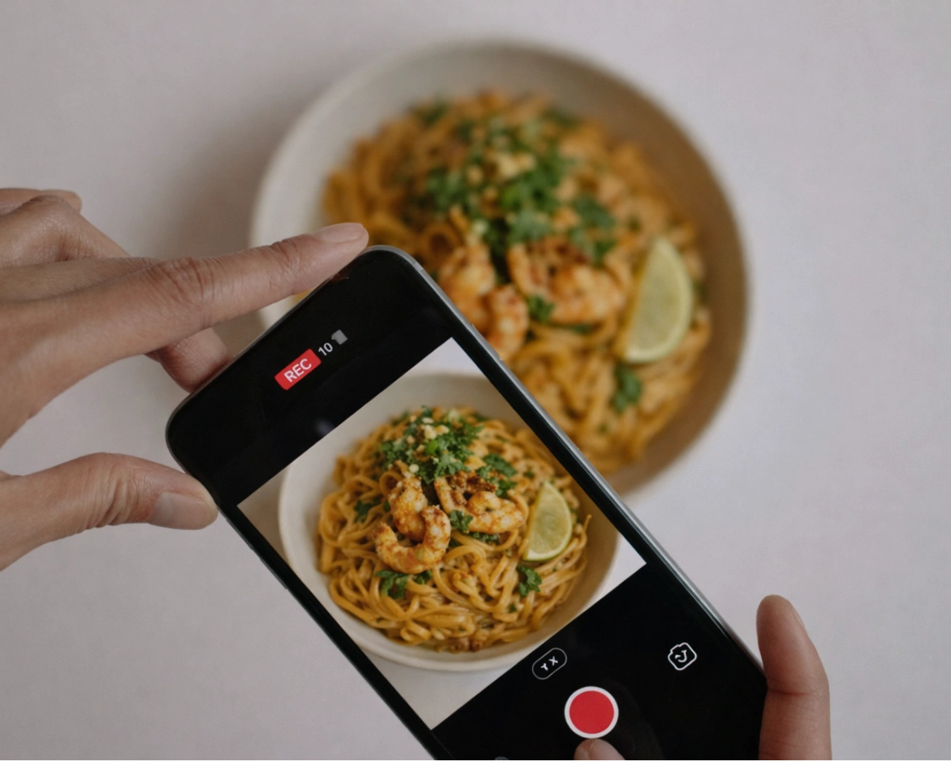
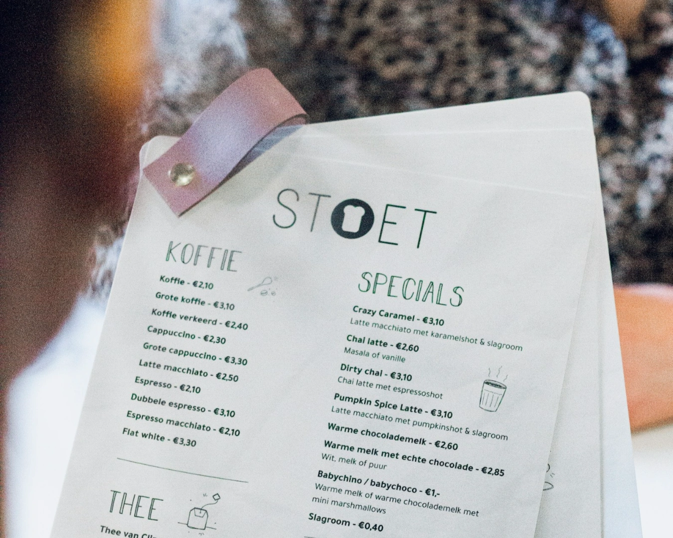
The Death of the PDF Menu
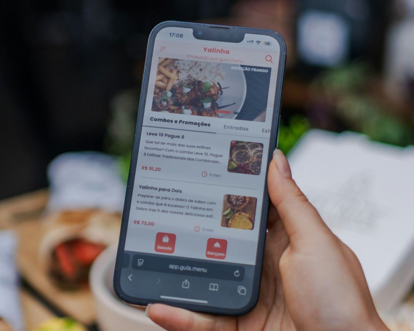
Stop forcing your customers to download a PDF file to see what you serve. It is a poor user experience that consumes data and clutters phone storage. More importantly, search engines cannot read the content inside a static image file as effectively as live text.
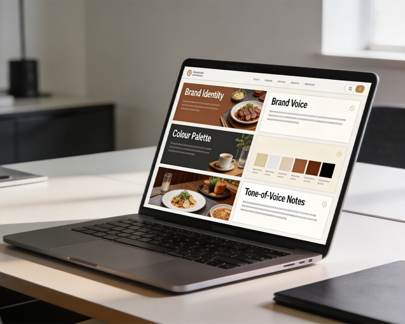
A true digital menu should be built directly into the site. It should load instantly and adapt to any screen size. This allows you to update prices or seasonal dishes in real time without needing a graphic designer to re-export a file. Efficiency in your digital workflow translates to better communication with your guests. When the information is clear and accessible, the guest feels that your business is organized and professional.
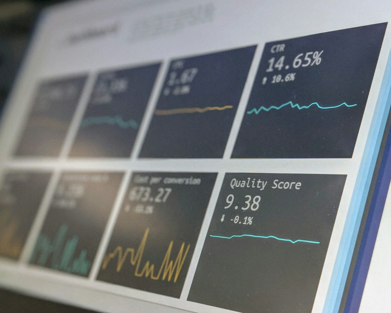
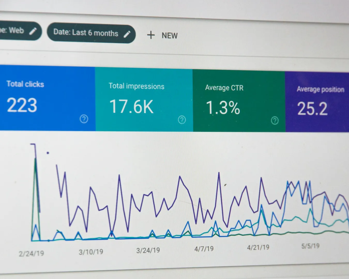
Search Visibility and Local Results

Google prioritizes sites that perform well on mobile devices. If two restaurants in the same neighborhood offer the same cuisine, the one with the better mobile experience will rank higher in local search results. This is not about complex algorithms. It is about catering to user behavior.
Building a high-performing website for restaurant operations means focusing on speed. A heavy site with uncompressed images will fail to load on a weak 4G connection. You want your brand to load before the customer changes their mind. Speed is a signal of quality. It tells the guest that you value their time as much as you value their patronage.
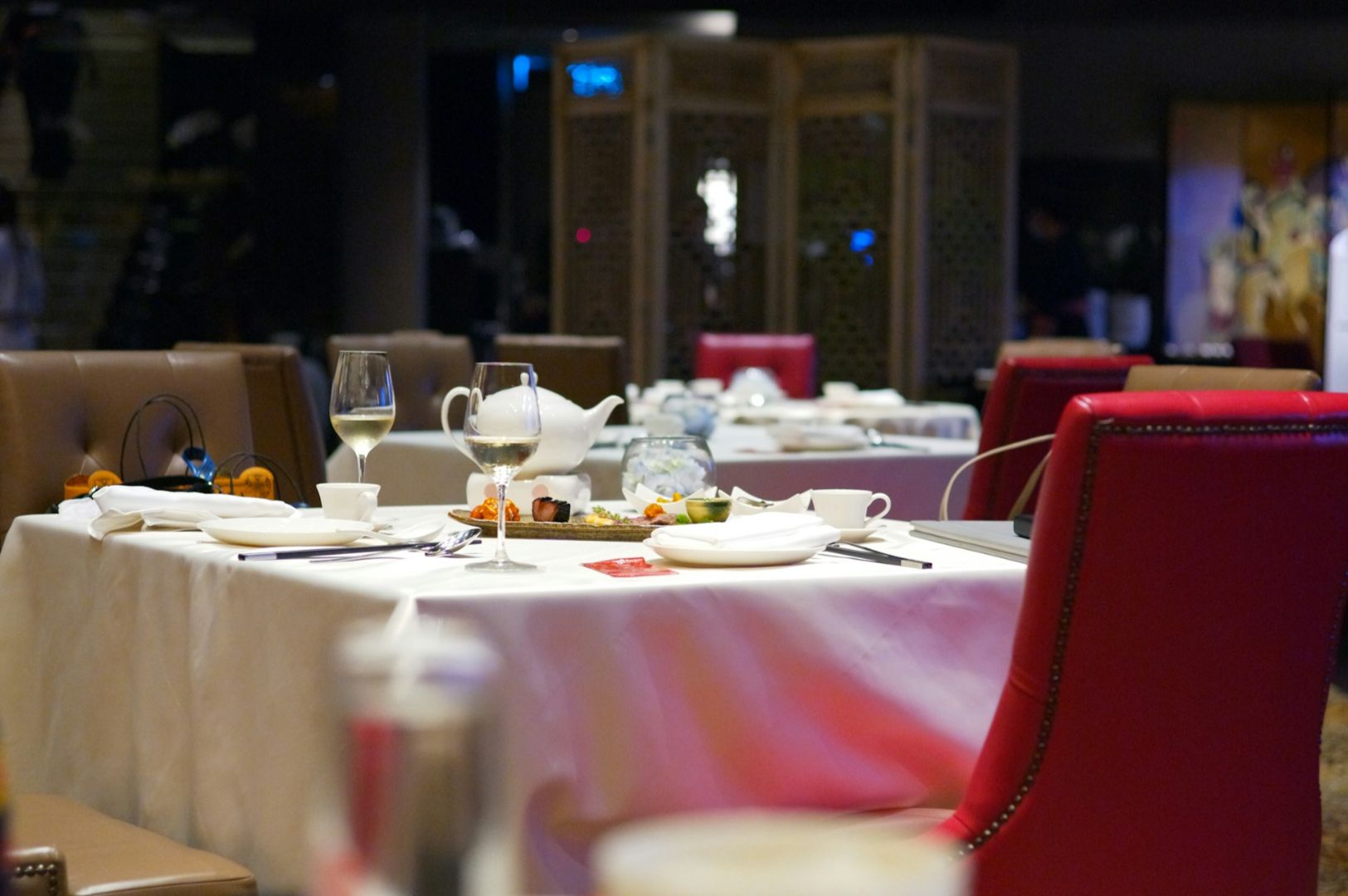
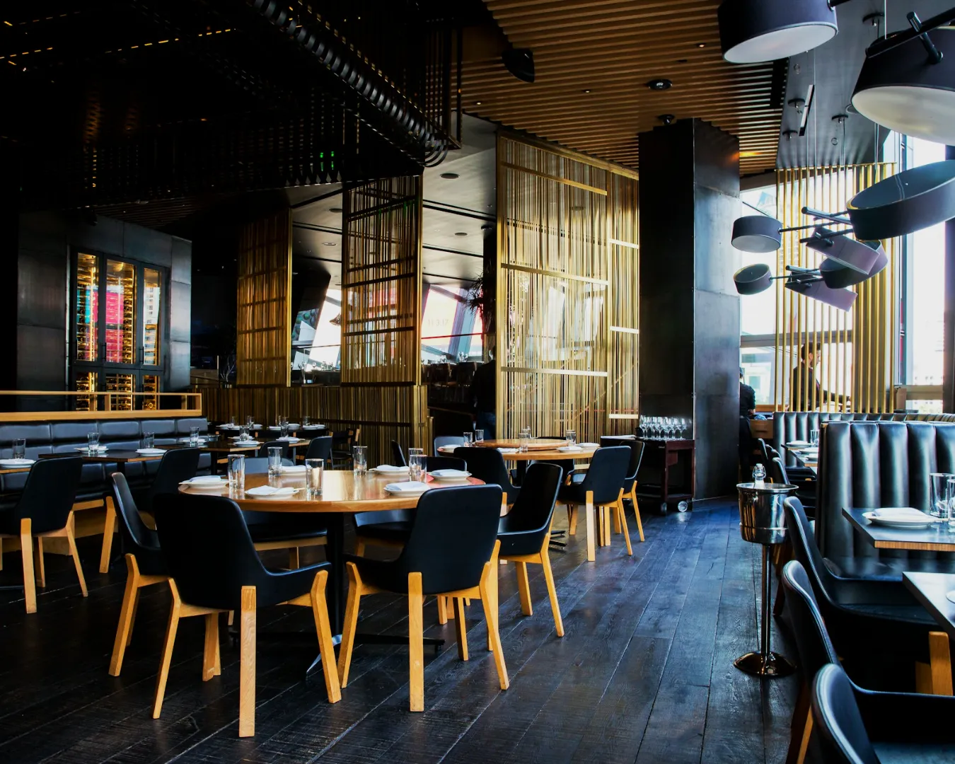
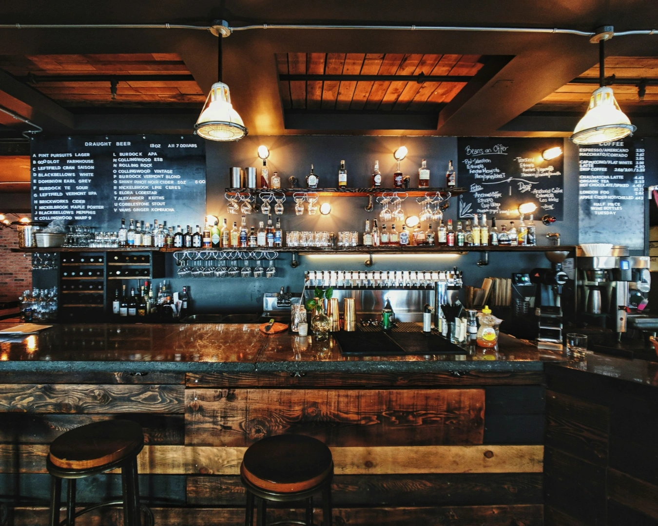
Digital Standards as a Brand Reflection

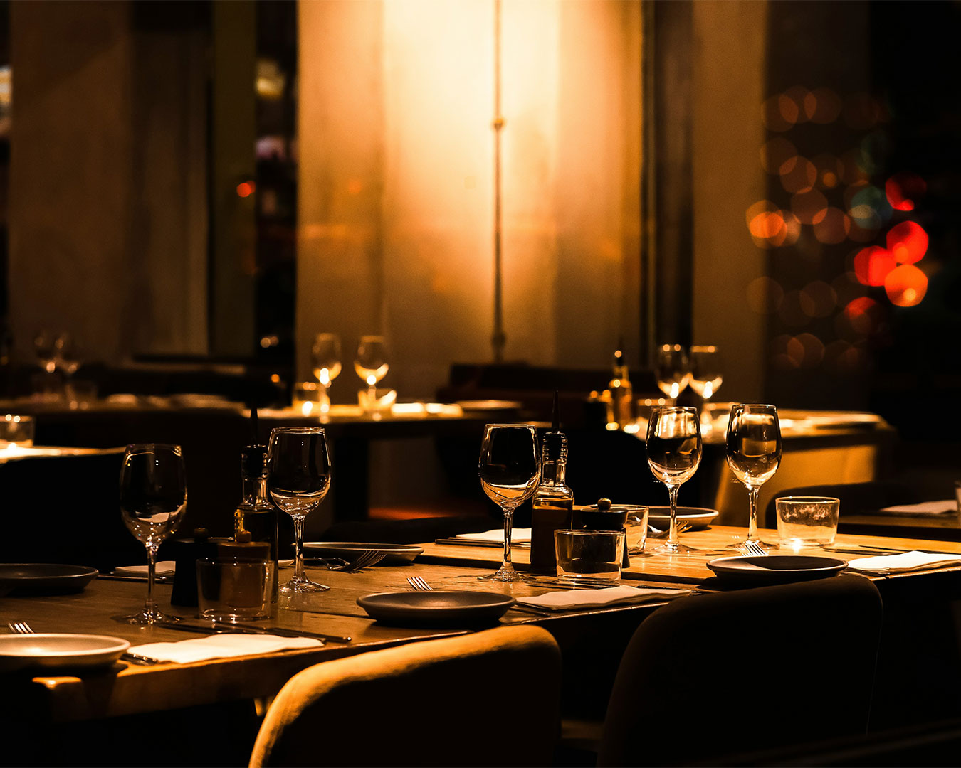
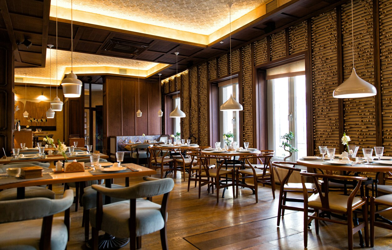
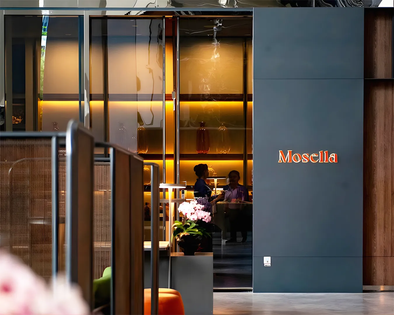
Your website is a reflection of your front-of-house standards. If the site is broken, slow, or outdated, a guest will naturally assume the service in the restaurant follows suit. Consistency across all touchpoints is how you build a resilient brand in Singapore.
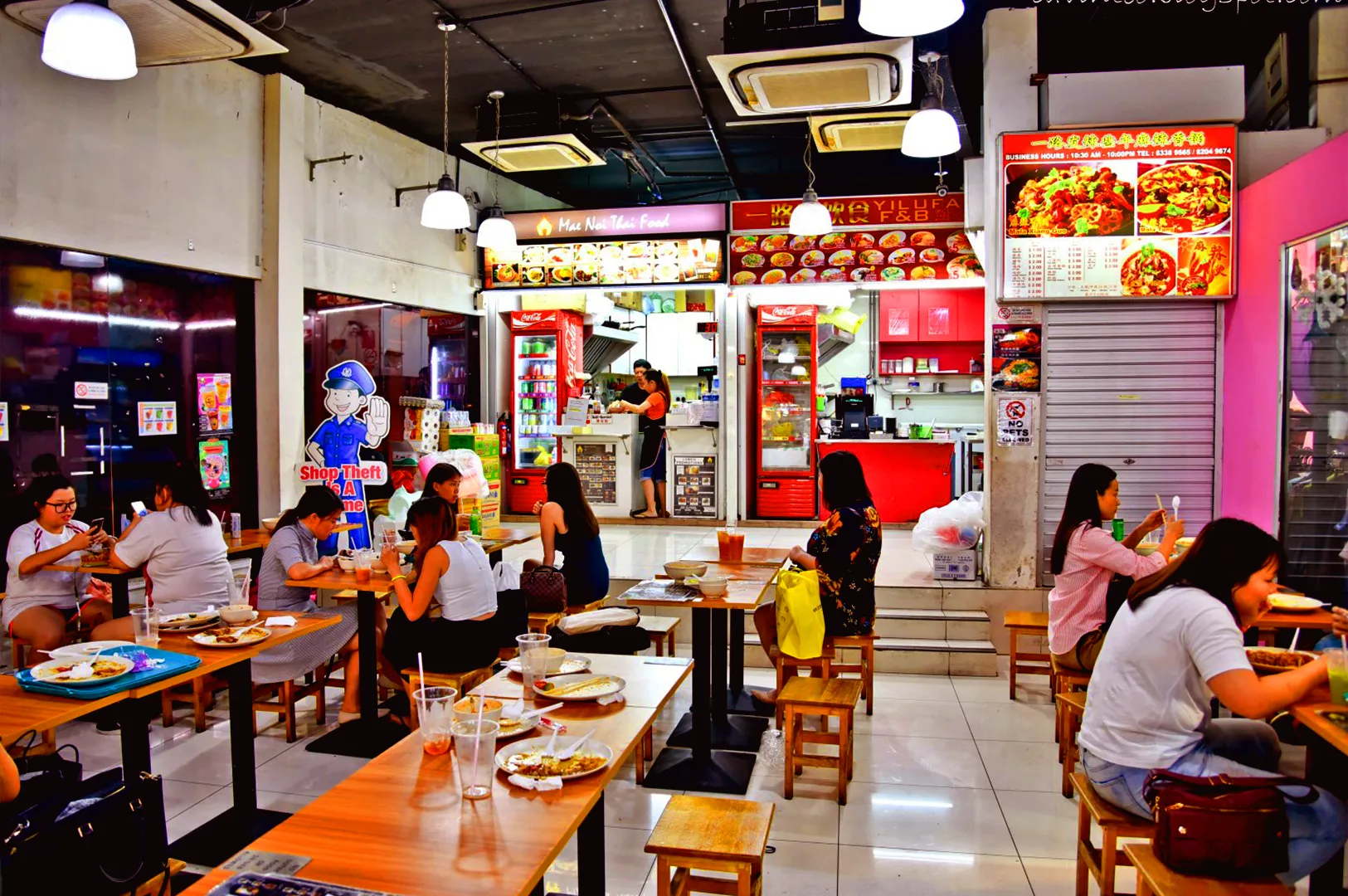
Your mobile presence should carry the same atmosphere as your dining room. If you are a high-end establishment, your site should feel elegant and sparse. If you are a casual bistro, it should be vibrant and direct. When the digital experience matches the physical reality, you build a sense of trust that justifies your price point.
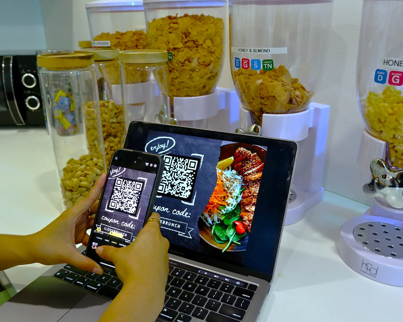
Protecting Your Direct Bookings
Third-party platforms and aggregators are useful, but they come at a high commission cost. Your website is the only channel where you own the relationship and the data. By providing a seamless mobile booking experience, you encourage guests to bypass middleman apps.
Every direct booking is a win for your margins. To achieve this, your site must be more reliable and easier to use than the aggregators. It must be designed with a “thumb-first” mentality, placing the most important information exactly where the user’s hand naturally rests on their phone.
Checking Your Digital Doorway

Take out your phone right now. Search for your restaurant and try to find your weekend specials or book a table for four. If the process feels clunky or if you find yourself getting frustrated, your guests are feeling the same way.
Technology should serve your kitchen, not complicate it. We can help you look at your current digital setup and identify exactly where you are losing potential diners. Let us conduct a brand audit to see how your site compares to the current market standard. We can review your mobile presence together and find a more efficient way to fill your seats. This consistency across your digital and physical spaces is crucial, as we explore in Same Brand, Same Time, Every Time: The Logic of Consistency.


