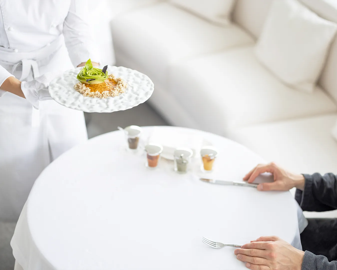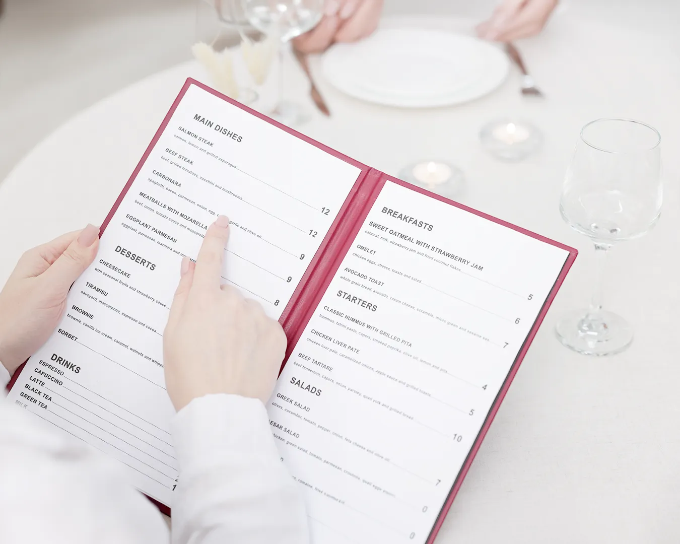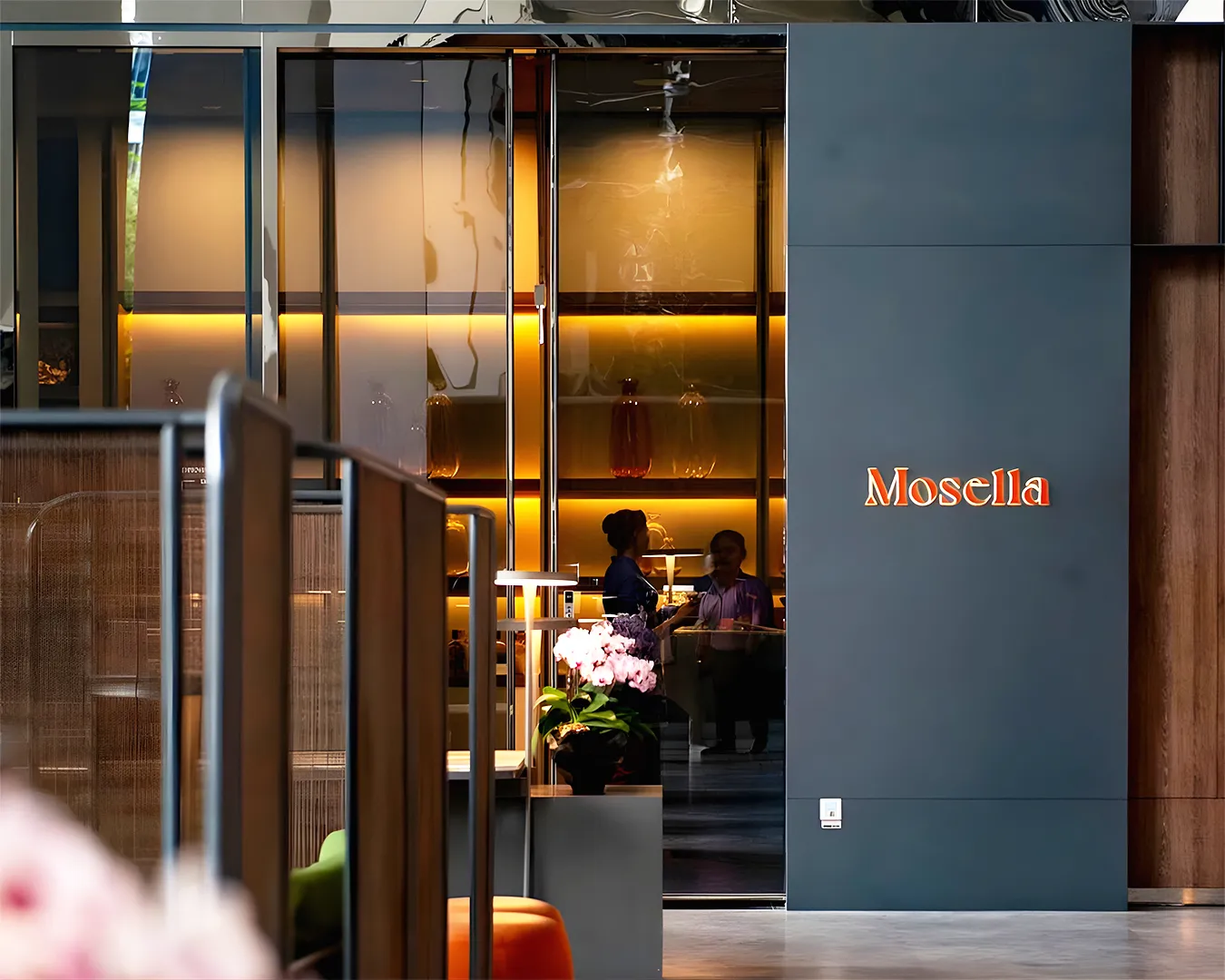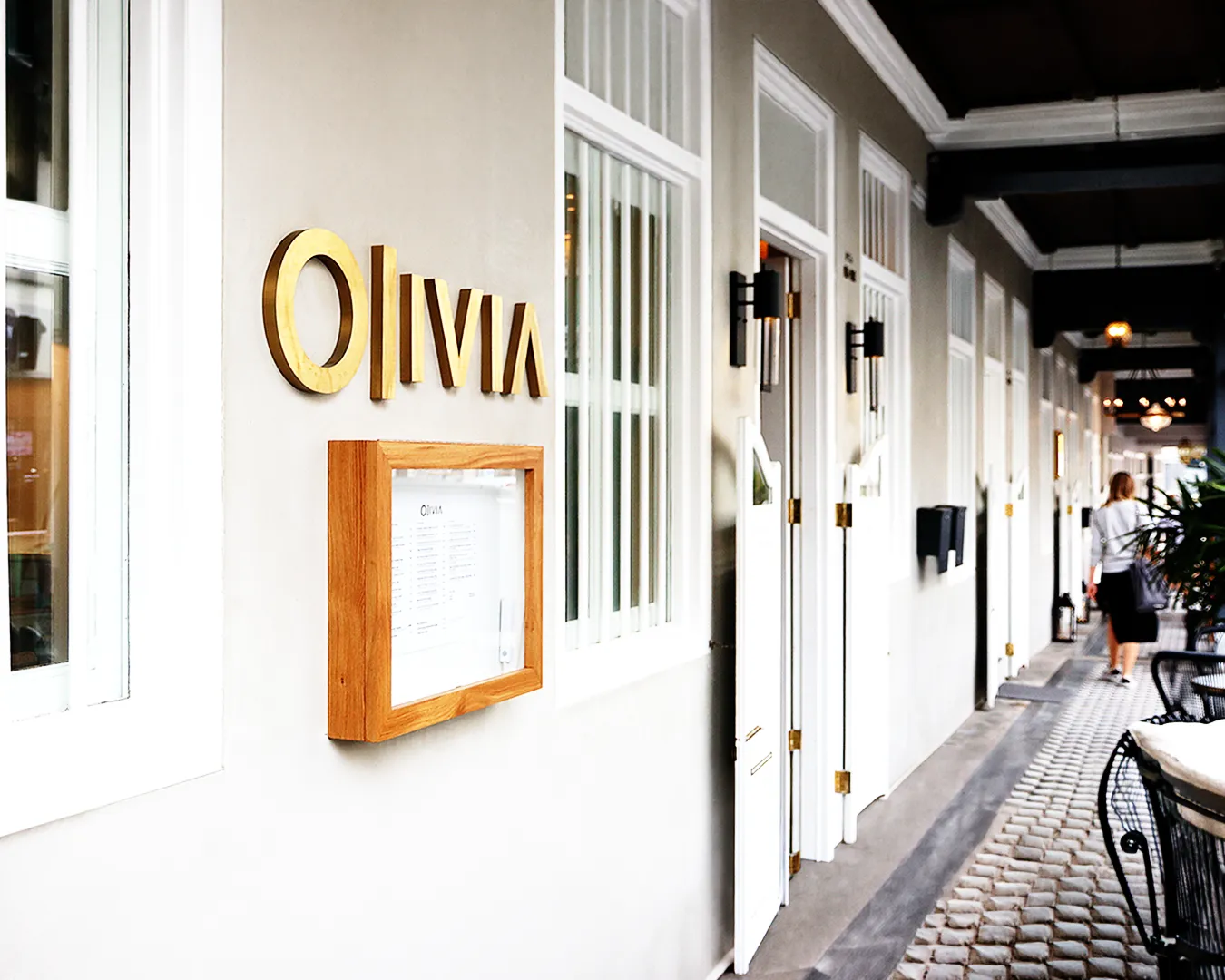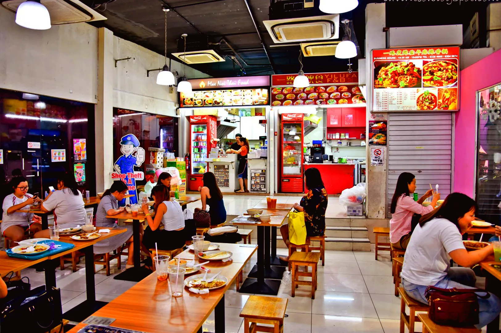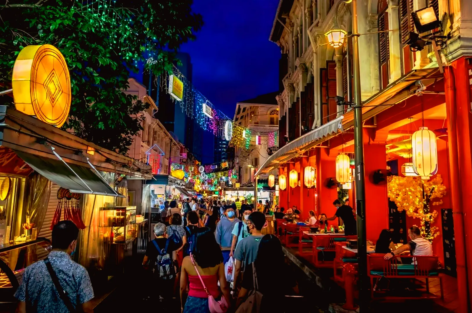
When launching a new restaurant concept in Singapore, owners often arrive at the branding phase with a long wishlist of visual ideas. A common pitfall is the insistence on a broad, five-colour palette to represent every aspect of the venue, from the interior soft furnishings to the cocktail menu.
While a rich array of colors feels expressive on a moodboard, executing it across real-world dining touchpoints creates visual chaos, dilutes brand recall, and inflates production costs. Saying no to a five-colour palette protects the integrity of the restaurant identity, ensuring the visual framing remains focused, elegant, and commercially viable.
The Operational Strain of an Over-Complicated Palette
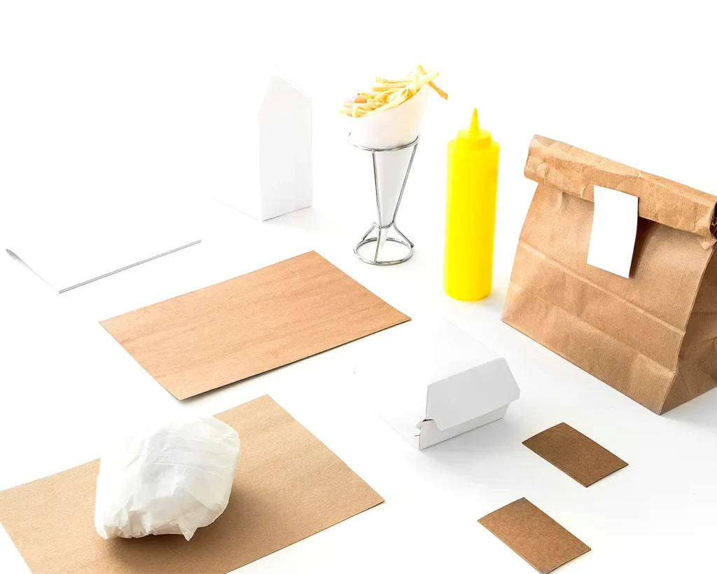
A restaurant visual identity must function seamlessly across dozens of physical and digital formats. What looks balanced on an agency presentation slide rarely translates cleanly to physical touchpoints.
Excessive color variation introduces structural friction across operations:
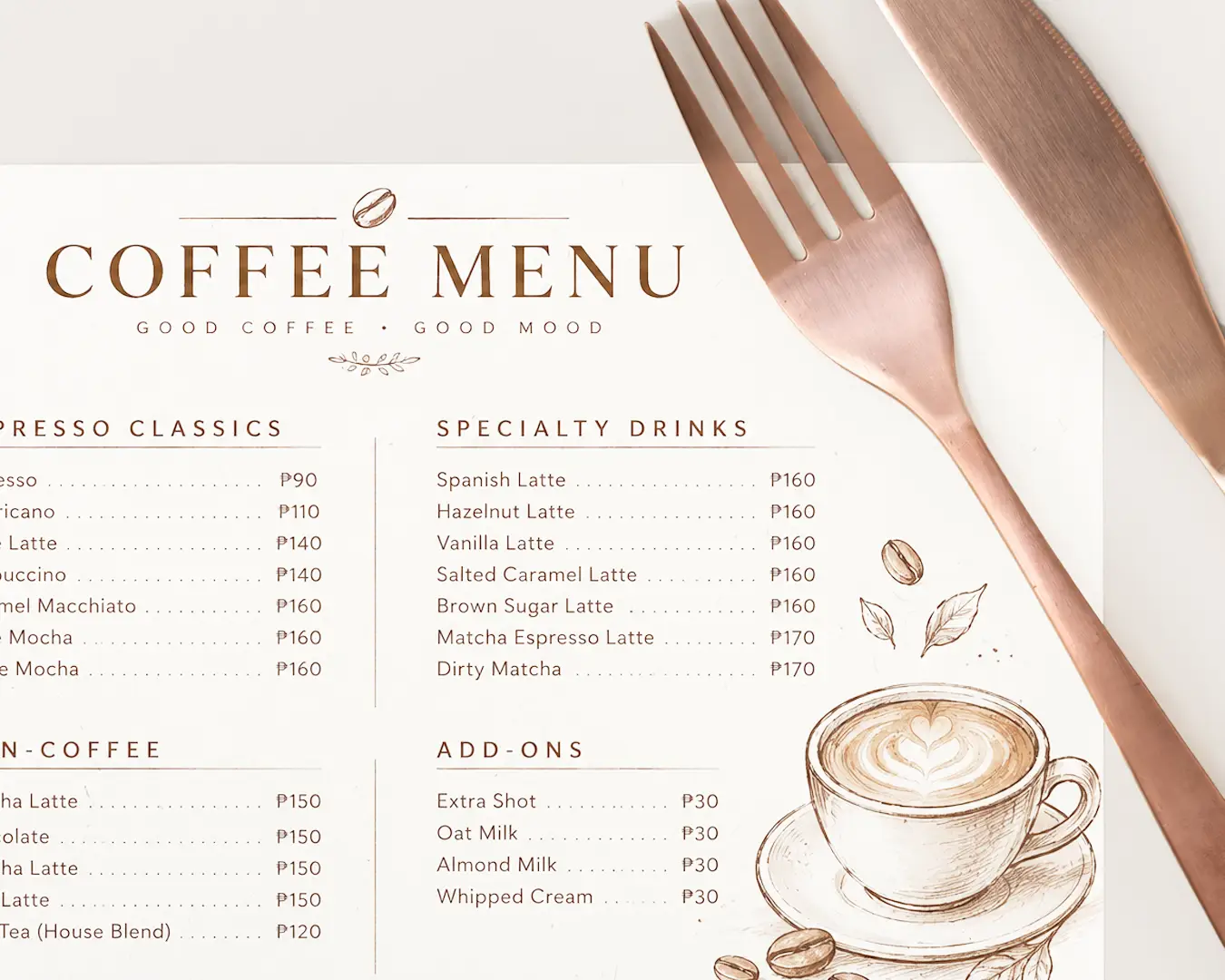
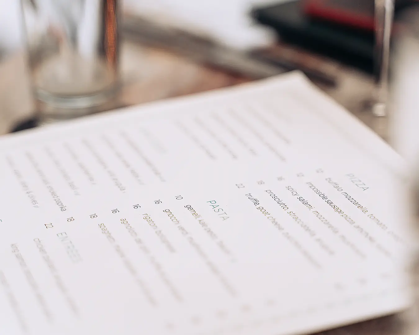
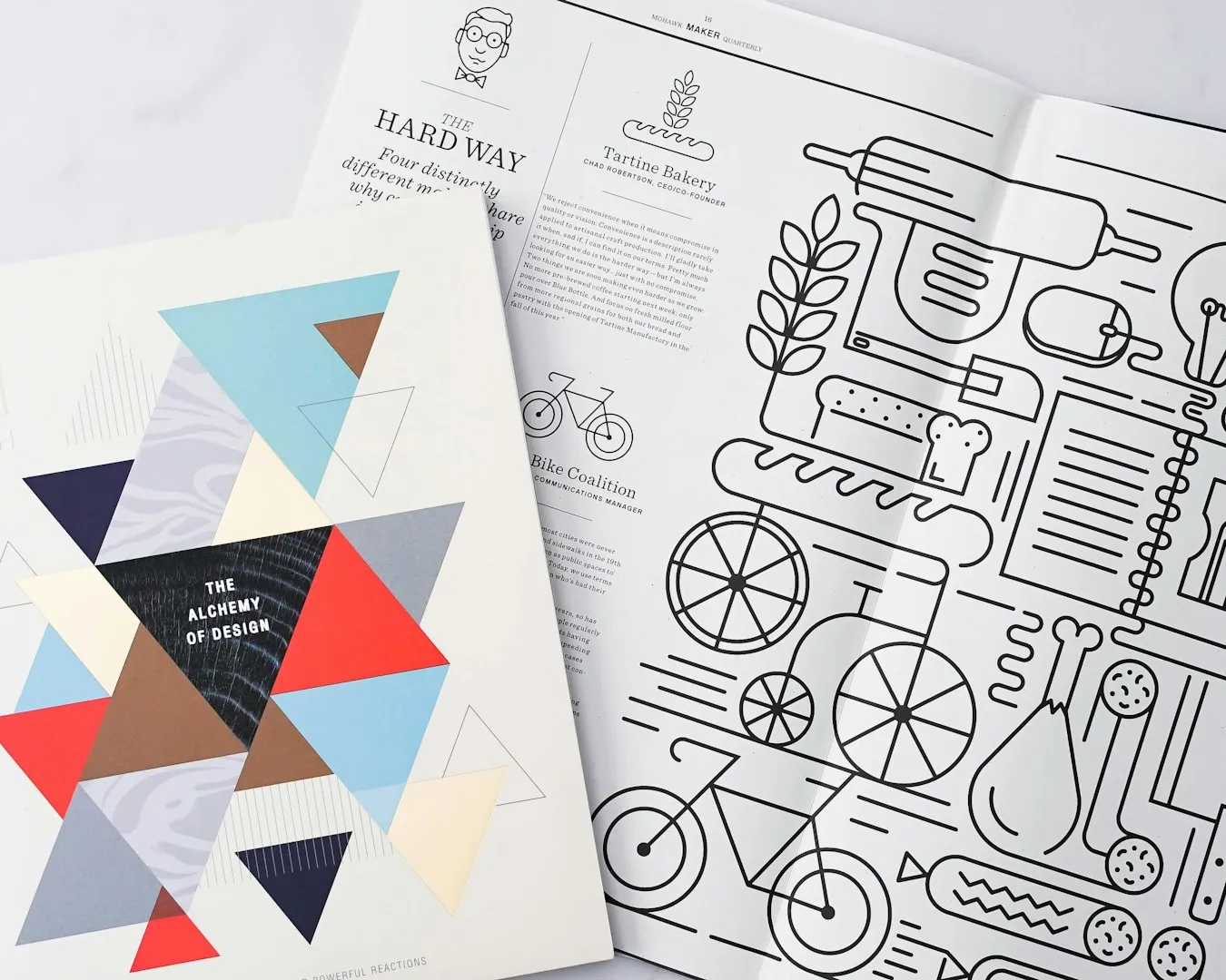
- Inconsistent Print Reproduction: Matching five distinct custom spot colors across textured paper stocks, debossed leather, coaster boards, and takeaway bags creates severe print consistency issues.
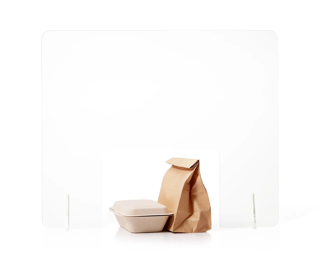
- Higher Packaging Overhead: Every additional spot color increases plate setup fees and unit costs for custom packaging, napkins, and takeaway containers.
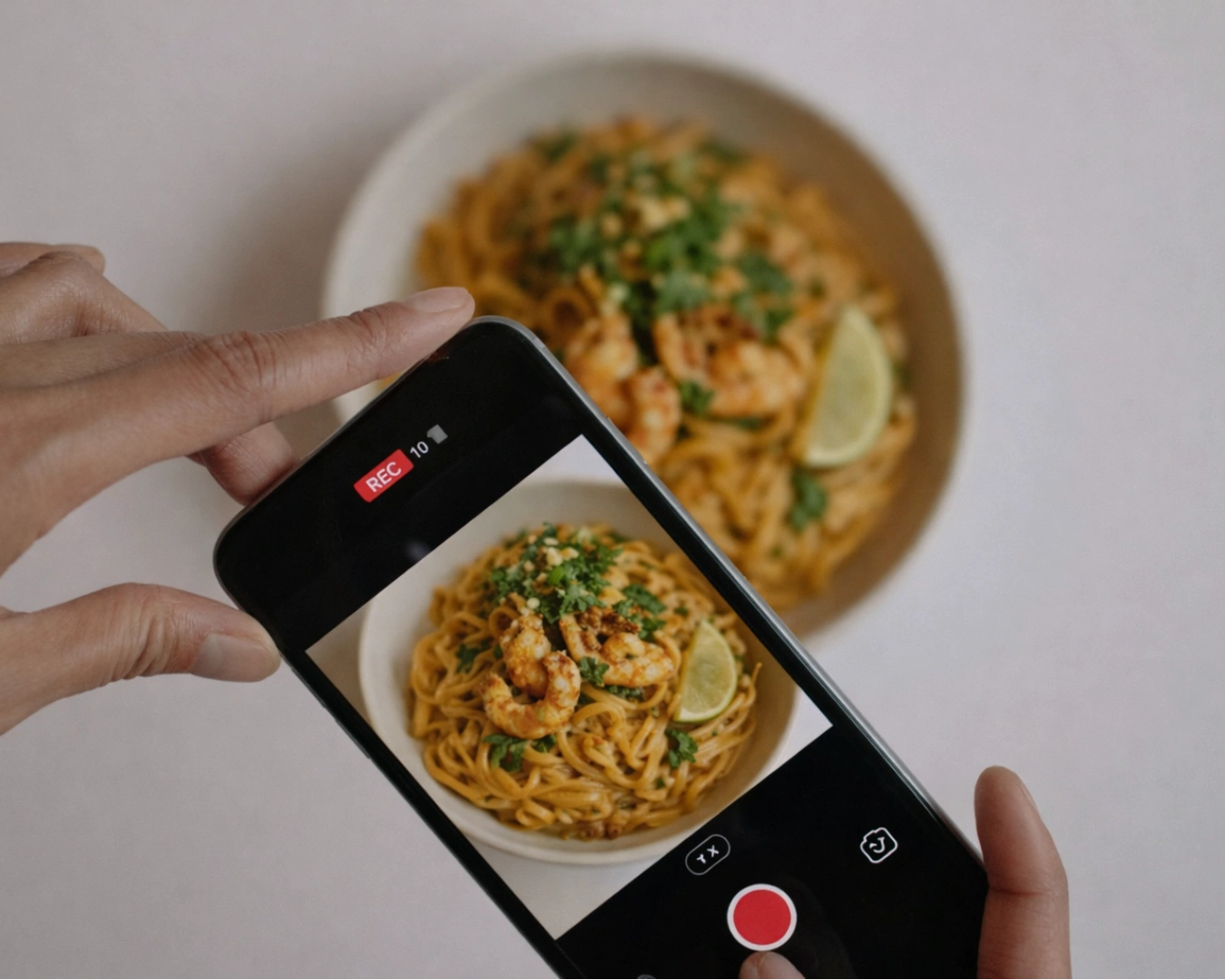
- Digital Dilution: On mobile screens, social media grids, and third-party delivery apps, a cluttered palette loses impact, making the venue look unfocused and unmemorable.
The Psychological Power of Color Restraint
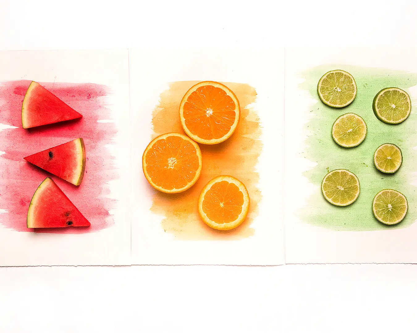
In elevated hospitality, restraint signals confidence. The most recognizable dining brands across the world rely on tight, disciplined color systems comprising one primary anchor, one supporting neutral, and occasionally a single functional accent.
| Palette Architecture | Color Structure | Visual Signal to the Guest | Best Suited Concept |
| Monochromatic Precision | Single core hue with varying shades and neutrals | High exclusivity, architectural minimalism, confidence | Premium omakase, high-end wine bars, modern steak houses |
| Focused Dual-Tone | Two contrasting core colors plus one background tone | Refined balance, clear brand recognition, timelessness | Elevated neighborhood bistros, heritage dining rooms |
| Uncontrolled Five-Colour | Multiple dominant hues competing for visual attention | Clutter, low perceived value, lack of concept clarity | Mass-market casual concepts, temporary pop-up stalls |
Guiding Clients Toward Visual Discipline
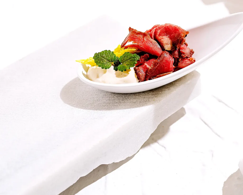
Steering a client away from a complex palette requires reframing the conversation around commercial outcomes rather than subjective personal taste.
At Atelier Creations, we guide operators through structured design principles to ensure visual decisions drive long term brand equity:
- Focusing on the Signature Anchor: Identify the single hero color that carries the emotional narrative of the venue, allowing that hue to build instant recognition across the precinct.
- Using Texture Instead of Color: Introduce depth through physical materials such as brushed brass, raw plaster, oiled timber, or heavy paper stock rather than adding more ink colors to the page.
- Reserving Color for Intentional Accents: Limit secondary colors strictly to functional elements like seasonal specials tags or physical reservation markers where guest attention needs to be directed.
Protecting Brand Recall Shift After Shift
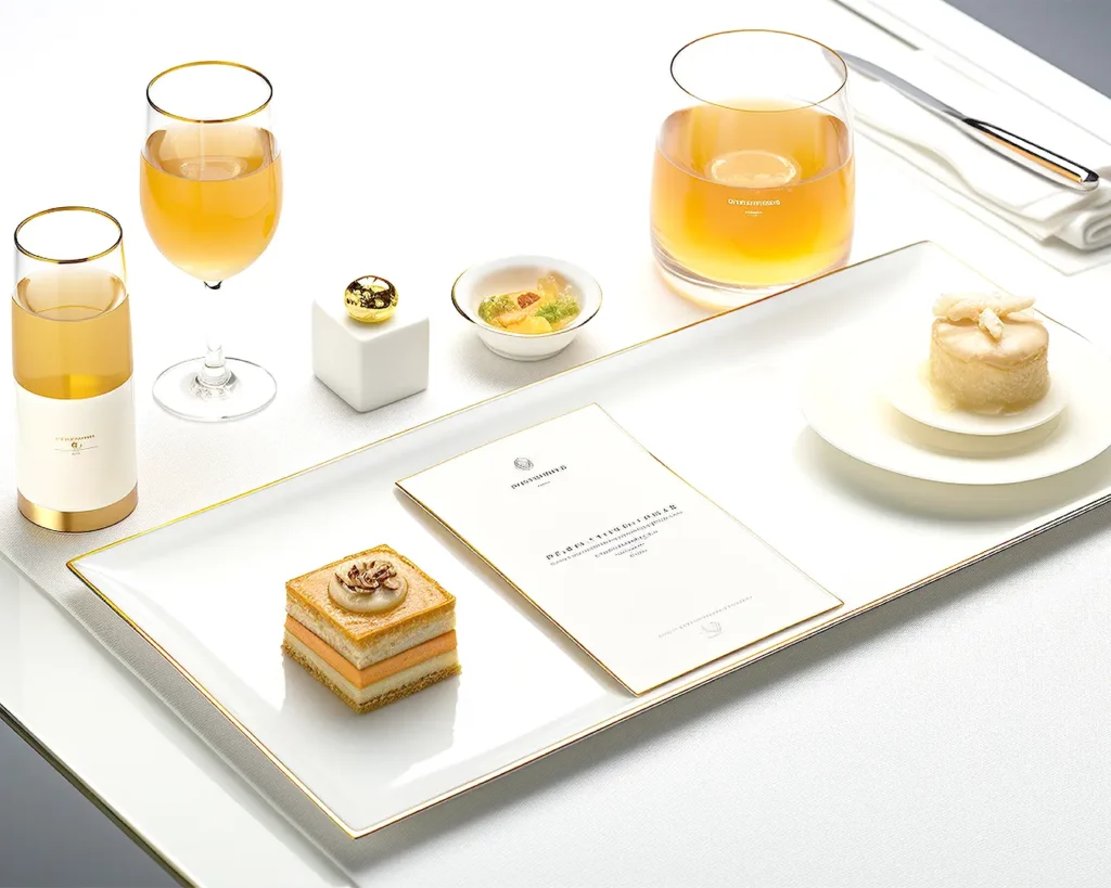
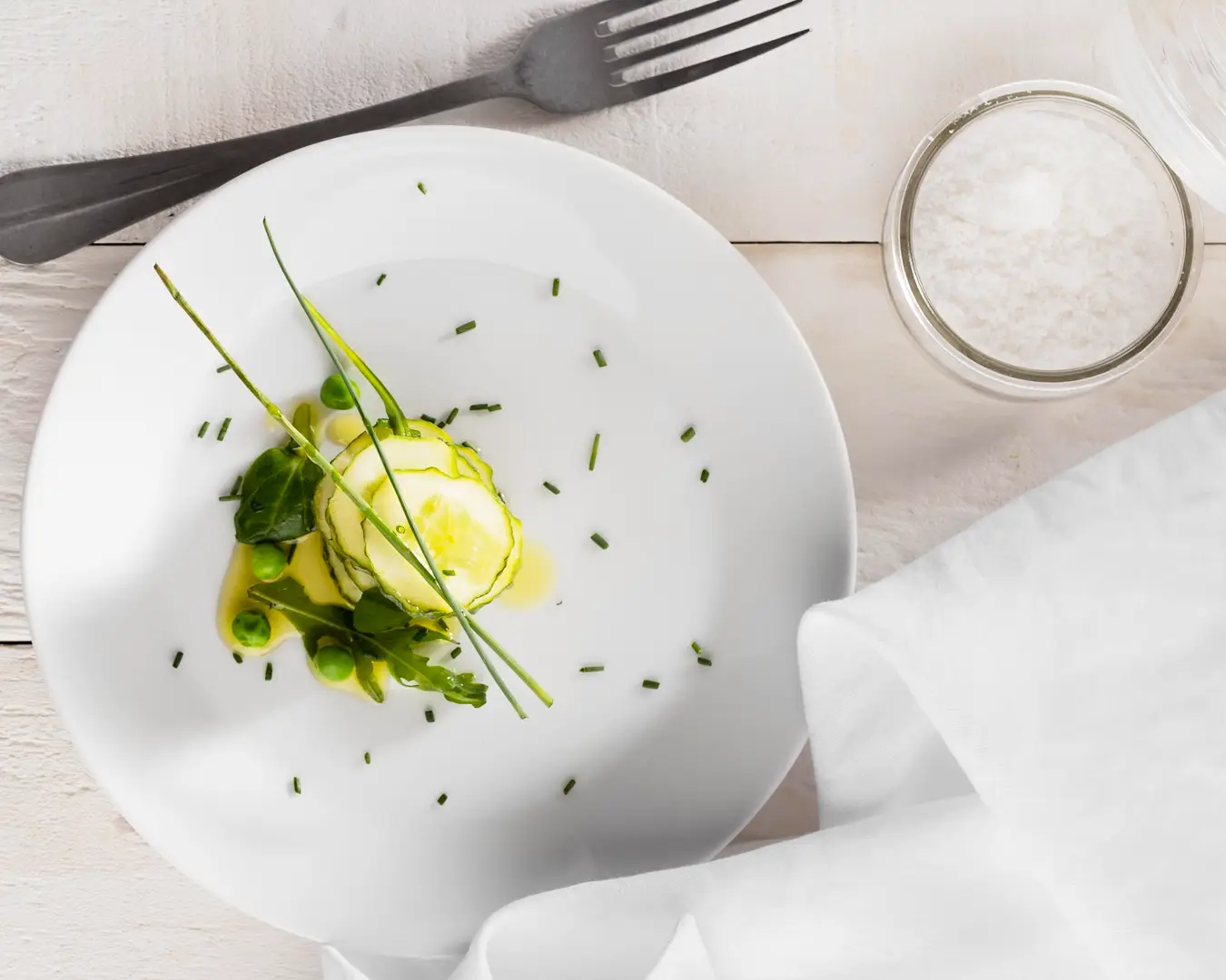
A restaurant’s visual identity should serve as a quiet, authoritative framework for the culinary experience, not compete with the food on the plate. By enforcing color restraint and saying no to unnecessary visual clutter, operators build a sharp, recognizable brand identity that stands out in a crowded hospitality market.
Achieving total clarity across your physical and digital touchpoints requires strategic discipline and experienced design direction. If you want to refine your brand positioning and build an enduring identity system for your venue, get in touch with our team to evaluate your concept strategy.