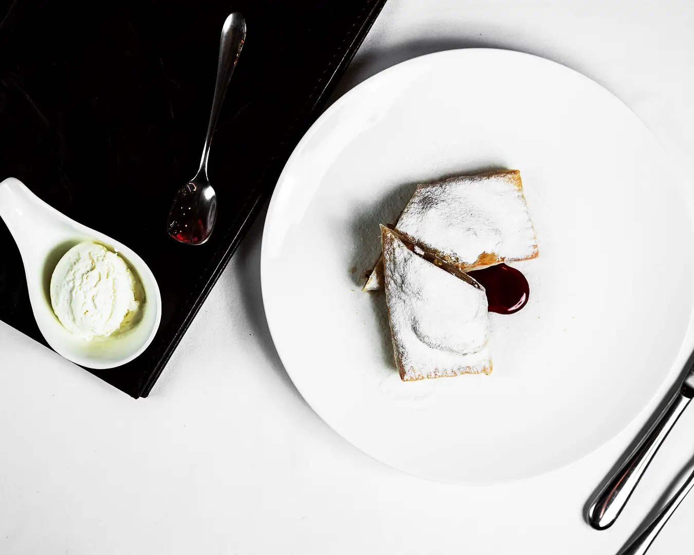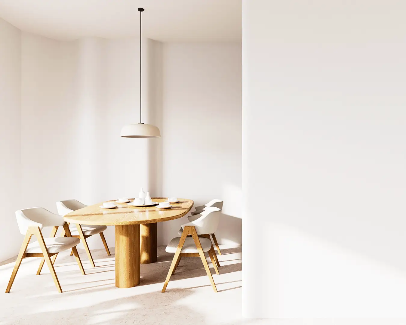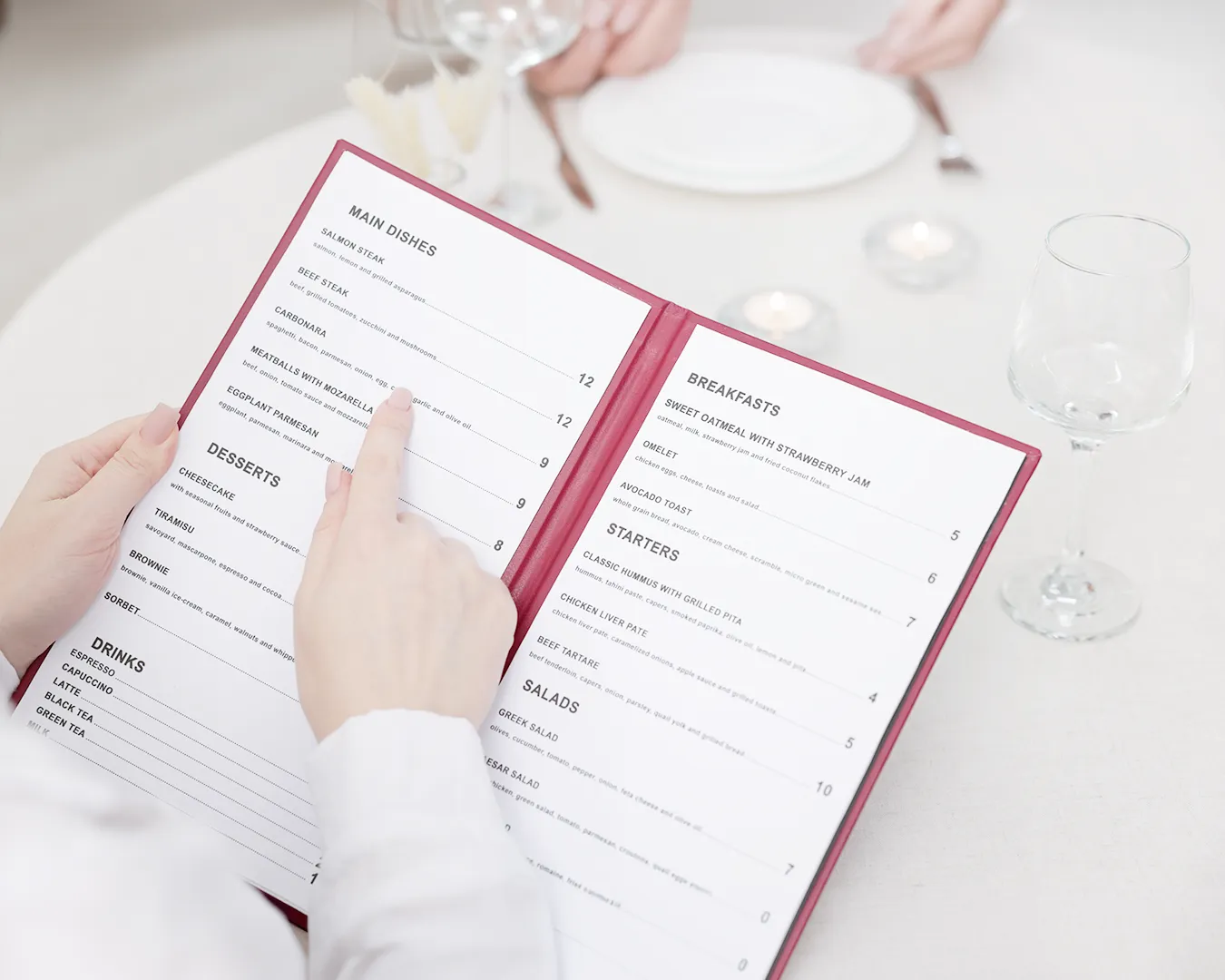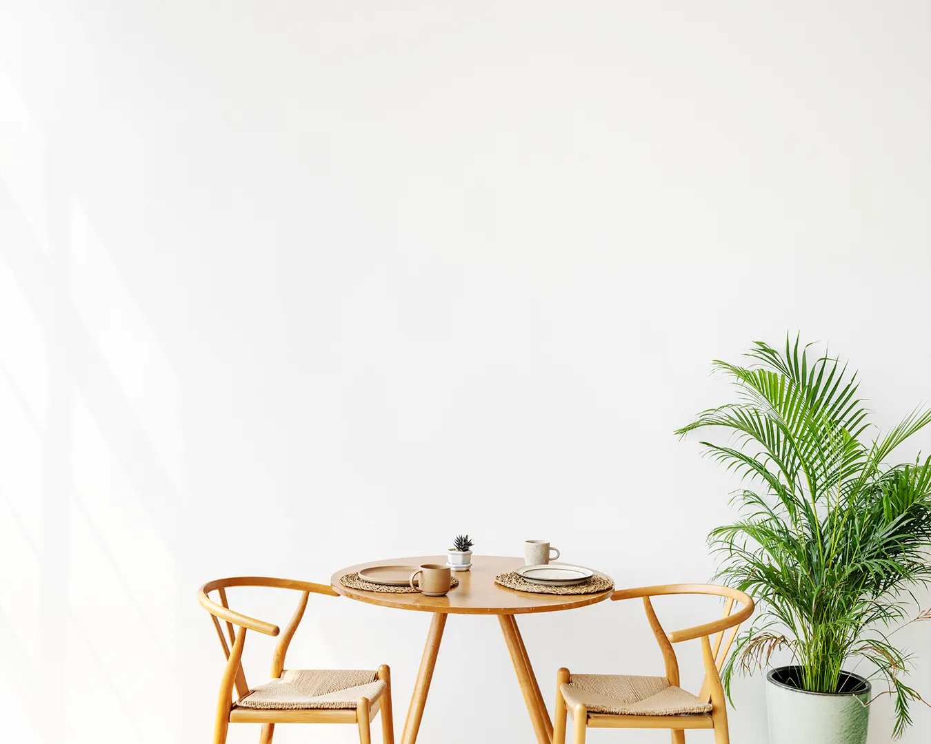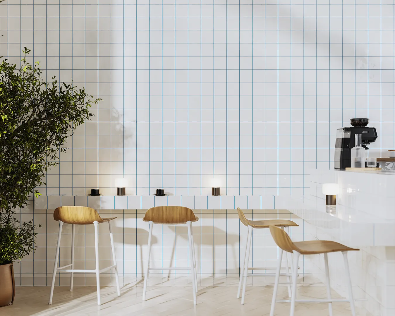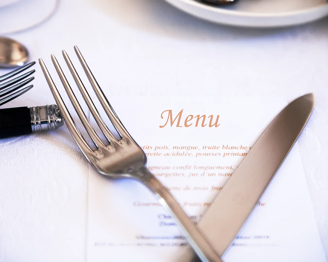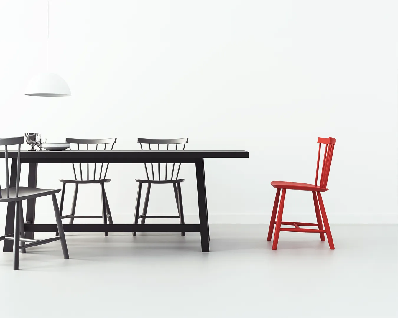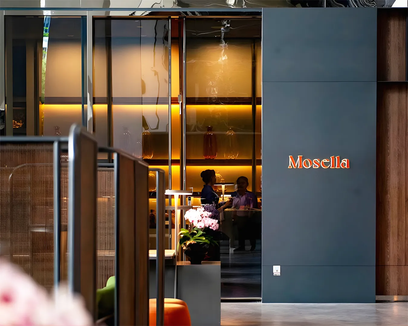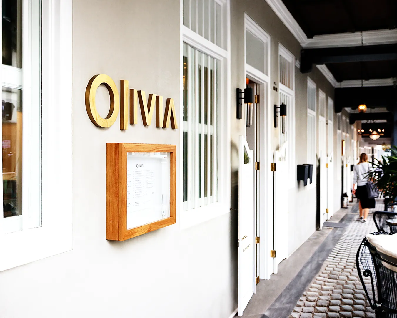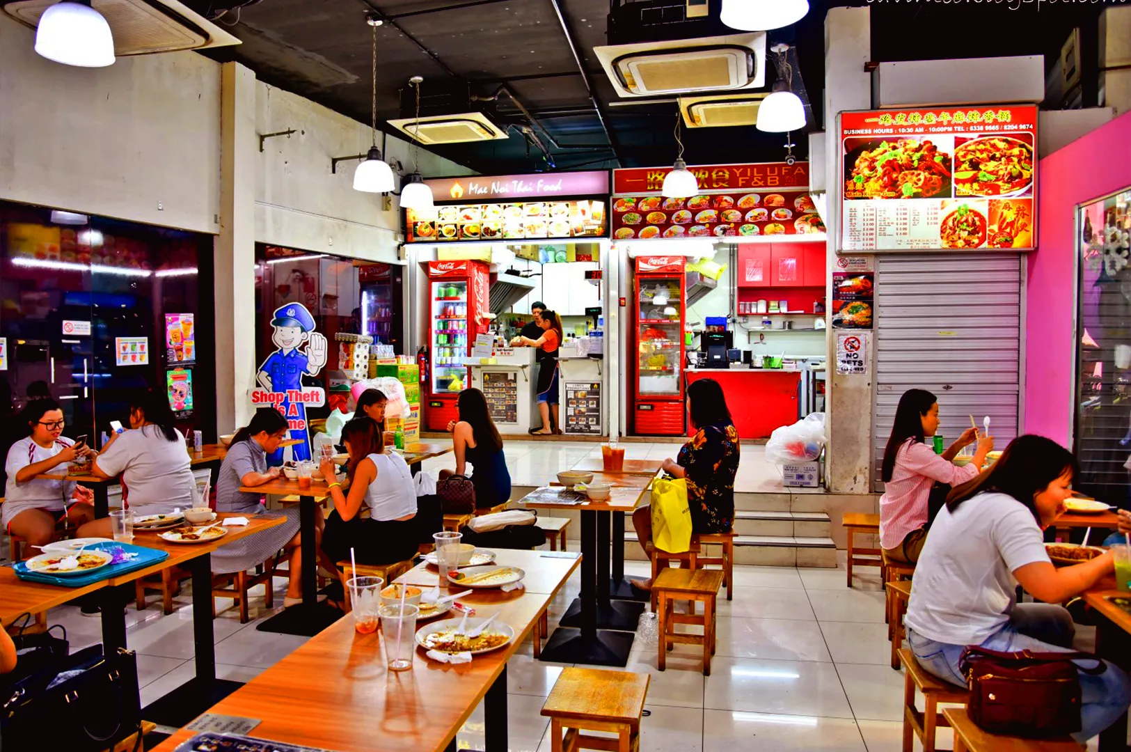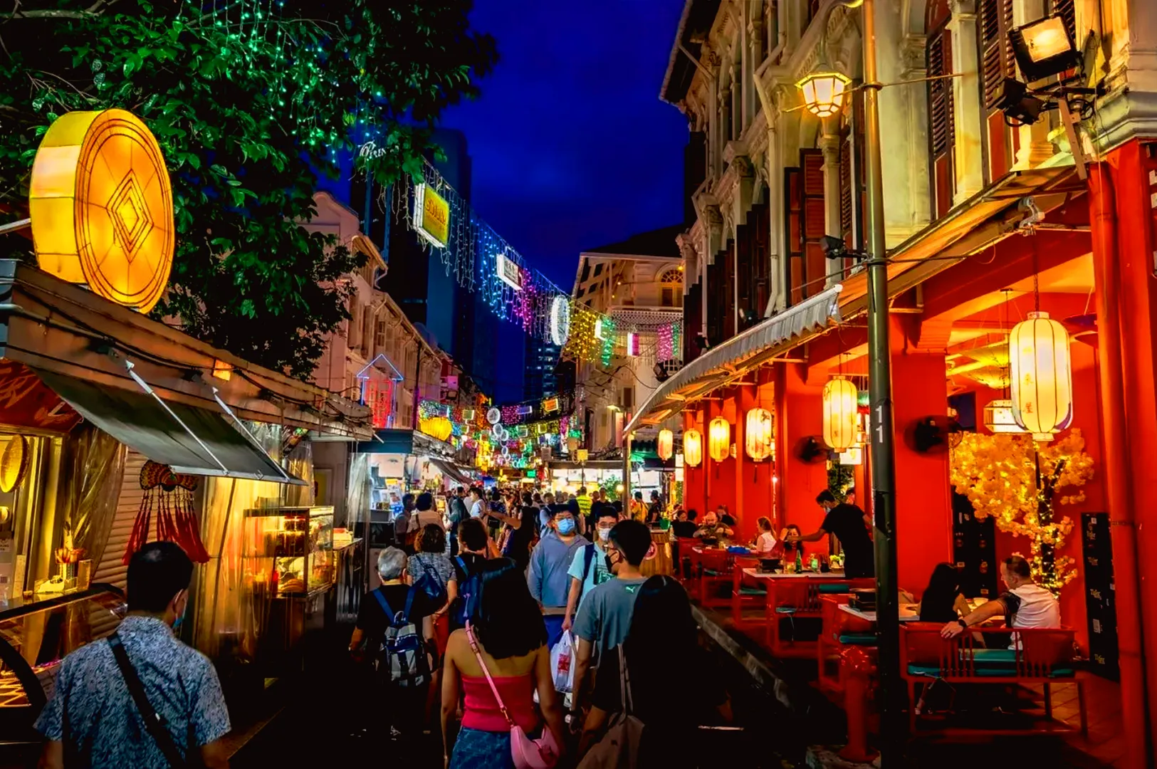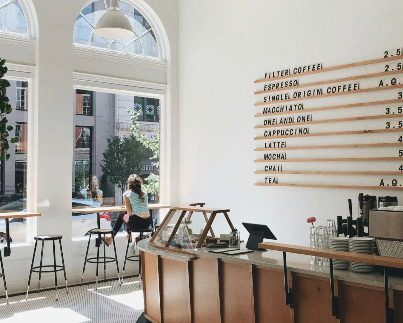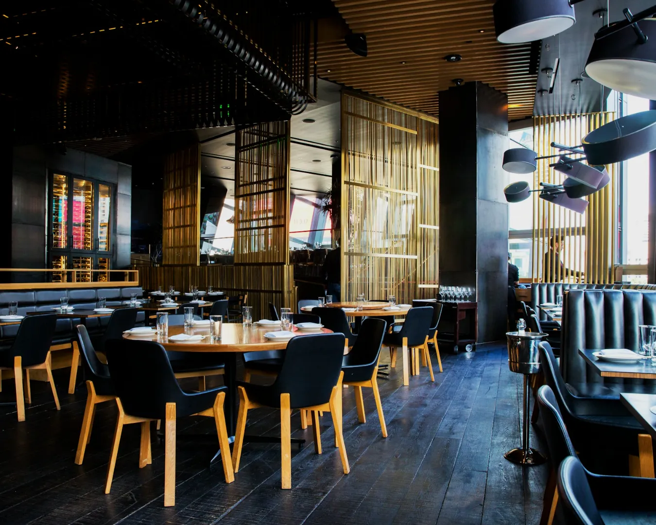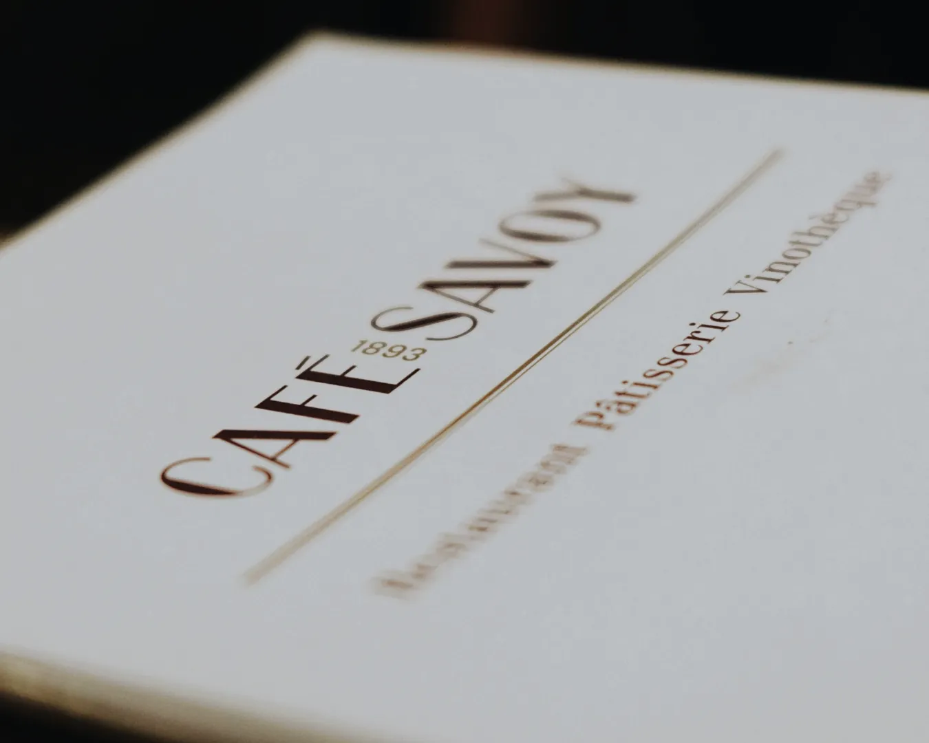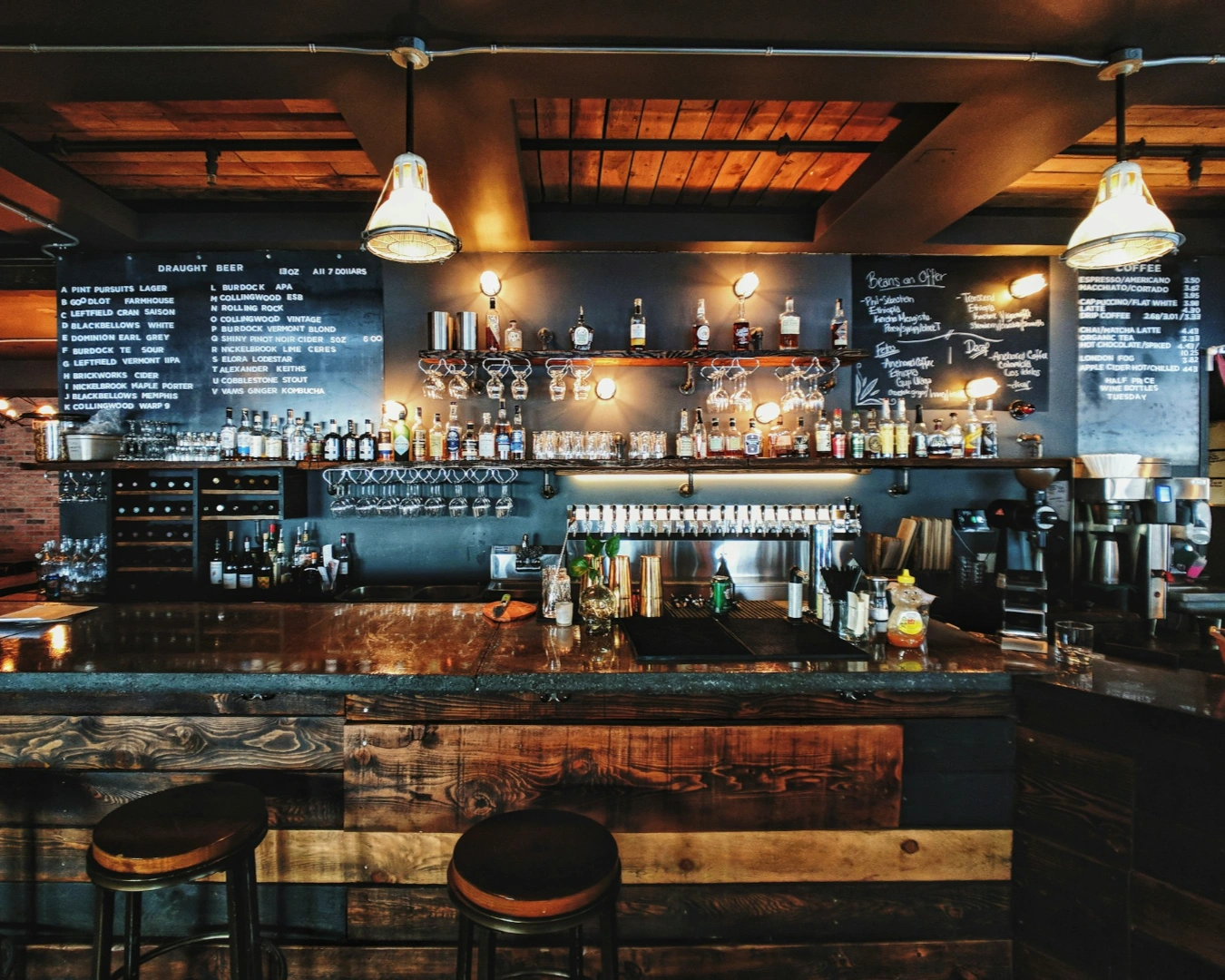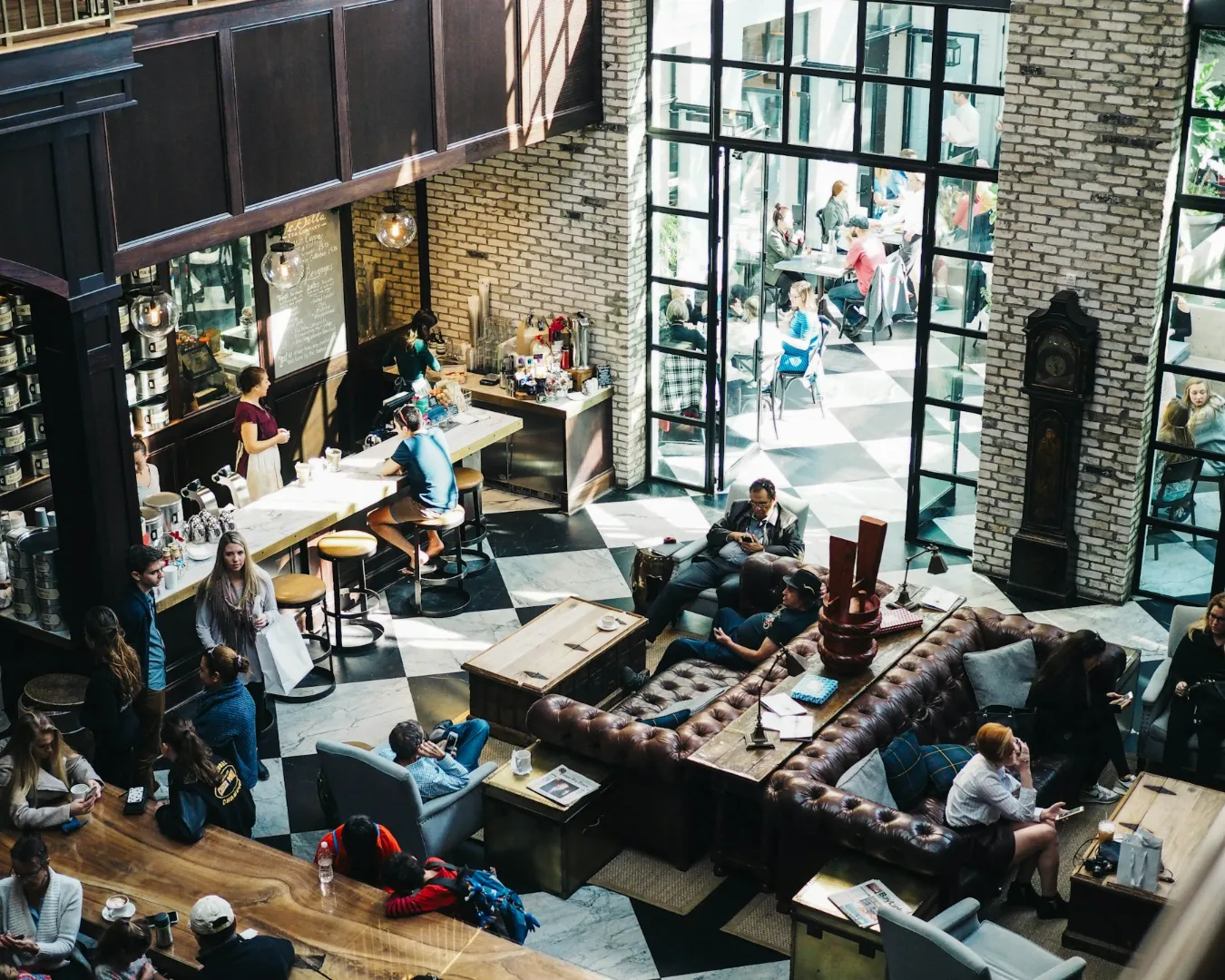

Walk down any major dining strip and you can find two venues serving authentic Italian pasta within blocks of each other. Yet one features raw concrete, polished steel, and minimalist typography on a clipboard menu, while the other warm timber, hand-drawn typography, and classic linen tablecloths.
Both kitchens may source the exact same San Marzano tomatoes and DOP Parmigiano-Reggiano, yet their visual identities, spatial atmosphere, and guest demographics could not be more distinct. Two restaurants serving the same cuisine look nothing alike on purpose because branding is about target market positioning, not ingredient lists.
Positioning Beyond the Plate

A cuisine is simply a set of ingredients, flavor profiles, and cooking techniques. A restaurant concept is the specific cultural narrative, price tier, and emotional experience built around those ingredients.
Differentiation allows venues sharing a core culinary origin to capture entirely different consumer segments:
- Occasion-Based Targeting: One venue positions itself for high-ticket anniversary dinners, while the other targets quick mid-week lunches or casual group gatherings.
- Price Tier Framing: Visual cues immediately signal price expectations. Industrial minimalism signals modern, high-volume dining, while muted tones and heavy paper stocks signal luxury and exclusivity.
- Cultural Narrative Selection: A concept can highlight centuries of traditional heritage or reframe the same cuisine through modern, global, or fusion lenses.
Deconstructing the Concept Divide
To understand how identical culinary foundations transform into completely different brand expressions, consider how two venues approach the same regional focus:
| Concept Pillar | The Modern Fast-Casual Concept | The Heritage Fine-Dining Concept |
| Core Cuisine | Regional Japanese Ramen & Small Plates | Regional Japanese Omakase & Kaiseki |
| Visual Identity | Bold neon, custom anime graphics, sans-serif typography | Stamped wax seals, hand-woven paper, minimal kanji lettering |
| Interior Materials | Polished concrete, exposed tile, stainless steel counter seating | Aged hinoki wood, neutral plaster, soft warm focal lighting |
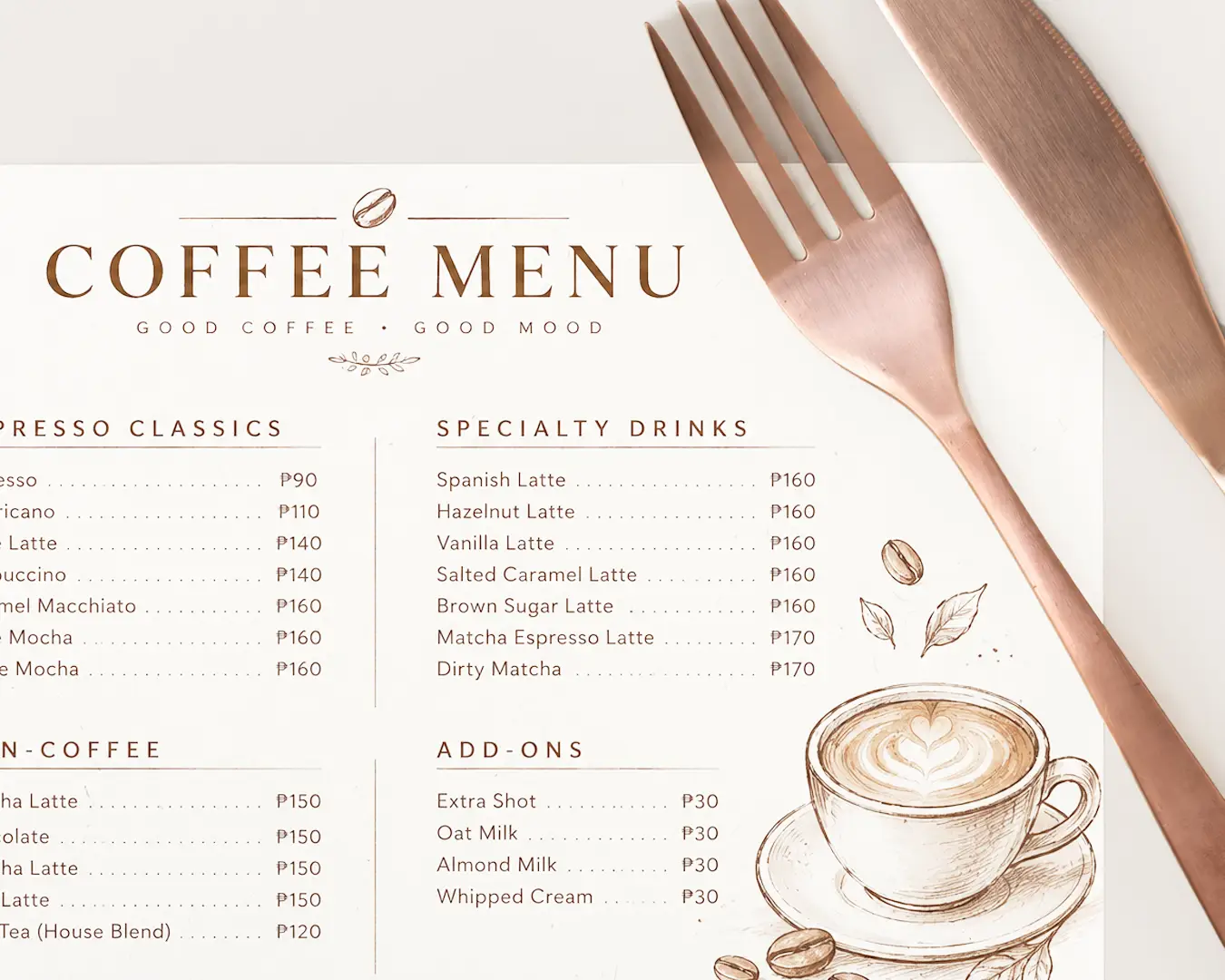
| Menu Engineering | Laminated single-page cards, bright photography, bundled sets | Debossed leather covers, minimalist course lists, no currency symbols |
| Guest Psychology | High energy, fast turnover, accessible price points | Quiet exclusivity, deliberate pacing, high average cover spend |
Avoiding the Trap of Generic Regional Clichés
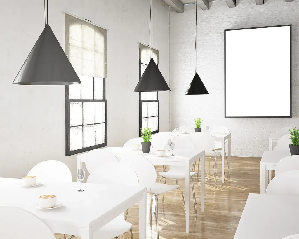
When operators fail to define a sharp brand positioning strategy, they default to generic regional tropes. Every Italian spot defaults to checkered tablecloths and red sauces; every Mexican spot defaults to bright papel picado and sombreros.
Relying on generic visual clichés creates severe commercial disadvantages:
- Commoditization: Looking like every other neighborhood option forces you to compete on price rather than brand value.
- Lowered Price Ceiling: Generic visual identities cap how much guests are willing to spend, regardless of kitchen execution or ingredient quality.
- Weak Digital Distinction: In crowded discovery channels, generic aesthetic choices fail to capture consumer attention.
Crafting a Distinct Market Space

At Atelier Creations, we work with operators to uncover the distinct emotional and cultural drivers behind their concepts before a single logo is drawn or menu printed. By aligning visual identity, spatial design, and menu psychology with a clearly defined target audience, a restaurant transforms a shared cuisine into a defensible market position.
Clarity Drives Commercial Performance
Culinary heritage provides the foundation, but brand positioning dictates profitability. By intentionally designing a brand identity that contrasts with competitors serving the same cuisine, operators avoid direct price wars, attract their ideal guest demographics, and build enduring market equity shift after shift.